
Cadogre Upgrade!
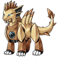
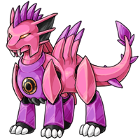
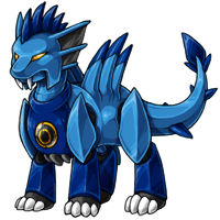
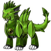
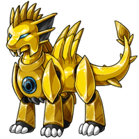
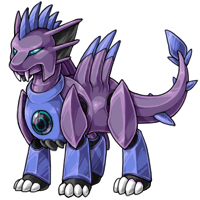
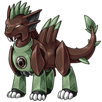
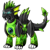
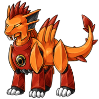
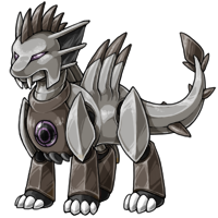
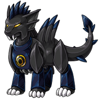
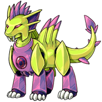

Posted by [NPC] Calvin Blackmoon
WolfieWU
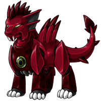
Always had a soft spot for the cadogre. That cherry one is tempting..

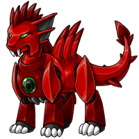
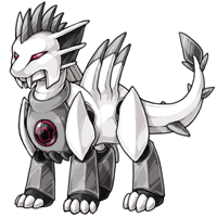
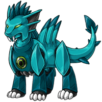
Oh wow, these were never pets I really wanted to have, but I think the updated shading makes the look so much better. I chose one for Monorail because it's a futuristic species but I can't wait for the Spectrum to get updated now. Their claws could maybe be a little sharper but I still think it looks great. (:
I'm very confused. Why does the nuclear Cadogre still look exactly like the original?
Anyone else see it?
Anyone else see it?

The shading alone is worth it, IMO.
Just curious -- how come folks with constructive criticisms aren't making a revamp feedback thread? Several pets have been modified post-release due to user request! If there are anatomy issues or if the attitude of the pet has been totally altered, artists seem pretty willing to consider tweaks... just not from offsite comments or news post replies.
Just curious -- how come folks with constructive criticisms aren't making a revamp feedback thread? Several pets have been modified post-release due to user request! If there are anatomy issues or if the attitude of the pet has been totally altered, artists seem pretty willing to consider tweaks... just not from offsite comments or news post replies.

yeah, these are neat. but Calvin Blackmoon, what is up with you? you need an update way more than cadogres ever did.
Not a fan :/ The older one looked more fierce. Don't get me wrong, the art is lovely, I just feel like it's more... cutesy now and I don't quite dig it.

I've read all the comments now and can't understand the hype. Honestly, if you showed me the 2 pics, I'd say the old one was the updated one? More detail, livelier, shinier, everything but the claws waaayyy better (radar, pose, legs,...). The new one kind of looks like a child's scribble version of the original :-(
Hm... They look stiffer, bulkier,... Got mine from the Adoption Center and not really wanted a roboter :-)
I'm glad mine has been a Nightmare for years - if only it didn't have those strangely huge claws...
I'm glad mine has been a Nightmare for years - if only it didn't have those strangely huge claws...


Not a fan of this change. It's way more blocky and the loss of sharpness in some of the features (the claws in particular) take away from the character that the original had.

The art is definitely an upgrade. They feel less alive now, though. A bit stiff in terms of their stance, a bit positioned. Oh well, it's still nice that they've been updated to the more "full" art style.
I want to add that I do really like the art overall, and I do think it looks better than the old one overall. Honestly it wasn't until I started really looking at it and comparing it with the old one that I found things I don't like about it. So, yeah, nothing against the artist, and I don't hate it, it's just little things that bother me that I'll probably get used to.
I'm not hugely fond of robots but I like the new design! I just think the orb on their chests and their eyes should have a bit of a glow to them to make them look more alive/on. They kind of look like they're powered down right now.

I never really had much of an opinion on these guys before, but WOW, this updated art really brings out the best in them. :o Kudos!

You know...I've never really been fond of this species...not because they are ugly or bad or metallic, or any of that. In fact, these revamps are amazing, kudos to the artists. Perhaps it's because Mr. Blackmoon had something to do with them, or perhaps it's because I've never been able to figure out how to pronounce the species name...Kay-dog'- er? Kay-Dodger? (heaven forbid!! ) Kuh-dough'-gur? Kud'-uh-gur? Kay-doo'-jer? How do you stand on the back porch and call one of these thingies to come in at night..."cadogercadogercadogercadoger!" See...it's sad that such a mighty-looking pet is saddled with a totally unpronounceable name that conjures up all sorts of silly images in my fertile little ADHD brain. I will stick with pherrets (pronounced "puh-hair'-uts") and my priggles, (pronounced "pruh-jel'-ies")....snicker

Quote by Books:
(basically, there's no inner light that a working radar screen should have, thus making the orb dull and muted)

The new update is amazing, great job to the artist(s)!!!
I also agree that I wish the chets orb was more illuminated and that the claws were sharper.
I also agree that I wish the chets orb was more illuminated and that the claws were sharper.
ohhhh my goodness my favorite robot dragon got a huge, fantastic update!! kudos to the artist, you did an amazing job!!
My favorite species got an upgrade, what an awesome surprise! <3 They all look gorgeous, wonderful job artists!
Ooh, very lovely remake! The new highlights make them look so sleek and refreshing. Great job on the new tail posing too.
I can't help but feel like the front feet are super tiny in comparison to the head though and that the middle, where the front and back leg meet, isn't super distinct on the non-light colourations.
Beautiful work over all though. These guys were certainly ready for their update!
I can't help but feel like the front feet are super tiny in comparison to the head though and that the middle, where the front and back leg meet, isn't super distinct on the non-light colourations.
Beautiful work over all though. These guys were certainly ready for their update!
I love the revamps that keep in the spirit of the old art but also improve upon it, although personally I like the old claws better, the sharp ends seem more powerful robot-ish.
(basically, there's no inner light that a working radar screen should have, thus making the orb dull and muted)
@Sielbee
comparing the two commons, helpfully posted by Ninja below, the radar is extremely dull, no light coming from the screen. some of the other colors' palettes make it look more of a "working" screen, but the basis of the species (which all color revamps will thus be based upon) just has an uncharacteristic dark half-orb. I guess you could say it's turned off? but that makes no sense in context for the pet. :/
comparing the two commons, helpfully posted by Ninja below, the radar is extremely dull, no light coming from the screen. some of the other colors' palettes make it look more of a "working" screen, but the basis of the species (which all color revamps will thus be based upon) just has an uncharacteristic dark half-orb. I guess you could say it's turned off? but that makes no sense in context for the pet. :/
I like how they're starting to lean back towards their solid, bulkier original designs. Those things were lovely old clunkers!
I hope all the special poses don't change too much-- maybe to reflect the stockier anatomy, but not too much. I love my Storm, Angelic and Dark Matter Cadogres very much!
(Maybe the new Bloodred one might have the weird robot tentacles return, I always liked that little detail.)
I hope all the special poses don't change too much-- maybe to reflect the stockier anatomy, but not too much. I love my Storm, Angelic and Dark Matter Cadogres very much!
(Maybe the new Bloodred one might have the weird robot tentacles return, I always liked that little detail.)
I can't believe I didn't notice how outdated the old art was cringe these new babies look so nice and sturdy!
I should look into getting one after the older special colors get updated
I should look into getting one after the older special colors get updated
Anyway I do really like how the Nuclear look, I've never wanted a Nuclear pet before but I might have to change my Cadogre
It looks great overall, I just wish it had kept the same sharpness. They look more like toys now. Actually they look more plasticy than metallic now. But then since a toy is used to change a pet into a Cadogre maybe the toy look is intentional?
@Books I'm not sure what you mean but the crosshairs are still there, just harder to see especially on the common and arid, so not sure if that's the problem, that and it's not just a flat spot anymore
@Books I'm not sure what you mean but the crosshairs are still there, just harder to see especially on the common and arid, so not sure if that's the problem, that and it's not just a flat spot anymore

Woah, the new art looks so much nicer! :0 I miss the sharp claws they used to have, but overall, I think this is a big improvement.
Wait... Did Glade and Hydrus already get updated?! Or were their faces already without the microphones as people are calling 'em?
Boy, I'm looking forward to seeing what the special coloration poses look like, since I've got a few of my boys as them.
while overall I love the new look, I'm really, really sad to see the claws turn into ~happy little puppy paws~ and all the spikes rounded off. :c
also curious why the targeting system has been turned into a misplaced looking random dull orb on its chest?
if we're turning them into robo-housepets now, why even keep it at all? aesthetics?
also curious why the targeting system has been turned into a misplaced looking random dull orb on its chest?
if we're turning them into robo-housepets now, why even keep it at all? aesthetics?
Wow, they look so much better! They have so much better shading and shape now and look more like metal dino-dogs.
OOOOMG every neopets redraw makes me happy.
I liked so much this change. Gz and thank you so much Subeta.
Nice redesign, now I want one o
I liked so much this change. Gz and thank you so much Subeta.
Nice redesign, now I want one o