
Potential Paralix Revamp!
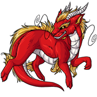 - - -
- - - 
Current - - - Proposed
We're interested in hearing your feedback over a potential paralix revamp! We'll be updating the pet and its basic colors soon, so have your say now and we'll do our best to get it looking tip-top.
Note: There's not a poll at this time! Please leave your comments in this news post.

Posted by SubetaTeam
Jen
Prefer the current version (and kind of confused as to why this species needs a revamp)

Echoing everyone here. Proposed one looks outdated. Not enough detail, not sleek enough for being a dragon inspired pet. And that waluigi grin without any of the teeth is meh.


I prefer the sleek fierce look of the original and all details. The only things I sort of like on the suggested revamp is how you can see a little more of the underside of the tail and I like the horns a little better.
If I saw a revamp of the Paralix I would prefer to see a revamp of the colors in the basic pose like Twilight, Cherry, Arid, etc. Most of them don't use the full color scheme of the color or if they do its so tiny I can't tell. The silver, nuclear, and common look nice but the rest seem to have less color than they could.
If I saw a revamp of the Paralix I would prefer to see a revamp of the colors in the basic pose like Twilight, Cherry, Arid, etc. Most of them don't use the full color scheme of the color or if they do its so tiny I can't tell. The silver, nuclear, and common look nice but the rest seem to have less color than they could.

I think the new one loses some important features of the old. Old one looks leaner, sharper, and more aggressive with the smile and eye. The new one is much softer and rounder. I think the old one looks much more like a traditional Chinese dragon, with the slightly manic eyes and grin and the curly hair on the elbows and knees. I like that look and would like to see more of that in the new version.
I'm definitely favoring the older one, particularly the face. (Eyes, teeth, whiskers) I also like the more slender appearance on the original. The shading is lacking in the new one as well
I definitely prefer the current one, as others have said the 'possible revamp' doesn't have enough spice to it.

This one is tough. I'm torn. The current design is better pose wise (slender, more dynamic). I prefer the face, whiskers, stomach, and feet of the current. The proposed has nicer shading and a more colorful mane. I also like the horns/ears of the new version.

There's absolutely no need for a revamp. And I'm sorry to say but the current design looks more up-to-date to me than the suggested revamp.
I wish I could give more constructive critisism. As it is, only thing I can say is: please no to the revamp.
I wish I could give more constructive critisism. As it is, only thing I can say is: please no to the revamp.
I prefer the older one, the art doesn't even look dated enough to warrant a revamp, and I shadow other comments that there are other pets more deserving of updated art. :c
I have to agree with some of the other posters. The older version is better than the redraw. The shading, the definition, the attention to detail. The new one looks like a neopet...I hate to say it. Also, hate to parrot the others here, but there are other pets who are WAAAY over due for a revamp. We should really stick with the original on this one and move on to other pets who have had the same look since this site came up.
I have to agree with some of the other posters. The older version is better than the redraw. The shading, the definition, the attention to detail. The new one looks like a neopet...I hate to say it. Also, hate to parrot the others here, but there are other pets who are WAAAY over due for a revamp. We should really stick with the original on this one and move on to other pets who have had the same look since this site came up.

The current: I like the pose more, it's more alert, the eyes, the grin, the long horns, the whiskers, the sleek look, the linework.
The revamp: I like that it shows the inside of the tail a bit more, and I like the manes and tufts a bit more, in the current one it comes across as almost too detailed.
All in all the question, why is there an interest in a revamp? I think the Paralix is one of the prettiest pets, and one of the pets which needs the least revamping (I had to change my reborn Paralix because of the design change, so I'm not that fond of pet revamping tbh).
The revamp: I like that it shows the inside of the tail a bit more, and I like the manes and tufts a bit more, in the current one it comes across as almost too detailed.
All in all the question, why is there an interest in a revamp? I think the Paralix is one of the prettiest pets, and one of the pets which needs the least revamping (I had to change my reborn Paralix because of the design change, so I'm not that fond of pet revamping tbh).

What I don't understand is how people in the comments did a better lineart/redline for free with better posing and proportions than the proposed design...which someone is getting payed to do...
I don't like the new art at all. It doesn't seem like a paralax to me at all. It needs the snarl + a bit trimmed off that behind. I miss the scale detail on the chest. The new one just doesn't seem detailed enough for me imo.
The new one is fine... but I quite like the original. I don't feel this one needs revamped, the original is very nice and one of my favorites.
The new art is nice, but it takes away from the feel of the Paralix. The main reason I love them as a pet is the dark sclera eyes and the snarly face.
I agree with the majority about the flatter shading and rounder lines just not working, but especially to me it's that the new design, while looking lovely and smooth, dosen't stay true to the sort of spirit and personality to the original. If anything is going to be revamped, it has to not change the spirit of the thing or it just becomes something new instead.
Personally I think instead of becoming less dragon, it should if anything play up the eastern dragon aesthetic. A thinner body, grace, scary teeth, and like someone said here, the curls in the hair. There have to be ways to make the hair smoother and nicer looking while still preserving the existence of some of those little spirals.
Also a pet being remade must have the same emotion/expression. People really often can base character off of the expression, and if it changes that feels a little like pulling a rug out from under them.
That said, the new art looks good, it just doesn't look right.
Personally I think instead of becoming less dragon, it should if anything play up the eastern dragon aesthetic. A thinner body, grace, scary teeth, and like someone said here, the curls in the hair. There have to be ways to make the hair smoother and nicer looking while still preserving the existence of some of those little spirals.
Also a pet being remade must have the same emotion/expression. People really often can base character off of the expression, and if it changes that feels a little like pulling a rug out from under them.
That said, the new art looks good, it just doesn't look right.
I think my biggest critique is that the new version is perhaps a bit too polished and smoothed out. Furrier hair/brows and mimicking the old snout would make it perfect, I think! Both look great but there's a certain 'edge' that old version has that the new one doesn't. Giant kudos to the artist, though! I love the Paralix.
The proposed version looks cleaner and a little more modern with the use of shadows and highlights but I don't think it feels slinky and mischievous enough. I strongly prefer the current version's head angle, smirk, and whisker placement though the now horns are way better. I think the hair would benefit from more definition and maybe direction--the current is a little over detailed but the proposed is a little too understated--and the belly scales could also use more definition as they seem a bit flat, especially on the neck. I think the body would benefit from more flowing s curves, the proposed version feels very dog-ish and lacking in the snake/ferret quality paralix's have.
I like the newer one a lot. I'd like it more if it retained some of the original's defining features. I'd say give it back the longer horns, the longer "eyelashes", the original whisker shape, more defined shading on the mane to make it look as stiff/wiry as the original. I feel like these are important parts of the pet's character.
The Paralix is why I joined Subeta, and the new design is very much a step down. No goofy smile, no chonk, and like someone below said the whiskers look goofy. The shading also feels flat and lacking :x It's not the fun dude I fell in love with, but I know staff can take all of these into consideration when redoing the revamp.
The current version has better angles and shading, the new one looks a bit bland. I do like the fur on the proposed revamp, but it loses a lot of personality and the whiskers look very goofy. The revamp would be a step down, I think.
continuation from my prev comment bc im dumb
The colors, lines, and shading definitely could benefit from the newer styles displayed on the right. but the shapes and dynamics and anatomy and Feel, i prefer the left
The colors, lines, and shading definitely could benefit from the newer styles displayed on the right. but the shapes and dynamics and anatomy and Feel, i prefer the left
I like the proposed revamp, but it loses a little something special. let it be lanky and weird lookin
Call me an oddball, but I'm all for the new one. The current one has a bit too much of a shine on its fur like it's metallic hair. However, if the new one kept the lanky legs, it would be perfect.
I like the newer design, but I think I prefer the older one more. Like many others said, it just has more personality to the expression and coloring/shading. The angles on the older one are sharper as well, like its paw, whiskers, and chest have more movement/depth to them. Makes it look more dangerous :o
But if the goal is to make it more friendly/cuddly, then I think the redesign works. I think it looks good thicker, just maybe some more definition would be needed on the coloring/lineart. The complexity and definition of the art is why I like the pets on Subeta :) That's just my 2 cents, I would be happy with it even if it was updated to look just as is :)
But if the goal is to make it more friendly/cuddly, then I think the redesign works. I think it looks good thicker, just maybe some more definition would be needed on the coloring/lineart. The complexity and definition of the art is why I like the pets on Subeta :) That's just my 2 cents, I would be happy with it even if it was updated to look just as is :)
Current!
i prefer the current image as i think the newer one is too chunky and flat and loses the details of the current version. it needs to keep it's shape and definition, it becomes very bland otherwise.
i prefer the current image as i think the newer one is too chunky and flat and loses the details of the current version. it needs to keep it's shape and definition, it becomes very bland otherwise.

The newer one seems too large and very flat. I don't think there's anything wrong with the current image for the pet. Definitely plenty of other pets and pet colors that could be changed/added though!
The new one DOES lookcleaner, but loses a bit of the figure around the torse, maybe give him a bit of a curvature like the current one? Also I think it should show a itty bitty more teeth
I like the newer one for the smoother look overall but as a few people already said i prefer to keep the desing a little slimmer, also the expression on the old one gives it so much more personallity. I would prefer a middle road of updating the artwork in general but keeping the old design.

Personally, I much prefer the current one. It seems more detailed than the new one. I don't really see why it would need changed.

I don't have a paralix, but if I was going to get one it would be because I wanted a pet that was sharp, elegant and long, with a fierce expression (instead of a "pixar smirk"). The proposed one feels like it'd lose some of that. Feels like someone crossed it with a clawsion or something.
It's not bad or anything, I just prefer the current one.
It's not bad or anything, I just prefer the current one.
I personally like the coloring on the newer one a bit better but as many have said I think the old design is pretty unbeatable, it just oozes all the personality and 'sleekness' you expect from the Paralix.
The only thing I like better of the new one is the smile. I think you should leave the old one alone, no offense.

My question is why do we need to update this pet? I dislike the new art. It is fig like not dragon like bc as said above. Longer, leaner, and more detail in the face . It leave it alone? I love how they look now and don't really understand why it needs an update over other pets with much more strange line work. There's many others that need it much more ( especially artists that are gone/ won't be doing more colors. )we need more recolors or new colors in general (finish off some of the pets who didn't get the colors yet! Please? )
I honestly don't understand limiting an artist to one pet if they are up to doing others, as long as the artwork is consistent with the pets design ( and fans of that let can weigh in like here! Thank you so much for asking us!!)
I honestly don't understand limiting an artist to one pet if they are up to doing others, as long as the artwork is consistent with the pets design ( and fans of that let can weigh in like here! Thank you so much for asking us!!)
The current design looks more crisp and finished, not to mention fierce and mature. My preference is to leave it as-is.
Not a fan of making the Paralix look "Huskier" than it is. The broader chest and thicker legs gives it more the appearance of a dog, imo.
As an artist myself, I have a few gripes with the new design. As many others have said, the new one feels more childish and chunky. It takes away from the personality of Paralix, which is sly and sleek. The lines and coloring make it look weighed down. I would add back the teeth from the original. That was always my favorite feature and and makes Paralix look fierce, which compliments its Eastern dragon design. It's also one of the cooler looking pets and making it look more cuddly takes away from its aesthetic. I would honestly just update the render style on the old base and call it a day. The original pose and design are fantastic and don't really need a revamp. I would opt for an update instead.
Yeah, I agree with others, the revamp looks a bit too thick, tbh. He should look more serpentine, lean and limber. This one looks like he'll just chunk along as he walks... Aso def no 'wow' factor like others have mentioned and I feel the shading is pretty lacking and makes him look rather flat.
the suggestions, esp those that proposed alternate linework, are amazing. they really pull it all together.
I like the newer one, personally. My only "gripe" on the matter is that it could stand to be slimmer, more serpentine -- as a Eastern dragon might be.

Since the only Paralix I own is a Dark Matter, I can't say much about the Common color, but that new version feels off. Looks a lot like a plushie.