
Potential Paralix Revamp!
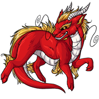 - - -
- - - 
Current - - - Proposed
We're interested in hearing your feedback over a potential paralix revamp! We'll be updating the pet and its basic colors soon, so have your say now and we'll do our best to get it looking tip-top.
Note: There's not a poll at this time! Please leave your comments in this news post.

Posted by SubetaTeam

GLaDOS
No offense to the artist but the new one seems to have lost a lot of detail and is more... smooth/rounded? I don't like it at all.

i like what you did with the fur and whiskers but i do prefer the old facial expression, it was may more defined and mischievous. A little more shading, so it looks more muscular, like the old one. The new one is chubby and cute, which would be nice, but a new vibe for the pet which might ruin it for a lot of Paralix owners.
Thank you for including us in your decisions, team! ♥️
Thank you for including us in your decisions, team! ♥️


Quote:
Yes!! I've had my Paralixes for 10+ years. IIRC, they had one previous revamp that led to the current design and it was a great update! Honestly, my stomach dropped seeing the images until I read that staff had opened this up for comments and feedback which I'm VERY thankful for because I would've honestly been devastated if they just went ahead and rolled out the update.you can say that if people dont like it, they dont have to have that pet, but the absolute problem is that some people have had their pets for 10+ years. theyve built characters and stories around them. so you have a pet youve had for years, youve worked hard training it and raising it stats, ect, and then suddenly one day the whole pet is changed and it just isnt what you like or built that pet to be. their image doesnt match their personality anymore. what are you supposed to do then? staff wouldnt have put up this post if they didnt want the users opinion on it, because yes, it effects everyone on site.
I know they're just pixels in the end, but I grew up with these pixels and I've continued creating designs and characters inspired by them. Visual aesthetics and art are very important to me and for when I craft my characters.
I actually joined subeta when neo rolled out that awful converted art update, without any warning, and destroyed all of my characters. So yeah, a major art change for one of my favourite things on this site would have a major impact on me as a user.


I am a BIG Paralix fan. This is like my favourite pet on the site so I have A LOT of them <3
And I honestly do not like the revamp at all. Something is just...off. The old one looks way more inspired by eastern dragons which I love love love.
The new design actually feels like a step back and kind of feels like it lacks the "spirit" of the Paralix. I like that the Paralix looks a little mischievous and SHARP! The new one feels so...blah. :(
I think the whiskers on the old design could be changed so they're not in those positions, but...it honestly does not need a revamp at all. There are so many other pets on here that DO need one. I think the old art could have updated shading and lineart, but the actual core design should not be changed at all.
And I honestly do not like the revamp at all. Something is just...off. The old one looks way more inspired by eastern dragons which I love love love.
The new design actually feels like a step back and kind of feels like it lacks the "spirit" of the Paralix. I like that the Paralix looks a little mischievous and SHARP! The new one feels so...blah. :(
I think the whiskers on the old design could be changed so they're not in those positions, but...it honestly does not need a revamp at all. There are so many other pets on here that DO need one. I think the old art could have updated shading and lineart, but the actual core design should not be changed at all.
hours later and im still laughing at myself for mistaking my own sketch of the hair as the far ear and making it look like its growing out of its eyebrow
I agree with a lot of the comments, but I still like the proposed one better b/c I like its smirk and the horns better than the old ones.


@caramelapplecandy , ive not seen too many people be openly hostile about it. and the problem with it only pleasing staff is that the site and its contents is more for its users than the people that run it, just in my opinion.
you can say that if people dont like it, they dont have to have that pet, but the absolute problem is that some people have had their pets for 10+ years. theyve built characters and stories around them. so you have a pet youve had for years, youve worked hard training it and raising it stats, ect, and then suddenly one day the whole pet is changed and it just isnt what you like or built that pet to be. their image doesnt match their personality anymore. what are you supposed to do then? staff wouldnt have put up this post if they didnt want the users opinion on it, because yes, it effects everyone on site.
you can say that if people dont like it, they dont have to have that pet, but the absolute problem is that some people have had their pets for 10+ years. theyve built characters and stories around them. so you have a pet youve had for years, youve worked hard training it and raising it stats, ect, and then suddenly one day the whole pet is changed and it just isnt what you like or built that pet to be. their image doesnt match their personality anymore. what are you supposed to do then? staff wouldnt have put up this post if they didnt want the users opinion on it, because yes, it effects everyone on site.

For the most part I like it, but I think new art should be a little more noodle like, as well as more toothy.
As a whole I like the new art a lot more. I do agree that this one should be skinnier; usually things like that are eh but in this instance it lends well with the overall design, the old classic design it's based off, and probably because I am so used to the older one; oh and it sorta makes the head look too small. Now if it were always a bit thick I'd feel a different way. Artistically, if the slightly chubbier version stays (which in the end is fine), I think the head needs to be bigger/reworked some, and the background legs need some working too.
Oh, also, the random black lines indicating fur on the side area have never gone with the flow of the fur. I'd honestly just omit them.
I do like Jesus' and frederick's redlines, though not 100% because things are always subjective, I think they did good jobs on what my eyes see issues with.
@frederick
I don't know how I feel about you describing the moustache I personally have as a a villains moustache.
I love it. I always say 'If I look like a Disney villain, I am doing it right.'
Oh, also, the random black lines indicating fur on the side area have never gone with the flow of the fur. I'd honestly just omit them.
I do like Jesus' and frederick's redlines, though not 100% because things are always subjective, I think they did good jobs on what my eyes see issues with.
@frederick
I don't know how I feel about you describing the moustache I personally have as a a villains moustache.
Praise @Jesus ! Everything in his edit made it tons better. Please get as close to this as you can or just pay him for the design and use it direct.
I personally really like the revamp. Sure it looks soft, but I like that, especially for virtual pets. But honestly I don't understand why some people are getting so hostile over it - both versions look nice. I think what matters is if the artist and other staff like it. If players don't like it, they don't have to have that pet.
I really like the slinky dragon nature of the paralix, I feel like it leans more into a fox with the new changes, plus the black shading on the belly looks more like stitches than any sort of detail.
I like the new one! I do have some critiques...
Love y'all! Whatever it ends up being will be great!
- The yellow mane fur looks like it's coming from behind the paralix. Given the anatomy, it seems like we should be able to see the fur beginning on the middle of the back? Does that make sense?
- The... dragon nose hair... thing... I don't know what it's called but the one on the right is hard to see, so I would maybe make it either thicker or have it enter the white space a bit more.
Love y'all! Whatever it ends up being will be great!
I think, if it’s based off of eastern dragons, it should probably be more… noodle-y? I’m personally not a fan of the beefed-up version, myself, and feel like the pet itself would look better with a slimmer, longer build.
Actually, now that I think about it, I do think it should look a bit slinkier, but then the old one doesn't look as slinky as I remember it being.
Angelina
STAFF
Hi everyone! I'm here with a couple of reminders for everyone since staff have been reading these comments!
First of all, please make sure that you are commenting on the art itself, and not the artist. Constructive criticism is great, and we'd love your feedback on what you like about the art, or what could be improved. However, attacks on the artist because you don't like the art are not appropriate.
Secondly, this thread is specifically regarding the Paralix - bringing up other pet species that need to be revamped isn't very helpful in this particular comment thread! There's areas in the forums where you can suggest pet species to be revamped, and please post your thoughts on other pet species that need revamps in those areas. We'd like to keep this focused on the Paralix revamp!
First of all, please make sure that you are commenting on the art itself, and not the artist. Constructive criticism is great, and we'd love your feedback on what you like about the art, or what could be improved. However, attacks on the artist because you don't like the art are not appropriate.
Secondly, this thread is specifically regarding the Paralix - bringing up other pet species that need to be revamped isn't very helpful in this particular comment thread! There's areas in the forums where you can suggest pet species to be revamped, and please post your thoughts on other pet species that need revamps in those areas. We'd like to keep this focused on the Paralix revamp!
I feel like the old one is more detailed, the new one looks like a better shape but it could do with some more shading, especially on the white parts.

CHONKY
not that I have anything against fatter designs but I think on the whole it misses out on the detail the original had in its body and face, especially the face, the old face looks demented and the new one lost that demented twinkle in its eye D:
not that I have anything against fatter designs but I think on the whole it misses out on the detail the original had in its body and face, especially the face, the old face looks demented and the new one lost that demented twinkle in its eye D:
The integrity of the face is definitely lost in the revamp. The shading feels too light on the new one, I miss the more visible fur texture of the old one by comparison. The whiskers flow MUCH better in the current version. I do love the linework of the new one & the ears are very cute but it feels like it's missing the spirit of the current Paralix. :/ Gotta make them meet somewhere more in the middle... User Jesus is right on with that sketch, I would be happy with something like that as the revamp.
I prefer the current design, it has way more personality. The new one has a "cool face" which I find pretty cliche. : /

Hi! I haven't read all but I also feel its kind of chonky and soft, lack of details. The chonky look is good for Dragarth because they are a really soft and cute dragon, but I always have seen Paralix more feral, I really miss their fangs on the new one, a more rough shape and I like that he is a long boy, like a snake.
I really like @Jesus and @frederick proposal. I also agree with @samson I love the artwork of the experiments that play with more realistic and fierce features, I would love that Paralix take that direction
I really like @Jesus and @frederick proposal. I also agree with @samson I love the artwork of the experiments that play with more realistic and fierce features, I would love that Paralix take that direction
I wont lie, I have a hard time telling the two apart. Kind of seems like a revamp for the sake of revamping, not necessarily that the design needed one, or that anything new is being brought to the table/
I understand the need to revamp every once in a while, but I think the new art loses a bit too much character. I'm echoing a lot of people here, but particularly I prefer the sleekness, definition and expressiveness of the current paralix. The proposed revamp (while very nicely drawn) looks kind of watered down comparatively! I think maybe just a slight update of the shading and colouring on the current art would be better than a whole redraw. :^)
I personally like the current one better, although I do think that it needs some kind of update. Many others have already pointed out several things that I agree with such as: the new proposal looks less lean and long; the shading seems a little too flat; and I don't like how one of the whiskers is basically lost in the design. I always thought that the Paralix was supposed to represent an East Asian Dragon... I like the fierce sort of personality and the serpentine body that the current art has. In my opinion I think that you could just potentially use the current version and give the shading an upgrade.
I do like some aspects of the proposal though. It does fit the canvas better and the angle of the head looks more natural. It just needs to be tweaked a little... Slim it down; add some muscular structure; make the claws, horns, and tail longer with a more pointed edge. I also agree with Jesus that the far ear could be completely cut off because it makes more sense with the overall positioning and it wouldn't detract from the overall design.
@Jesus
Wonderful job!
I do like some aspects of the proposal though. It does fit the canvas better and the angle of the head looks more natural. It just needs to be tweaked a little... Slim it down; add some muscular structure; make the claws, horns, and tail longer with a more pointed edge. I also agree with Jesus that the far ear could be completely cut off because it makes more sense with the overall positioning and it wouldn't detract from the overall design.
@Jesus
Wonderful job!
Okay after reading some of the other comments I do agree it does look like a plush toy, but I don't really mind it. I like both of them in their own ways.
However, I do agree that a revamp isn't necessary when there are other neglected pets and colors that haven't been made (e.g. I'm still waiting on the spectrum/blacklight rreign lol)
However, I do agree that a revamp isn't necessary when there are other neglected pets and colors that haven't been made (e.g. I'm still waiting on the spectrum/blacklight rreign lol)


The Paralix is perfect as is. The revamp has its issues and I don't care for any of the changes even conceptually. As others have said different pets would benefit more from a revamp. Hate to leave a message that's just a repeat of what others have said, but I really love it as is and feel like I need to voice that lol
Forgot to mention, new shading should have the same amout of colour contrast as the old one.
I do like it. I'd just tweak are the position of the right whisker. I don't know, it just looks kind of off. Doesn't quite flow with the pose of the drawing. And I'd make the grin more prominent, I think that'd help give it more expression in the face. Just my two cents. I think it looks awesome otherwise!

I'm not sure what I don't like about it.
It's too round/chunky-looking I guess? Also the tail needs to be just a little longer and more slender imo
It's too round/chunky-looking I guess? Also the tail needs to be just a little longer and more slender imo
I like the level of detail and texture in the current one. I agree with some of the comments about the new one is nice, but there appears to be a lack of facial expression in the redraw.
Looove the expression on the new one, but it's a little more chonk than I think it should be, especially in the tail.
I prefer the old one because there is more character in its facial expression. I also think the new one is too soft
i don't mind the "chubbiness" of the new one actually , though i would like for it to keep the inherent sneakiness / mischievous traits of the current one . the shading is kind of lacking , too .