
Potential Paralix Revamp!
 - - -
- - - 
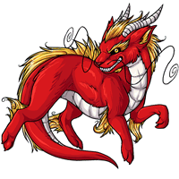
Current - - - Proposed
We're interested in hearing your feedback over a potential paralix revamp! We'll be updating the pet and its basic colors soon, so have your say now and we'll do our best to get it looking tip-top.
Note: There's not a poll at this time! Please leave your comments in this news post.

Posted by SubetaTeam

Bat
I like the older one better, but I like how the newer one has a little fur-detail on the tail.

Personally, the original looks nicer, more detail, more realistic(as much as a digital dragon can be) vs the proposed new design that feels, cartoony.


This newer design is very flat looking when compared to the older design which has much more detail. There's less personality in it. This is not a step up from the old design.

Destiny
STAFF
I actually like the newer one. The only problem that bothers me is the tail. Something about it seems off. Like it is too short or the way that the white (underbelly?) transitions. Other than that, I like it.
I second what’s been said already. The proposed revamp isn’t bad, but I do think the original is better because it is more defined, it’s a bit more slender as an eastern dragon should be, and it’s got that sassy look. The new one is just too soft for my liking.

gonna second everyone else saying it's too cutesy and round ;; though some other (nitpicky?) things i wanted to add
(sorry if they have been mentioned already orz)
+ the new mouth and expression are lovely! i prefer the smugness over the weird aggressive barred teeth of the old one
i feel like as a revamp this is just making the paralix look more like a generic dragon rather than an eastern dragon. i think as a revamp it would look a lot more interesting if the elements that make the paralix unique were exaggerated more rather than toned down
longer body! flowy-er mane! more angular horns! curlier whiskers!
idk man i just feel like the proposed revamp kind of just... lacks the energy of the original
(sorry if they have been mentioned already orz)
+ the new mouth and expression are lovely! i prefer the smugness over the weird aggressive barred teeth of the old one
- the nose looks like it's at a different angle than the rest of the muzzle
- the scales on its belly look flat and untextured
i feel like as a revamp this is just making the paralix look more like a generic dragon rather than an eastern dragon. i think as a revamp it would look a lot more interesting if the elements that make the paralix unique were exaggerated more rather than toned down
longer body! flowy-er mane! more angular horns! curlier whiskers!
idk man i just feel like the proposed revamp kind of just... lacks the energy of the original
@Varsna
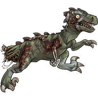
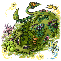
Some of the worst offenders are glade pets, where you can see how the plants and pets' bodies run right up against the edges of the canvas
Quote:
This is not actually a good thing when the anatomy has to be distorted for it to work! The best pets are the ones where you forget there's a space at all. The current gy velosotor is still one of my favourites in that regard.i do love how it fills up more of the space though.
Some of the worst offenders are glade pets, where you can see how the plants and pets' bodies run right up against the edges of the canvas

Generally, I really like the newer. The new one is not muscular enough, but the mischievous grin and hair shading on it is great. The limb positioning in the newer one is also more natural looking. I would be all for the newer one if it didn't look so.. cuddly. Paralix to me are chiseled. Strong. Angular. Not cuddly

I like the new one's smile and think the horns look better, but it does look very chunky/less sleek than the original and the shading doesn't really do it for me. I also miss the upraised paw from the original, which gives the whole look a bit of character.
I would love a mix out of both of them - more muscular like the current one yet a more friendly smile like the proposed one!
I agree with many here - the older looks more muscular/angular and fits more with the species to me.
I don't really like how chunky the new one looks but I do like its grin. It's less evil/angry and more mischievous.

i agree with most of the points made;
on the revamp- i love everything about the mane, the positioning of the limbs is much better, the updated shading looks GREAT but could use darker shadows/more contrast, i dislike the whisker going over the ear/horn/mane area (even if it really does make more sense) since it gets a bit too busy, the overall look is much less slim/muscular/angular which isn't as true to the species i feel, it's lost some of its smirk in the updated art, and i think the tail and horns and claws are a bit too short. i do love how it fills up more of the space though.
that feels like A LOT to nitpick but honestly with just a little tweaking, i think it would look perfect. i'd also like to say thank you for giving us the opportunity for feedback before the finalized design! :sparkling_heart:
on the revamp- i love everything about the mane, the positioning of the limbs is much better, the updated shading looks GREAT but could use darker shadows/more contrast, i dislike the whisker going over the ear/horn/mane area (even if it really does make more sense) since it gets a bit too busy, the overall look is much less slim/muscular/angular which isn't as true to the species i feel, it's lost some of its smirk in the updated art, and i think the tail and horns and claws are a bit too short. i do love how it fills up more of the space though.
that feels like A LOT to nitpick but honestly with just a little tweaking, i think it would look perfect. i'd also like to say thank you for giving us the opportunity for feedback before the finalized design! :sparkling_heart:
While I don't have a Paralix currently, it was one of the first pets I did have when I first joined Subeta because of its wild appearance and overall 'attitude'. The proposed revamp looks very...domestic. Like an overweight ferret instead of a sleek and wild ermine, just based on the body type without comparing it to a dog. Chinese/Long dragons are sleek and beautiful and this looks like it's trying to be a western dragon without wings...Like a lot of other users so far, I have to agree that the shading of the new one is very lackluster and soft. Bolder shading would make a huge difference.
Kudos to the artists that are putting in all this hard work to keep the art and site updated, ya'll are amazing and I appreciate the opportunity to give my opinion. With that said, I sadly can't find anything that I like about this possible new revamp. I'm with the users that have said perhaps a simple touch-up would be better, not a full revamp. I, personally, think all the revamps are getting too cutesy, soft, and 'plastic'. No personality to them.
Kudos to the artists that are putting in all this hard work to keep the art and site updated, ya'll are amazing and I appreciate the opportunity to give my opinion. With that said, I sadly can't find anything that I like about this possible new revamp. I'm with the users that have said perhaps a simple touch-up would be better, not a full revamp. I, personally, think all the revamps are getting too cutesy, soft, and 'plastic'. No personality to them.

The shading on the hind leg doesn't look as furry as the old version which I liked.
The eye doesn't seem as defined in the new one.
I think the whiskers on the new one could be a little sharper.
The eye doesn't seem as defined in the new one.
I think the whiskers on the new one could be a little sharper.

The new art is really nice, but there are some things that bother me about it.
New Paralix looks fluffier. I think the sleeker look of the current design suits it better.
Tail of new Paralix feels kind of stumpy? Thicker end of new design is more realistic though. Maybe making the tail longer would help?
Iris of new Paralix is less distinct. Prefer current design's eye. Otherwise I'm liking the face. Less aggressive looking (current one looks like it's about to snap!), but still fierce.
Overall, I prefer the current Paralix. It could use a refresh though. But I have to agree with others. There are other pets in much greater need of a revamp.
New Paralix looks fluffier. I think the sleeker look of the current design suits it better.
Tail of new Paralix feels kind of stumpy? Thicker end of new design is more realistic though. Maybe making the tail longer would help?
Iris of new Paralix is less distinct. Prefer current design's eye. Otherwise I'm liking the face. Less aggressive looking (current one looks like it's about to snap!), but still fierce.
Overall, I prefer the current Paralix. It could use a refresh though. But I have to agree with others. There are other pets in much greater need of a revamp.

I can say I only like the look of the horns, and the golden hair. The rest is kind of eh. It's not my favorite pet, but the older version looks better over all. Maybe if you just updated the horns and the golden hair to the older one? Though I can appreciate other people liking a more wild look for it. The new one also just makes me think of Swipper from Dora. It had a "sneaky" look about it that is off putting, but not in a good way.
The current one just seems so dynamic, ready for action. The proposed isn't bad. It just looks more passive. It looks smug but beyond that other than that just a bit flat.
@Ferinsy
Not everyone can explain why it looks fatter in the revamp bc of unfamiliarity with anatomy which is why you get those "diet" comments, it's one of those "a chef could tell you what went wrong with the soup but a layperson could still tell you it tastes bad" things.
But it's basically a combination of a shorter but still tall torso, and thickened limbs with widened thighs. Those are the parts that are fattest on an actual fat person or animal, so that's the impression those specific changes will convey.
Not everyone can explain why it looks fatter in the revamp bc of unfamiliarity with anatomy which is why you get those "diet" comments, it's one of those "a chef could tell you what went wrong with the soup but a layperson could still tell you it tastes bad" things.
But it's basically a combination of a shorter but still tall torso, and thickened limbs with widened thighs. Those are the parts that are fattest on an actual fat person or animal, so that's the impression those specific changes will convey.

I prefer the current version too! The redesign is too fat. Fat pets make me hella sad irl, I don't need/want to see that sort of stuff here too.
I agree with everything already said - the new design has better coloring and line art, but looks chonky and the shading seems too flat. Also it doesn't keep the spirit of the pet's expression, making it plainer and less sharp. Not all pets need to be soft and cute! Evil-looking pets should stay sharp and expressive.
Please don't mention "WHAT ABOUT THE CELINOX/AEANOID/DEMI" on that post, they might be assigned to another artist who isn't the one who did this revamp.
Anyway. This is way too bulky, the shading is lacking, the eye shape is too generic. The mane looks too bright, and the fur definition is...not so great. There is a lot to work on.
Anyway. This is way too bulky, the shading is lacking, the eye shape is too generic. The mane looks too bright, and the fur definition is...not so great. There is a lot to work on.

I do want to post that I very much appreciate asking for opinions. And do want to stress that I send all my love to the artist(s).
These comments are a little rough, but hopefully they're not taken too personally. Because we love you guys.
These comments are a little rough, but hopefully they're not taken too personally. Because we love you guys.

I like the older one more. The new one just looks too fat and lost its more sinister look it once had.
I'm 100% not a fan of the new one. It definitely has lost it's lithe eastern dragon look. If you want a fluffy chonky dragon create a new species...
with utmost respect, I think the artist, whoever they might be, would be much better suited to a celinox or keeto revamp with this style, just not an eastern dragon. soft, stocky and fluffy fits much better for those cat/catlike forms those two pets have versus the fierce noodle we would expect from this specific pet.
Honestly, Paralix is one of the pets that less need a revamp now. The proposed art is chubby and too soft, even the expression is softened(idk if the shading is just a wip but it should be a little darker too. We have many pets that are older than paralix in art terms and we hear a loud nothing about their revamp...
I like the more slender design and do agree, keep the slender look and bring the shading/lines up to the new standards and then work on the 10 or so species that havent been touched
Yeah, we came to a point of people stating that a pixel art looks too fat, that it needs to be on a diet... Oh well...
I do like the new art, but as a Chinese dragon creature, the old art pleases me more: facial expression is on point, the pose, tail thickness and the overall art/shading seems more Subetan.
I do like the new art, but as a Chinese dragon creature, the old art pleases me more: facial expression is on point, the pose, tail thickness and the overall art/shading seems more Subetan.
“As other people have said, you've turned a long slender dragon into an overweight (seriously, it's out of proportion fat, it looks like it needs a diet, it's very clearly not meant to be that fat) fuzzball. It's cute but it's not a paralix any more, it's almost chibified.”
—Dandelion
“Newer one looks too "soft". I adore the Paralix and while my own preference shouldn't affect an update for an entire site, I would be sad to see it revamped to this current version.”
—kudzu
“the current Paralix is more slender and more fitting an asian dragon! I love chunky pets but need this svelte one for certain themes as well. Plus the shading and detail is very much lacking in the proposed one, making it look like a much simpler child version. Just compare shoulder to hip, eyebrow or any hair for that matter.”
—Dracona
These are all great points of observation! :)
—Dandelion
“Newer one looks too "soft". I adore the Paralix and while my own preference shouldn't affect an update for an entire site, I would be sad to see it revamped to this current version.”
—kudzu
“the current Paralix is more slender and more fitting an asian dragon! I love chunky pets but need this svelte one for certain themes as well. Plus the shading and detail is very much lacking in the proposed one, making it look like a much simpler child version. Just compare shoulder to hip, eyebrow or any hair for that matter.”
—Dracona
These are all great points of observation! :)
hmm nope i much prefer the original thanks...sorry...
my 2 cents worth: for starters i really don't like how the proposed is chubbier, less muscle definition (i guess that's the flatter shading) which makes that little line in the furr on the torso/side a bit odd. the golden orb eye is lost without the darker surrounds, and the ears are cute but much too floofy and dominating over the horns, the balance of the two is nicer in original. i love the sharpness in the hair tufts of original. on proposed the front paws get a little lost, they seem smol in comparison to the body/head.
it's like an adult chibi...and i just think the original style is much more fierce, not cuddly like proposed version. i'd love to have a paralix in future, but i really don't want a chibi dragon with a smile/sneer instead of a snarl. i want a sleek flying beast, one that i can envisage curling and twisting through the air. the proposed has lost that vibe for me unfortunately :(
one thing i love though is the direction of the pupil, it seems to be staring right out at you! in the original it's harder to tell where the gaze is focused.
(sorry if any of that was said already, kinda took a bit to consider my thoughts on it >< now goes to bed because it's past bedtime oops )
my 2 cents worth: for starters i really don't like how the proposed is chubbier, less muscle definition (i guess that's the flatter shading) which makes that little line in the furr on the torso/side a bit odd. the golden orb eye is lost without the darker surrounds, and the ears are cute but much too floofy and dominating over the horns, the balance of the two is nicer in original. i love the sharpness in the hair tufts of original. on proposed the front paws get a little lost, they seem smol in comparison to the body/head.
it's like an adult chibi...and i just think the original style is much more fierce, not cuddly like proposed version. i'd love to have a paralix in future, but i really don't want a chibi dragon with a smile/sneer instead of a snarl. i want a sleek flying beast, one that i can envisage curling and twisting through the air. the proposed has lost that vibe for me unfortunately :(
one thing i love though is the direction of the pupil, it seems to be staring right out at you! in the original it's harder to tell where the gaze is focused.
(sorry if any of that was said already, kinda took a bit to consider my thoughts on it >< now goes to bed because it's past bedtime oops )
This is definitely one of the pets that'd benefit the most from traced lineart and updated shading; the anatomy on the new one is significantly worse (bad angle on the face looking halfway between profile and 3/4 view, thighs/upper "arms" too long and too fat, awkward angle on the paws, body too short and cramped, the left whisker getting lost on the face, a shorter, clunkier tail). That big dark patch of shading on the hip probably shouldn't be there either, since there's not enough body to bend for that shadow like there is in the original.
The thing that makes the paralix unique from the 5 or so other dragons on the site is its sleek intensity; the proposed revamp makes it look a lot closer to the mahar but with fur (since it's already the cutesy eastern dragon!)
The thing that makes the paralix unique from the 5 or so other dragons on the site is its sleek intensity; the proposed revamp makes it look a lot closer to the mahar but with fur (since it's already the cutesy eastern dragon!)
I, personally, use overlays for most of my pets (including the 3 I have of this species) so it wouldn't really affect me either way, but I have to say that I do prefer the overall look of the current version. It just has more personality to it. Just updating the shading to make it less harsh and make the yellow fluff look fluffier like in the proposed version would be enough of an update for the paralix, in my personal opinion.
And I agree that there are other species that are more in need of revamps than this one. Like the antlephore, aeanoid, demi, endeavor, keeto, rreign and swampie just to name a few (I, personally, don't mind the look of the celinox which is why I didn't mention it here).
And I agree that there are other species that are more in need of revamps than this one. Like the antlephore, aeanoid, demi, endeavor, keeto, rreign and swampie just to name a few (I, personally, don't mind the look of the celinox which is why I didn't mention it here).
Oh gosh I totally missed the Illumis, that's definitely one that needs a touch-up on shading
There's a couple others like the Popoko that could also use some new shading but pose-wise it looks perfectly fine. My own personal opinion, the Kanis really could use an update to look better somehow (I'd prefer a more natural colour scheme or patterns and markings) but it does match fine style-wise with the rest.
There's a couple others like the Popoko that could also use some new shading but pose-wise it looks perfectly fine. My own personal opinion, the Kanis really could use an update to look better somehow (I'd prefer a more natural colour scheme or patterns and markings) but it does match fine style-wise with the rest.
Ok everyone already pointed out what i was going to but as soon as i get to my computer y'all know what's going to happen
Oh heck no... the current Paralix is more slender and more fitting an asian dragon! I love chunky pets but need this svelte one for certain themes as well. Plus the shading and detail is very much lacking in the proposed one, making it look like a much simpler child version. Just compare shoulder to hip, eyebrow or any hair for that matter. Also the right whisker on the proposed is impossible to see and looks like a scribble.
it's lost too much definition and the main characteristics of the original design:
everything has gotten softened out way too much. honestly i think simply cleaning up the linework and modernizing the shading of the original art would be the best course of action.
- slender body/paws, long slinky tail
- crisp whiskers (the new ones look so gray and transparent that they get lost where they overlap the body)
- defined shading/musculature
- curlycue elements in the mane and whiskers
- strong facial features/expression (the teeth on the new version are barely visible, the horns look short and dull...)
everything has gotten softened out way too much. honestly i think simply cleaning up the linework and modernizing the shading of the original art would be the best course of action.
Oh yes, the Celinox is a great idea that could use some care. But to stay on topic...yeah, I like the sleekness. The chonkness is cute, but it's not the essence of the pet.