
Potential Paralix Revamp!
 - - -
- - - 
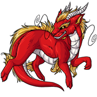
Current - - - Proposed
We're interested in hearing your feedback over a potential paralix revamp! We'll be updating the pet and its basic colors soon, so have your say now and we'll do our best to get it looking tip-top.
Note: There's not a poll at this time! Please leave your comments in this news post.

Posted by SubetaTeam

4leaved
seems like it's already been torn to shreds but i'll echo that the revamp seems to be missing what makes the Paralix appealing to people. it's a needless update anyway, the current looks fine and doesn't stand out nearly as much as pets like the Swampie, Kora, and Dragath...

Both look nice!
Personally, I like the more slender, defined look of the original one and its more dynamic pose. It just feels like it has a lot of movement to it. The original one also looks more like a dragon, where the new one has a bit of a fox/ferret look to it.
Personally, I like the more slender, defined look of the original one and its more dynamic pose. It just feels like it has a lot of movement to it. The original one also looks more like a dragon, where the new one has a bit of a fox/ferret look to it.

i prefer the new one, but i think the tail looks too short? i think it's because the "underbelly" area has been kind of extended down it but it makes the tail look a little stumpy. if you made it longer i think that would help balance it out!

NO!! please no, no offense to the artist but the pet is fine the way it is and the new art looks worse and boring. Pls just keep the old one or continue to work on the revamp, especially the face. The snarky grin on the original is cute and that isn't there in the new and takes away their personality.
Just my opinion ~
Just my opinion ~

I like the Paralix as is, and see no reason to change it, especially in such a way that it'll lose its personality and essence.
The proposed design looks too.... fluffy? It should be fierce and cool but this new design looks kinda cuddly, NOT a fan.
The proposed design looks too.... fluffy? It should be fierce and cool but this new design looks kinda cuddly, NOT a fan.

I always feel a bit bad for the artists because their work gets shredded any time something is revamped. IMO the new art looks so much more smoothed out, less pixelated and easier to look at. But I do see what people are on about with the anatomy proportions. As an eastern dragon inspired pet I think it would benefit from being slimmed down elongated a bit.
Thank you for your hard work and please don't take any of these crits personally. You're doing the site a huge favor by working for them in the first place.
Thank you for your hard work and please don't take any of these crits personally. You're doing the site a huge favor by working for them in the first place.
I much prefer the current design. The current one has a lovely asian dragon/foo dog look to it's face while the proposed one loses that with it's elongated snout. The body on the proposed revamp just seems a bit thick and chunky.
I don't own a paralix, but if I did I would be pretty upset with the proposed changes.
I don't own a paralix, but if I did I would be pretty upset with the proposed changes.
I would like to point out to the users saying other pets should be revamped first:
Different pet species are assigned to different artists. Please keep that in mind. I don't know which artist does Paralix, or what other species they handle, but suggesting a bunch of other species to update instead really doesn't help them here. Your comments in that vein would do much better in the revamp request forum.
Different pet species are assigned to different artists. Please keep that in mind. I don't know which artist does Paralix, or what other species they handle, but suggesting a bunch of other species to update instead really doesn't help them here. Your comments in that vein would do much better in the revamp request forum.

I like the revamped body/fur, esp the streamlined look. However, I prefer the classic/current facial expressions, esp the teeth showing. I feel they are an important part of this species' character.
I agree with those saying other pet species could use attention instead. I'd personally like to see the Kora base colors revamped, seems to be the most outdated imo
The newer one looks so friendly and warm compared to the og that gives more of an intimidating look. I don't come on subeta for pets but I certainly like the og then the newer one for multiple reason: details, shading, texture. Though lining in the new one much more superior.

I like the proposed edits! The lines are a lot more balanced in the horns, and it's a very lively. However, I do like the older version of the eyes.
OG Paralix is fine as is to me as opposed to Chonky Paralix Prime.
Personally, the practice of changing the designs of pets permanently in one direction can throw off the pre existing aesthetic players build their pets around. Now if we had options to switch between the models... THAT is some progress.
Personally, the practice of changing the designs of pets permanently in one direction can throw off the pre existing aesthetic players build their pets around. Now if we had options to switch between the models... THAT is some progress.
Chiming in to say that the Paralix does not need a revamp. It's one of the pets that have already received a fairly recent update where as others have not received an update in ages (especially when it comes to pets like the Aeanoid, Antlephore, and especially the Endeavor and the Swampie). I get that different artists work on different pets, but is mind-blowingly frustrating when the same pets get revamps over and over and over again (and the new colors) and the others may as well be chopped liver.
Everything seems so much less detailed on the new version. As many others have said the revamp is way too chonky. Makes them look like a plushie rather than a dragon. The legs hang limply compared to the old ones dynamic pose. The belly scales are too wide, too few, too flatly colored, too deeply curved around the belly..., not snakelike at all. The body has zero muscular definition. The nose is crooked compared to the position of the eye and mouth. Their ear is too big, and the horns are too short and thick compared to their head
I do like the new eye, that insane stare on the original is what I based my own paralix's personality around, but it doesn't suit the species as a whole.
I do like the new eye, that insane stare on the original is what I based my own paralix's personality around, but it doesn't suit the species as a whole.

Agreeing with just about everyone - it's not a bad revamp, but it's not great. The body is too chonky and shortened lengthwise, and it's lost the fierce attitude. Paralix is the sleek long boy with Eastern influences, compared to the other dragons. Something I didn't see anyone else call out yet is that the tail is too wide and it's contributing to the overall 'too chunky' look. For how wide the white underneath part is, It's making it appear too muscled and thick, and tails of that nature typically have too much muscle and structure to bend & drag like how the image is depicting. I really prefer how the haunches and shoulders look on the older one, the better definition/shading of the muscles and sleekness add to the power aura of this guy. Removing those aspects do the dragon a disservice.
Why not create a few different design revamps and let the users choose what feels best? I feel like taking one design and then tweaking it over and over ends up detracting from the original design.
The more I look at the proposed, the problems are becoming a bit more clear. Notice there's no lineart to define the shoulders or hips. It's one giant line essentially connecting where the shoulder meets the belly then goes straight into the leg. The forelegs are too short and are hanging there rather limply compared to the current which is confident, proud, ready for anything.
The artists here are very talented and I appreciate all the beautiful artwork that has been put out over the years. However, I am not a fan of the new version of this particular pet. I prefer the older one. I am not an artist so can't give anything more constructive I am afraid if I could, I would.
i love the revamp! i agree that it needs to be a bit longer, but otherwise looks great to me ^_^


Now that I'm not just waking up and I've looked at it a bit, I, yeah, am not a big fan of this. It's not ugly or bad by any means, it just doesn't suit the Paralix if you know what I mean? I'm bad with words haha.
What I don't like/would change-
That being said, I do like how the muzzle is drawn better on the new than old. The ears are shaped better as well (the original's ear has an odd point to the end I see).
What I don't like/would change-
- Sleeker/slimmer. It's based off an eastern dragon, right? They're long and slender. This boy is short and thick. Not just in body but legs as well. Feels like the proportions might be a tad off as well?
- Keep the eye/gaze on the view of the art. Honestly not a fan of it looking away like that, portrays a way different vibe.
- Too soft. I like the sharpness of the body and shading on the original.
- Shading needs more contrast. Looks way more flat than the original.
- That ear needs to be resized, it's huge!
- The whisker on the right side of the image should be lower and not go over the face like that.
- It needs more of a snarl/fierce look D:
- Horns could use some slimming down too maybe?
- The back feet should possibly be a lil' longer? They seem too short. Also wouldn't mind the paws/toes to be a little more defined as well, though tbf they aren't defined in the original either. The further back foot also looks odd to me though I cannot place why. The way the closer back leg connects to the body at the front also looks off.
- Please keep the detail of the hair. The hair on the new version looks bland and doesn't seem as "hair-like". Also maybe shape it more so it looks like it's attached to the back, maybe flick a little over the back to help convey it being part of the pet better.
- Speaking of detail, the belly and neck plates could use more as well.
- The angle of the nose seems slightly off compared to the angle of the face. Maybe the whole end of the muzzle is an odd angle but the nose is the most obvious part.
That being said, I do like how the muzzle is drawn better on the new than old. The ears are shaped better as well (the original's ear has an odd point to the end I see).
I like the older version. It has similar vibes as the new beautiful Experiment #699 (that swamp fox), so I would prefer revamp, where the Parlix would be in same style as the #699 (fierce eyes, sporty muscular body, beast vibes...):
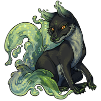
There are also other dragon species, which looks already cute and chubby, so I would like this one to stay in its way - I prefer differsity.^-^ Thanks for considering other people opinions.
There are also other dragon species, which looks already cute and chubby, so I would like this one to stay in its way - I prefer differsity.^-^ Thanks for considering other people opinions.
Fourteen and a half years ago I joined Subeta and made my first and main pet, a Paralix. I think it took me less than a year to get him his Chibi Potion and he's been that way ever since. I obviously love my Chibi Paralix, but that color isn't what initially drew me to the species and I don't think the Common pose should look this much like a Chibi.
A lot of other people have already commented on the things I don't like about this revamp, but I do want to bring up how much I like the current one's shiny and scruffy fur and mane since I haven't seen enough people bring that up. The only things I like better on the proposed revamp are the lack of line down the center of the belly scales and that the horns look more three-dimensional.
A lot of other people have already commented on the things I don't like about this revamp, but I do want to bring up how much I like the current one's shiny and scruffy fur and mane since I haven't seen enough people bring that up. The only things I like better on the proposed revamp are the lack of line down the center of the belly scales and that the horns look more three-dimensional.
I prefere the old design by far.
The new one looks way to soft and lost the fierce look of the original one.
Jesus fixes make it look a lot better and I would give the paralix a more fiercy look in general.
The new one looks way to soft and lost the fierce look of the original one.
- the shading looks flat
- the legs feel to short
- the body should be slimmer
- the tail looks to short
- the angle off the face looks off
Jesus fixes make it look a lot better and I would give the paralix a more fiercy look in general.

I like the direction of the new one but I love the alterations/suggestions made by Jesus. With some tweaks I'd personally be all for it!


I prefer the current one: it's more detailed/shaded/textured.
I don't like how chubby the proposed version looks. I always thought the Paralix looks like a Chinese dragon, and the proposed version looks nothing like that. Sorry, artist, I know you worked hard on this one.
Like Metroid said, Paralix doesn't really need a revamp, other pets do.
Thank you staff for asking for our opinion before releasing it.
I don't like how chubby the proposed version looks. I always thought the Paralix looks like a Chinese dragon, and the proposed version looks nothing like that. Sorry, artist, I know you worked hard on this one.
Like Metroid said, Paralix doesn't really need a revamp, other pets do.
Thank you staff for asking for our opinion before releasing it.
Why is every Subeta pet secretly a dog? The new version is fine as far as art goes, its clearly drawn well, but its not a Paralix or even an Eastern dragon of any sort imo.
Not a fan of the joints on the new version. The shoulder and stifle look puffy and swollen, which makes it look less like an animal and more like a stuffed toy.
General agreement with most folks - I'm all for updating art, but this image isn't suitable for the Paralix. It's too soft, and too stocky. The Paralix has always had a sharp and sleek feel to it, and if anything I'd like to see it even lankier, since we're really missing that kind of body type on the site.
We have a LOT of canine looking pets, which is fair because they're well-liked!! But we don't need any other species to look MORE that way. I'd slide more in the dragon/reptilian direction than away from it. I'd like to see the species in general have a look to closer to, say, the Graveyard and Steamwork Paralix. To REALLY call back to older Paralix art, look at Sterling the Paralix. He's SO LANKY!! He looks great. Gun for that and I think you'll get it!!
We have a LOT of canine looking pets, which is fair because they're well-liked!! But we don't need any other species to look MORE that way. I'd slide more in the dragon/reptilian direction than away from it. I'd like to see the species in general have a look to closer to, say, the Graveyard and Steamwork Paralix. To REALLY call back to older Paralix art, look at Sterling the Paralix. He's SO LANKY!! He looks great. Gun for that and I think you'll get it!!
So lemme see if I got the concensus so far:
Like if you agree.
P.S. CRTL + F these timestamps to see/like others art:
frederick @ 06/21/21 12:53 pm
Jesus @ 06/21/21 12:51 pm
Jesus @ 06/21/21 12:56 pm
Batsquatch @ 06/21/21 11:39 am
- Too short
- Body looks bloated
- Red is too orange
- Overall too soft/not fierce enough
- Face/pointed look of the original is preferred
- Personality is lost
Like if you agree.
P.S. CRTL + F these timestamps to see/like others art:
frederick @ 06/21/21 12:53 pm
Jesus @ 06/21/21 12:51 pm
Jesus @ 06/21/21 12:56 pm
Batsquatch @ 06/21/21 11:39 am
Pretty much everything has already been said, but I much prefer the old one. Don’t fix what isn’t broken.
Keep the current!
The new one is moving towards a more cartoon-ey and less detailed art piece. Good attempt, but the lack of detail, especially on the face and belly for some reason, really gets to me!! I have enjoyed seeing years of advances in more detail in the artwork of subeta. I would feel let down to see anything move backwards.
!!! Also, the intentional curls in the eyebrow-line and throughout the entire mane is intentional in the first one, it is really a homage to Chinese guardian lions and folklore dragons in my opinion, where the traditional art form had many curls and spirals. To get rid of that and simplify it so much, I am just so against! I am so sorry to be so vehement over this,, but please; Please keep the current!
The new one is moving towards a more cartoon-ey and less detailed art piece. Good attempt, but the lack of detail, especially on the face and belly for some reason, really gets to me!! I have enjoyed seeing years of advances in more detail in the artwork of subeta. I would feel let down to see anything move backwards.
!!! Also, the intentional curls in the eyebrow-line and throughout the entire mane is intentional in the first one, it is really a homage to Chinese guardian lions and folklore dragons in my opinion, where the traditional art form had many curls and spirals. To get rid of that and simplify it so much, I am just so against! I am so sorry to be so vehement over this,, but please; Please keep the current!