
Potential Paralix Revamp!
 - - -
- - - 
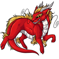
Current - - - Proposed
We're interested in hearing your feedback over a potential paralix revamp! We'll be updating the pet and its basic colors soon, so have your say now and we'll do our best to get it looking tip-top.
Note: There's not a poll at this time! Please leave your comments in this news post.

Posted by SubetaTeam

Sugar
I prefer the older one, it's more angular which lends itself to being more realistic. The newer one, though I like the horns, the legs have a fluffier broader appearance that makes it appear more plushie looking. The expression also appears more concerned or uncomfortable than harsh and scary


I'm not really into the chonky plushie body on the new one. The art style's fine and the face is good, but I prefer the more muscular look of the current art.

I like the new one more, but do not have one and never plan to so I'm probably not the target demographic haha - super cool to see pet revamps happening though!! ♡♡

Oh dang, meant to add - also the mouth, the teeth! I like how fierce the teeth on the old Paralix look better than the strained grin on the new one.
I like the old version the best. The head is more defined and the length of the horns make more sense to me. The body, I would think, should be sleek and the golden main and hair should look like hair like the older version already does. I don't see any reason to change the current version. :)
I prefer the older one because it looks less cutesy. I'm open to the idea of having a new Paralix in general, and I'm all for cutesy pets, but I feel like we have a ton these days and not enough that aren't, that also have updated artwork. The hair, the shading, and the slimmness of the old one is really nice and sharp and elegant vs the cutesy and softness of the new one.

I don't love all the comments calling the proposed revamp fat - animals (including humans!) being fat is in relative comparison to a baseline, there's plenty of animals that are fluffier and rounder or even naturally have a healthy layer of thick fat and it feels weird to project human body standards on that. The only way the revamp looks fat is in comparison to the older design as a baseline... which I think is the problem, because given the inspiration for the species, I think a longer, sleeker body does work better. I'd prefer a longer torso between the front and back legs and a sleeker shading on the fur to keep that impression.

I like the new one's head more (with the horns, and expression and the whiskers and all), but I think that the body of the old one looks better

I do like the double pronged horns of the newer one, although looking more closely it seems that is intended to be part of the original design too. It just blends in with the mane there. Overall though, I still prefer the original for its body shape. It evokes an eastern dragon much better than the proposed revamp.
Quote by @Marlboro:
Paralix revamp in 1980 and 1990:The design looks very old, like it was drawn in the 90s.
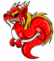
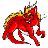
http://neocolours.me.uk/subeta/subetaoldpets.php
I like the horns and hair in the new one, and the whiskers. But overall, the old one is better imo. Not that it would matter much to me, it's not a velosotor lol

I like the newer one, but I like my pets to look cute. I guess the best opinions will come from people already owning a Paralix. I can see why people prefer the old design, it does seem more detailed. As although I think the new face is cute, its not for everyone.


Strongly prefer the original. The shading on the new one lacks depth in comparison and the round features completely change its personality in a way that I personally do not care for at all. Quite frankly, I see nothing wrong with the old art and I feel like it does not need a revamp at all. AT BEST I think it could use a touch-up in the mane and horns, but otherwise, the old artwork is quite beautiful and I think efforts to revamp things would best be spent elsewhere (ie: keeto, aeanoid, celinox, etc).
I like both of them for different reasons.
New version: I prefer this head/horns/face/whiskers. I think they look much cleaner.
Old version: I much prefer how sleek this body looks.
New version: I prefer this head/horns/face/whiskers. I think they look much cleaner.
Old version: I much prefer how sleek this body looks.
Aw, I really like the newer one! I'll definitely be getting a Paralix if that's what they'll end up looking like!

I prefer the original. I feel the more angular features are better for the Paralix, and also the deeper shading and more defined fur make it look more majestic and less "cutesy".

Nty. The new one has lost all its depth in the shading and personality in the face. Proposed new looks a lot more like a plush toy than a real dragon. (We already have enough plush toy pets) it looks like this new one was mostly changed to fill up the space in the 200 by 200 pixel cube better, but that could easily be achieved by just changing a few details, like leg and whisker position on the original, without making the body look more 'chunky'
I kind of wish a poll had been released, it's often a nice option for people who may be too afraid to comment on what they like or don't like.
Plus I'd be curious to see how the old and proposed duke it out. Traditionally the proposed often ends up winning anyways, but I think it would be a very close race. I remember when the current Paralix was also a proposed revamp (I think, I can't remember if it did or if it was revamped automatically without user input/feedback).
Plus I'd be curious to see how the old and proposed duke it out. Traditionally the proposed often ends up winning anyways, but I think it would be a very close race. I remember when the current Paralix was also a proposed revamp (I think, I can't remember if it did or if it was revamped automatically without user input/feedback).
I feel like the old one has more character with all its shading. The new one seems a bit too chunky.
@Varsna
That's fair! I'm the opposite; to me it looks as though they clearly couldn't fit the left whisker onto what was left of the canvas, which is why it's blurred across the face instead of flowing out to the side! The way the body is warped is also why so many people are calling it fatter. The pose really needs a bit more room to breathe.
That's fair! I'm the opposite; to me it looks as though they clearly couldn't fit the left whisker onto what was left of the canvas, which is why it's blurred across the face instead of flowing out to the side! The way the body is warped is also why so many people are calling it fatter. The pose really needs a bit more room to breathe.
a full revamp is needed in my opinion, the position, the design itself.
The design looks very old, like it was drawn in the 90s.
Most of the wears looks much wow than the Paralix.
The design looks very old, like it was drawn in the 90s.
Most of the wears looks much wow than the Paralix.
I definitely prefer the current one over the newer design...its shape is much more streamlined and its facial expression more appealing and mischievous...
I dislike the new one quite a bit. Like with a lot of these revamps, the new one may have better art, but it loses a lot of the charm of the original. The new one is basically just a dog with a dragon head. We have plenty of canine-like species on here, and I'd much rather the paralix be more.. noodly than canine.
The new grin and head angle is much more of a sly, smug expression, rather than the old one where it just looks like it's trying to smile and still manages to be more fierce. The new one's fur, and shading overall makes it look much less silky. It's.. too fluffy and cute, there's not enough highlights, making it look less majestic and more of a puffy cotton ball.
The legs are way too thick as well, which just adds to the chunkier canine-like aspect, overall making it look less graceful. The length of the tail was also lost, again making it less noodly. The emphasis on the underbelly being at a sharp angle was also completely lost.
TL;DR, new one is too round and fluffy, and it's lost all of the edge and silkiness the original has. Please do not revamp this.
The new grin and head angle is much more of a sly, smug expression, rather than the old one where it just looks like it's trying to smile and still manages to be more fierce. The new one's fur, and shading overall makes it look much less silky. It's.. too fluffy and cute, there's not enough highlights, making it look less majestic and more of a puffy cotton ball.
The legs are way too thick as well, which just adds to the chunkier canine-like aspect, overall making it look less graceful. The length of the tail was also lost, again making it less noodly. The emphasis on the underbelly being at a sharp angle was also completely lost.
TL;DR, new one is too round and fluffy, and it's lost all of the edge and silkiness the original has. Please do not revamp this.
i also want to say theres nothing wrong with cutesy pets, subeta has a lot of them, and i suppose the style of this revamp could be chalked up to wanting a uniform quality and similar art style for pets as a whole. i think that can be a problem for some of the more realistic or fierce pets, unfortunately. for example you have experiment pets, especially the newer ones. who in my opinion have some of the absolute best pet art on site. in comparison this one is incredibly lack luster, especially considering the character of the original pet. . im personally thinking of
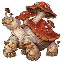
and as some others have mentioned, you can make a really interesting and well detailed pet without squishing it in the limited space you have, which i absolutely feel this suffers from. an option that might work would be to change the pose entirely, so that it works with the space better and can still keep its more lithe form.
and as some others have mentioned, you can make a really interesting and well detailed pet without squishing it in the limited space you have, which i absolutely feel this suffers from. an option that might work would be to change the pose entirely, so that it works with the space better and can still keep its more lithe form.
from an art perspective, i like the softer shading and i think having the mane be less cluttered is a good touch, but i’m not sure how i feel about the body rework. i think the old one had very much of a serpentine/wyvern charm to it and like others have pointed out it seems less strong, especially in the expression.

I prefer the current one, and not really sure why it needs a revamp tbh. The proposed one is ok, it's kind of cute, but then that doesnt really seem like a Paralix to me. The proposed one isn't fierce enough and is too short and chonky.
I do like the new one's facial expression (as does a lot of people). My biggest thing is that I feel it is a little fat, maybe slimmer would be better with a little longer tail. Other than that, I love seeing newer revamps.

i like pieces of the new one (particularly those horns!) but ultimately i prefer the old one and i'd be very sad if this is the direction the species takes. the torso just seems too short, and the tail of the new one gives me like, stubby worm in a fur coat vibes.
honestly, if the new one just didn't squish to take up the entire square, and had a longer torso and a longer tail (that transitioned from the underbelly to the fur uh... less bluntly), i'd like it way more. it just seems like we traded detail and charm for something that just takes up more space, and it doesn't really work for me :(
honestly, if the new one just didn't squish to take up the entire square, and had a longer torso and a longer tail (that transitioned from the underbelly to the fur uh... less bluntly), i'd like it way more. it just seems like we traded detail and charm for something that just takes up more space, and it doesn't really work for me :(
I like more about the original than I do the proposed but I think there are some pieces that would look better on the original.
Original:
Proposed
Original:
- Detail in the fur
- Eyes
- White chest detail
- Detail in the mouth
Proposed
- More exposed white on the tail
- Horn lines
- Whiskers
- He seems bigger
The proposed revamp is full of all sorts of little changes that ultimately make the paralix look weaker, I think. The pose is more relaxed, the grin reduced, and the horns are made smaller. The only things it does superior is better whisker placement and improved lineart, IMO.
this is sloppy and quick because i should be getting ready for a doctor's appointment (lol)
disclaimer i'm no anatomy expert this is just what i would want from a paralix revamp

i don't necessarily think the new revamp should be thrown out entirely but i do think it could benefit a lot from some slimming down and uh.... point-ifying. make it pointier. (especially in the horns, ears, tail)
i didn't touch the whiskers in my edit but they could stand out more.
the expression on the new one doesn't bother me too much but i did like the toothy grin on the old paralix
anyway other people have critiqued it more thoroughly below so thats just my 2 cents
disclaimer i'm no anatomy expert this is just what i would want from a paralix revamp
i don't necessarily think the new revamp should be thrown out entirely but i do think it could benefit a lot from some slimming down and uh.... point-ifying. make it pointier. (especially in the horns, ears, tail)
i didn't touch the whiskers in my edit but they could stand out more.
the expression on the new one doesn't bother me too much but i did like the toothy grin on the old paralix
anyway other people have critiqued it more thoroughly below so thats just my 2 cents
The older version is more dynamic and more slender, and while I do not care for all the fatphobia in these comments, Asian dragons are usually very slim and snakey.
The face on the newer version is greatly improved, but it needs more shading (which may be part of why it looks chunkier).
I wish you guys did this with all of the revamps.
The face on the newer version is greatly improved, but it needs more shading (which may be part of why it looks chunkier).
I wish you guys did this with all of the revamps.
Too many people are complaining about how fat it's gotten, and I don't like that.
Maybe make the body a little longer and have the same amount of shading as the older one? I like how simple it is, but it doesn't have the same energy.
Maybe make the body a little longer and have the same amount of shading as the older one? I like how simple it is, but it doesn't have the same energy.
why not just update the facial expression and hair texture on the old one? those are the only elements of the new design that I like. the grin is more mischievous and I do like that...but otherwise the original is far superior. I especially like the tail, whiskers, and proportions of the original design.

Personally I think the newer one needs a little more fine detail like in the original. Maybe make its body just a smidge longer? :3
I'd definitely like more detail on the newer one, or a touch-up done to the older. I prefer the older one out of the two as they are shown currently.
I love the new design, but maybe make the torso a little longer if you're going to stick with the Asiatic influence, and maybe noodle whiskers.