
Potential Paralix Revamp!
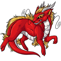 - - -
- - - 
Current - - - Proposed
We're interested in hearing your feedback over a potential paralix revamp! We'll be updating the pet and its basic colors soon, so have your say now and we'll do our best to get it looking tip-top.
Note: There's not a poll at this time! Please leave your comments in this news post.

Posted by SubetaTeam

Eris
face* Dump typos

I think this proposed revamp could be doable if it looked more like the current one, just filling the canvas better and trying to capture what makes the current so special.
I do like the greater emphasis of it having fur mostly instead of scales.
I do like the greater emphasis of it having fur mostly instead of scales.

No support. Newer one looks too "soft". I adore the Paralix and while my own preference shouldn't affect an update for an entire site, I would be sad to see it revamped to this current version. TBH, this pet does NOT need a revamp!! There are so many other pets that do - just see METROIDs posts here. The Paralix is one of the better looking ones that don't need a revamp any time soon. How about working on adding new colours to existing pets, too??

As other people have said, you've turned a long slender dragon into an overweight (seriously, it's out of proportion fat, it looks like it needs a diet, it's very clearly not meant to be that fat) fuzzball. It's cute but it's not a paralix any more, it's almost chibified.
Also as other people have said, the paralix does not need a revamp, compared to several other much worse and more dated species (PHERRETS).
Also as other people have said, the paralix does not need a revamp, compared to several other much worse and more dated species (PHERRETS).

Old one seems fine, maybe a touch up; There are much older pets that are in serious need of a revamp; Illumis comes to mind

I like the new hair and whiskers, but that's about it. My first response was "why is it so chonky?!"
The new version has lost its sleekness in favor of lack of defined joints and making the entire canvas feel more squished.
There are pets far more in need of revamps than the paralix.
The new version has lost its sleekness in favor of lack of defined joints and making the entire canvas feel more squished.
There are pets far more in need of revamps than the paralix.

Normally I would not post a comment as I am a very shy person, but as an avid owner of fifteen Paralixes, and having been hoping for a redux for this species since adopting my first Paralix, in all due respect, this is not exactly what I’ve been hoping for. I must politely voice that I do not particularly care for the new version—agreeing with @METROID, I feel the revamp is far too fat-looking, especially for an eastern dragon pet. The expression on the new seems flatter than the original, the shading is flat, and the pose also seems a bit stiff? Please forgive me if I’m coming off as harsh—I just really want this redo to be pleasing! <:D
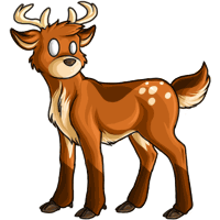
I think if any pets need more of an update it'd be the following:

[imghttps://img.subeta.net/pets/antlephore.png
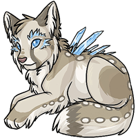
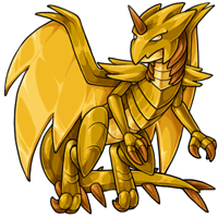

 (the shading could be better)

The current Paralix matches with the rest of the pets more or less, outside of needing a slight touch-up in shading and possibly lineart in the leg hair tufts.
[imghttps://img.subeta.net/pets/antlephore.png
(the shading could be better)The current Paralix matches with the rest of the pets more or less, outside of needing a slight touch-up in shading and possibly lineart in the leg hair tufts.
I prefer the old one. I don't see a reason to change their design when there are other pets who could use a visual revamp before them.
The mane, horns, and whiskers look nicer on the new one, and its lineart looks cleaner/smoother. Otherwise the original looks fine to me, doesn't need revamping. The new one looks kind of too chubby and cute (no offense intended to the artist) and its expression seems less expressive/fierce.
I like the shininess in the current one because it looks a bit scale-ish. Also, I prefer the curly hair in the current one because it resembles traditional depictions of foo dogs.

going from sharp long and lithe to soft and short is not the direction I want the species to go. I think the proposed has a shorter body than a kumos actually with how close the front and back limbs are, which is... please no. please, PLEASE no. the softening and shortening of the horns, removal of any expression, and random added fluff while nerfing the scaled belly and mane, not to mention removing any defined anatomy from the legs are also massively detracting from the current pet.
ngl im with Metroid here. of all the pets to need attention right now this one ain't it, especially with such a skeleton crew you keep telling us you're running on.
ngl im with Metroid here. of all the pets to need attention right now this one ain't it, especially with such a skeleton crew you keep telling us you're running on.

I have a ton of paralixs and would be fine with either. Please fix the one whisker that is overlapping the face. It's the only thing that really bothers me. Wouldn't mind a bit more floof the the mane and leg tuffs as well.
The shading is much nicer, but I don't think revamping pets should be a priority at this stage.
i agree with metroid, i dont think the paralix needs that much of a revamp? we already have too many cutesy pets, and the proposed update really does up the cute factor, ie softer expression, fatter. i agree with others that the shading is not as good, it looks kind of like a stuffed toy, no offense intended to the artist. its very nice art but i dont think it really fits.
ive been hoping for more pet revamps, specifically the reign, i would like a more fierce dragon pet lmao. and there are so many other pets aside that have been constantly neglected. i just personally dont think this is a huge improvement nor needed. ive seen a lot of pet revamps requests, and this has never been one of them.
ive been hoping for more pet revamps, specifically the reign, i would like a more fierce dragon pet lmao. and there are so many other pets aside that have been constantly neglected. i just personally dont think this is a huge improvement nor needed. ive seen a lot of pet revamps requests, and this has never been one of them.
The hair and whiskers on the new one are nicer but the old one has more shading and the horns look better.
I do like the less harsh shading - If the old, slim lineart had the smooth shading, I'd be okay with it. This is probably my second favorite pet species (despite not having any anymore lol).
Paralix are one of my favorite species on here. I really like the current look. The new one just doesn't speak to me ;A;
Hmm the newer one looks a lot flatter than the old one. I overall prefer the old but I do love the hair and whiskers on the new one though, they look a lot lighter/have more movement.
I really prefer the current one. The new one looks like a toy with soft features and not enough shading. The face is also not attractive, totally lost the angry/wild dragon face from the original one, now it looks like a random smirk and not like a traditional Loong dragon.
Alternative proposal - adjust the new art to be a more flowy 'water' dragon new pet vs the fiercer fire dragon Paralix? Because the new art is really nice, it would just be a shame to lose all the fun stuff about the old art!
This feels like a step back in terms of general quality. Would prefer you focus on other, more neglected species before trying to fix what isn't broken.

I wouldn't mind a revamp but that one just doesnt do it. Especially with how "wow" all these recent battle opponent challengers art have been.
No wow factor so its really just a waste of time that can revamp something else.

I do like the way the proposed revamp fills the pet image better - it comes across as stronger somehow. The new shading and yellow fur look much better, and the whiskers look like they're moving as the head moves (to me, the current whiskers look like they're fake ones stuck on).
As a not-so-positive (I'm not going to say "negative" :P) the angles of the legs look like it's just floating there in mid air - the current one looks like it's actually moving. I'm not sure if I like the way the body is chunkier (or at least not as 'slim' between the legs .... or is it that the legs are chunkier without appearing to have defined muscles?) - to me it loses some of the contrast, so the legs don't come across as being so strong....
although I love dragons, I've always been more of a fan of Western dragon designs, so that probably has coloured my opinion of the Paralix anyway :P
As a not-so-positive (I'm not going to say "negative" :P) the angles of the legs look like it's just floating there in mid air - the current one looks like it's actually moving. I'm not sure if I like the way the body is chunkier (or at least not as 'slim' between the legs .... or is it that the legs are chunkier without appearing to have defined muscles?) - to me it loses some of the contrast, so the legs don't come across as being so strong....
although I love dragons, I've always been more of a fan of Western dragon designs, so that probably has coloured my opinion of the Paralix anyway :P
I prefer the current version, I love the details on it, and thats why I chose it for two of my pets :)
The new version lacks a lot of the ferocity that the original one has. Instead it just looks vaguely sinister? The new one also feels more fluffed up? Like the old one has the impression of something with a very sleek shiny coat like a Doberman maybe, where as the new one looks softer and fluffier like a golden retriever's coat. It just doesn't have the same impression.
I am not super invested in the Paralix as a species, so my critique comes with a little weight I think.
I think a smidge more contrast on the shading would be nice, as it's very soft right now. I personally absolutely love the new look of the tail, I think it's probably my favorite part. The only thing I think is a little lacking to me personally is the face. The angle / perspective looks very slightly changed and the species has kind of lost that... wild eyed mischievous smirk. It's still smirking, but with the new eyes and angle it looks more smug that wild eyed.
Over all though, I do actually really like the direction it's started off in :) Those feet are very cute and the ears look very much like I'd like to pet them (at risk of limb loss). :)
I think a smidge more contrast on the shading would be nice, as it's very soft right now. I personally absolutely love the new look of the tail, I think it's probably my favorite part. The only thing I think is a little lacking to me personally is the face. The angle / perspective looks very slightly changed and the species has kind of lost that... wild eyed mischievous smirk. It's still smirking, but with the new eyes and angle it looks more smug that wild eyed.
Over all though, I do actually really like the direction it's started off in :) Those feet are very cute and the ears look very much like I'd like to pet them (at risk of limb loss). :)
Prefer the current version and prefer if species missing pet colors got released before revamping already released pets tbh
Hmmm it definitely looks flat, but the horns also look stubbier and the tail seems a bit shorter as well. There's something off about the expression I just can't put my finger on.
I don't mind the new one, but I prefer the older: more slender and with a bit longer tail. And that vicious look to its face... yeah. The old one looks more like a Chinese dragon, while the new one is just "meh, ok". Also, I prefer the old whiskers. New paws and fur are nice, though.

While its very nice and polished. I think the new one is lacking the personality the old one has, the new expression is nice but def lost its fieriness. It doesn't look as slinky as the old one its lost what I could call the noodley aspect of it. More shading or lighting would help a lot and maybe bring back the front back foot curl, I feel like that added to it
I like the old one better, mostly because of the facial expression - it's harder, almost a bit sinister and insane, I love that! The newer linework just looks like a prankster.
I also prefer the longer tail of the old version, I feel like that makes it more of a long dragon vs a dragon with a tail, if that makes sense?
I also prefer the longer tail of the old version, I feel like that makes it more of a long dragon vs a dragon with a tail, if that makes sense?
Personally I'd prefer more defined anatomy, it feels absent in the leg joints and shoulder/thighs
I don't have a paralix but have these comments:
Overall I actually like the old version a lot more, but an updated shading wouldn't go amiss.
- I don't like the much thicker limbs, the old thin legs and less white on the tail make him a bit more slinky and mystical which I prefer.
- Prefer the old whiskers coming out visibly to the side rather than over the head like in the new one.
- The new version seems to have shorter horns and would like the length kept from the old one.
- New shading is really nice, would like to see the old shape retained but just freshened up!
Overall I actually like the old version a lot more, but an updated shading wouldn't go amiss.
Ooh I hadn't noticed that about the right whisker (its left) crossing over the face. I don't like that. It disrupts the rest of the composition.
I like the new one a lot but I agree it looks a bit flat. I also think that its torso and legs being a little thicker, as well as the facial features, make it a lot more "wolf" like and less "chinese dragon" like, which is not necessarily a bad thing but it's not really what I think of when I think of this pet.
I actually prefer the current! It looks more chiseled, stronger somehow. The mouth in particular on the new one is missing a signature sneer.

I'm really curious what the goal of this revamp was. It'd be easier to let you know if you accomplished what you were trying to do, if I knew what that was.
The proposed version looks gentler, friendlier. I'm really not sure why the whisker on the righthand side (as we're looking at it) was repositioned. It makes the image messier, a bit harder to read.
The proposed version looks gentler, friendlier. I'm really not sure why the whisker on the righthand side (as we're looking at it) was repositioned. It makes the image messier, a bit harder to read.
If I can be honest, the Paralix does not need a revamp. A touch-up perhaps, but not a revamp.
Meanwhile you have something like the Celinox which clearly could use more of an update.
Meanwhile you have something like the Celinox which clearly could use more of an update.
I don't have a Paralix so I'm not super passionate about this, but I like it! It looks stronger. The face doesn't look quite as fierce though, I don't know how important that is to the Paralix's character as a whole?