Darkonite Revamp Poll #2 + Kumos Update

It's been a while, but it's time to revisit the darkonite revamp poll. Click here to vote for your favorite! As always, your concise, constructive feedback is appreciated.

And in the spirit of revamps, we have also given the basic kumos colors a slight update!

Posted by Luxe
Load this on 🆕 Kumos site

iGetThePoint
On the Darkonite, keep the current head and put it on the new body.


darko: the frontlegs seem a little... stiff? and the hidden hindleg a little... long? well, the stiff pose of the frontlegs is my main matter, besides that i realy like the darko-revamp (yay, a first for me? XD) LOVE the tails! - liked the 'fluff adding' idea by HoleWeet too, but not the muzzle/nose, it's great the way it is. ------------- hm, i intend to turn Ramah from Twilight to Galactic since the anatomy on those got fixed, so i don't care for the fading colors... otherwise i'd be peeved about how the eyes became dull. XD but yeah, the (shading/redraw) update is great.

I really love this new revamp, but there are a couple things that bother me about it. Even though it looks like I wrote OMG A LOT it really is just a bunch of minor tweaks except for the one about the leg pose.
It's pose does seem really awkward, but I don't think it's an anatomy issue. From what I can see, it looks like the hind leg on the right is bent too much. It looks like it's stepping down from or onto something besides the flat plane the rest of its legs are on. Usually that works in an action pose, but for the darkonite's standing pose it simply looks awkward. It does appear in the old darkonite as well, and it's actually one of the things I disliked about it.
The second thing is the face. While this is a HUGE improvement on both the old darkonite and the first revamp suggestion, there's still a couple things that I think many people agree need to be tweaked just a little. One of those things is the muzzle, yes the old darkonite has a round muzzle, but so did a lot of other old pets that got revamps without it.(I believe the ontra and feli could be examples of a less round nose now than before). The new darkonite looks like its muzzle is nearly detatched from the face. I believe this could be fixed with a simple move of a line. I think the line that defines the muzzle is too long. Even on the old darkonite it wasn't as long. End the line earlier and the muzzle won't be so defined.
The other thing on the face that could use some tweaking is the eye area. Most people are saying the iris/pupil is too small, and I think most of that has to do with how large the highlight is. The eyes themselves look very nice, but I think making the iris/pupil just slightly larger and decreasing the size of the highlight would go a long way toward making the eyes look larger. The area where the brow meets the skull helmet is a little odd too. The transition is very sudden and jarring. While the old darkonite has that too, the lines on the new one are much more defined making it just that much more obvious. I can't think of anything to fix it other than thinning those lines though.
There's just two more tiny things that could be changed: please add the eye-scar back! It gave so much character to the darkonite. The other thing is the shading on the side of the belly near the front leg. Why is there a spike in the shadow there? It simply doesn't make sense because the arm pit doesn't reach up that far and the shading isn't smooth enough to pull off that odd transition. The leg shadow should end lower than the belly shadow starts.
Tl:dr, I voted for the new one despite it's many mini flaws. The art is too much of an over-all improvement to discard. C:
Love the new Kumos! It definitely needed a revamp but I feared it will look completely different. Glad the artist had still kept its original look!
The Darkonite is a lot better but it still seems a little odd. The anatomy's great but I feel its muzzle is looking odd and possibly needs to be smaller. I'm personally not keen on the Darkonite at the beginnings but its looking good already! :)
The Darkonite is a lot better but it still seems a little odd. The anatomy's great but I feel its muzzle is looking odd and possibly needs to be smaller. I'm personally not keen on the Darkonite at the beginnings but its looking good already! :)
I also voted for the old. The art for the Darkonite is a lot better than the old art, but idk, the head really needs to be worked on more. The older one it looks like the artist pretty much, the new one looks too small and smushed together for me.
Everything that could been said has already been said, plus put more eloquently then me... But I still prefer the old Darkonite since he really looks like he put the DARK in Darkonite!
I like the new darkonite, but something seems..off, about it. I think it's the position the head is in. My vote goes for the old one, though I don't really mind the new one.
I second Mayonaka's post about the proposed revamp's pose. Like Mayo said, it looks like it's leaning away from the viewer (and could possibly be tipped over if you prodded its shoulder). I agree that the chest plate and the angle of the head might have something to do with it. I would like to add my two cents, as well, that the issue also lies with the neck-claw on its right, not ours--I'm not sure the viewer should be able to see it. There are some other things that many people have pointed out, but enough people have stated their case that I feel I would just be exhausting those particular topics. The leaning posture, though... I felt like some more attention should be called to it.
That said, I also agree with those who pointed out that the new Darkonite is sleek and it has a great sneer. This pet looks like it's on the prowl. I like the tails and how they have life to them, like a pair of scorpion stingers. I like that there are two face spikes instead of three.
I voted old because enough about the revamp bothers me, but I do think you guys are on the right track.
Also, the Kumos looks lovely, in my humble opinion. So soft and fluffy and is that a hint of a mouth I see there?
Yay for the Kumos but I'm still a bigger fan of the original artwork for the Darkonite. The new stuff just makes him look too friendly, the whole reason I got one was for that almost sinister look. The new revamp is like, "Oh look how kawaii" to me. Not a fan. Bummed that it seems to be going that way though :( bye bye sinister looking pet clings I know mine has an overlay but I don't like that solution from people. When I go to look him up it's still going to show the default photo.
Plus, the darkonite looks nothing like any of its other color variants so all those would eventually get re-done too.
Plus, the darkonite looks nothing like any of its other color variants so all those would eventually get re-done too.

Just a personal edit. The muzzle looks awkward to me. I made it more cat-like because I felt like the original darkonite was supposed to resemble a cat; but that's just my interpretation.
I added some fluff to his elbows/ankles because his legs look a bit smooth/plain to me, and I edited the paws and added claw slits; again because of the plain...ness.
But again this is just my own personal take on it. :3
Loving the kumos!
And the darkonite looks muuuuch better than the old update. I do prefer the eyes on the previous one, though.
And the darkonite looks muuuuch better than the old update. I do prefer the eyes on the previous one, though.
I've always thought the Kumos' right war was a bit too small, and it's been corrected on the new version. alo, the shading looks way more natural, more convincing now... though the old one was good enough as it was. look at some Hippotus or Swampies- these are the pets that could REALLY use an update. won't complain, though.
and about the Darkonite- I never liked it's derpy muzzle, now it looks much better. I think the grey in the eyes should be darker, because the other one was nearly black, and it would bring out the red much better. I don't really like the horns though, especially the left one- looks like an ice cream cone to me. the anatomy is obviously much better, though, and I really adore these tails <3 a good revamp, imo.
and about the Darkonite- I never liked it's derpy muzzle, now it looks much better. I think the grey in the eyes should be darker, because the other one was nearly black, and it would bring out the red much better. I don't really like the horns though, especially the left one- looks like an ice cream cone to me. the anatomy is obviously much better, though, and I really adore these tails <3 a good revamp, imo.
Lovely new Kumos. :3
Voted for the old Darkonite again, I really like them the way they are and apart from an update in coloring/shading I don't think that they need a revamp. The current proposals' pose also looks kinda stiff, the eyes are too small and the face is still too chibi looking and friendly (the grumpy face of the current Darkonite is what I like the most about it).
Voted for the old Darkonite again, I really like them the way they are and apart from an update in coloring/shading I don't think that they need a revamp. The current proposals' pose also looks kinda stiff, the eyes are too small and the face is still too chibi looking and friendly (the grumpy face of the current Darkonite is what I like the most about it).

I kinda like the proposed darkonite revamp. Well someone has to, over 2100 of us have voted for it xD
What really gets me is the shading at the top of its left hind leg, you see how the light and the shadow kinda makes it look like there's a big sausage-shaped patch down the top of the leg rather than the light/shadow fitting to the contour of the leg? Anyone else see that?
It just-
I can't unsee and its bugging me x.x

I like the updated shading and pose of the Darkonite, but I still voted for the old one; I love its expression. The brain of the new one also looks a little strange to me.
To SemeSam:
I'm neither "ignorant" nor "lazy" simply because i don't want to use overlays...the fact is, i don't even like the whole idea of overlays. If i wanted to use my own artwork, i wouldn't bother with a pet site; i'd draw my own creatures and create my own pet page on webs.com or something. What you are failing to realize is that there are more places than just pet lookups where we see and interact with our pets. When i take my pets into the battle arena or read them books or feed them or whatever, i have no choice but to see the original Subeta artwork and that is what i WANT to see. I use the sidebar widget that shows me my active pet just because i like to look at him and "bring him with me" everywhere i go on the site. There is no overlay option for that, nor would i want there to be. You have stated your opinion that the revamp is fine as far as you're concerned and that's great - now leave it at that. There's no reason to get all obnoxious and stir up drama about it. Everyone is entitled to their own opinion...even people who disagree with you, believe it or not!
To Xiria:
Hmm, you're right, that is a more drastic change than i realized they had made to the Kumos. I think the new one's eyes are prettier, but it is a shame the markings are so washed-out looking. I prefer the old one's shinier nose too...healthy dogs do tend to have wet, shiny noses. I don't own a Kumos, but i would be disappointed about those changes too, if i did.
The hind leg's connection to the body is better on the older Darkonite revamp. The helmet shape over the eyes is also somewhat awkward looking in this new revamp. I think too much is missing over the right eye.
Otherwise, I really like the new revamp. The eyes are much brighter than the first revamp without being as cartoony as the original. The paws and hooves are a great improvement as well.
Otherwise, I really like the new revamp. The eyes are much brighter than the first revamp without being as cartoony as the original. The paws and hooves are a great improvement as well.
@SemeSam
I should not have to pay someone to make me an overlay to fix pupils that are way too small too begin with.
I should not have to pay someone to make me an overlay to fix pupils that are way too small too begin with.
The only trait I dislike on the new darkonite is the eye size, aside from that it looks pretty good, definitely an improvement on the other redraw some referenced here! ^_^ I suppose he does seem kind of stiff when compared with the 'special' colors but that's kind of expected.
I agree with the twilight kumos owner that the purple seems drained out there. :/ I do, however, like the higher contrast between the light and dark grey fur patches. ^_^ You can't tell as much with the coloring on the common kumos but that helps highlight the differences in how the fur tufts are lined and I really love the subtle changes there. :)
I agree with the twilight kumos owner that the purple seems drained out there. :/ I do, however, like the higher contrast between the light and dark grey fur patches. ^_^ You can't tell as much with the coloring on the common kumos but that helps highlight the differences in how the fur tufts are lined and I really love the subtle changes there. :)
Love the kumos shading, its so much less flat. Even the slight shade changes seem to work well.
And with the darkonite I think the smile is the only thing that keeps it from feeling the same. I love everything else about it, but for some reason that grin seems odd when you look at the pout/frown on the old guy. Otherwise I love it and would consider owning one.
And with the darkonite I think the smile is the only thing that keeps it from feeling the same. I love everything else about it, but for some reason that grin seems odd when you look at the pout/frown on the old guy. Otherwise I love it and would consider owning one.
The new Darkonite looks mostly good. The upper part of the back leg looks too thin, I'd prefer a bigger iris (and possibly bigger nose) to look more like the original, and I think it might look better with three spikes on its cheeks like the original instead of just two. Otherwise I think it's great.
As for the Kumos, I thought it looked great on the front page when I saw the new shading. Then I saw my own Twilight Kumos. He looks like all the purple was sucked out of his eyes and markings and injected into his nose and ears instead, and he's noticeably lighter grey than he was before the revamp, too. I may be able to get used to this change, but right now I'm really not liking how washed out his colors look all of a sudden. Does anyone else here own a commonpose Kumos, and if you do, how do you feel about the color changes on yours (good, bad, or about the same)?


As for the Kumos, I thought it looked great on the front page when I saw the new shading. Then I saw my own Twilight Kumos. He looks like all the purple was sucked out of his eyes and markings and injected into his nose and ears instead, and he's noticeably lighter grey than he was before the revamp, too. I may be able to get used to this change, but right now I'm really not liking how washed out his colors look all of a sudden. Does anyone else here own a commonpose Kumos, and if you do, how do you feel about the color changes on yours (good, bad, or about the same)?
To the user who reiterated the point about putting in an overlay. You are soooooooo annoying. With your reasoning, Subeta need never bother to update any pets at all. This is a poll requesting opinions. We comprehended your opinion in your first post. Your second post was overkill.
I still prefer the current Darkonite by far, its look/expression/pose etc is what originally drew me to the pet when I first joined the site 3 years ago.
The Kumos looks lovely but I wish that the Darkonite could receive the same treatment that it did and rather than totally changing the art just update the current version to fit more with the style of newer pets.
Voted for the old Darkonite and unless things change likely will continue to do so. :P
The Kumos looks lovely but I wish that the Darkonite could receive the same treatment that it did and rather than totally changing the art just update the current version to fit more with the style of newer pets.
Voted for the old Darkonite and unless things change likely will continue to do so. :P
@SemeSam
The whole point was to offer constructive criticism. If people just stepped back and let it happen then what's the point on having a voice? Some people can't afford to commission overlays and/or don't have the time to draw them or whatever. If that's the case, I, for one, would want a pet I'm at least 50% or more happy with looking at, wouldn't you? I'm personally one that doesn't like offering constructive criticism, especially for a pet without offering positive feedback at the same time, which is why I did what I did in that massive, storybook-like post of mine lol! There should be good, positive feedback with constructive feedback at the same time...when the situation calls for it. In this case, it did :)
I know I said somewhere in a recent news post that if a pet's color was changed all you'd need is a pet overlay, but my own comment started bothering me and is why I'm fixing that comment I made now. People should be partially happy at least with a pet revamp and not so angry with a change that they want to get rid of their pet(s)'(s) specie altogether :)
the ears STILL look like shit and the eyes do not look like the old darkonite (and the one before thats) eyes. for me the eyes have always been a huge selling point. make another pet if you want to use a retarded dog, but leave the darkonite please.
@Kink
Go ahead and say that they are a big deal but honestly I think they look fine. People are just being picky. All i'm seeing here is negative negative negative. Everyone is going to be upset with a revamp, so if your upset with it use an overlay. Don't complain about something that can be fixed that easily. Subeta allowed the use of overlays for a reason, to make your pet look like how you want it to. And if you don't like it then use an Overlay. I'm sorry but its a simple solution that will make everyone happy and again you're just either ignorant or lazy if you're not going to use a simple overlay.
Go ahead and say that they are a big deal but honestly I think they look fine. People are just being picky. All i'm seeing here is negative negative negative. Everyone is going to be upset with a revamp, so if your upset with it use an overlay. Don't complain about something that can be fixed that easily. Subeta allowed the use of overlays for a reason, to make your pet look like how you want it to. And if you don't like it then use an Overlay. I'm sorry but its a simple solution that will make everyone happy and again you're just either ignorant or lazy if you're not going to use a simple overlay.
A couple of people made comments that pretty much nailed the feeling i get from the revamped Darkonite's eyes/brows but i couldn't quite figure out how to explain. They do make me think of glasses or goggles. It looks like it's wearing some kind of vintage granny glasses from the 1950s. That seriously does not work for this pet...lol
I am in the minority voting for the old Darkonite. All I thought needed tweaking was the elephant feet. I don't like the twisted muzzle and long legs. Seems that the majority of people like it though, so I suppose my opinon is not particularly relevant to anyone but me.
See - the kumos touchup/revamp/whatever you call it is fabulous.
It updated the art, without fucking up the pet.
Whyyy can't the darkonite have the same thing? :| Just trace over it and keep the same pose and art, just update it a bit... Its been done before, don't know why its being pushed for such a drastic change lol.
Especially when the kumos shows how just some shading updates can really make a pet look nice.
IDK
Not a fan of the new one at all.
Kumos colors are looking spiffy though!
I like how the original one looks like it's looking right at you, and I like the added detail of the new one (such as texture to the head). Squish those two together if you ask me. lol
Love the new Kumos. I dislike the darkonite though. It looks like it's stuffed as in taxidermy stuffed. Very, very stiff looking.
@Keshi
I think those colors will get revamped down the line anyway because they were drawn with the Darkonites first revamp in mind.
I think those colors will get revamped down the line anyway because they were drawn with the Darkonites first revamp in mind.
Both revamp proposals don't look like any of its special colours. If it looked closer to them then I think it would be alright. Right now he looks a little stiff and awkward and doesn't quite fit in or look consistent.


I'm glad to see the Kumos get updated, hope that means the chibi will sometime in the coming year or so.
I'm glad to see the Kumos get updated, hope that means the chibi will sometime in the coming year or so.
Kumos update = fabulous in every single way.
However I'm not a huge fan of the Darkonite. Others who have posted lists pretty much summed up how I feel- this one is nowhere near as "fierce" as the older Darkonite. I love the feet but I wish they were more "planted" to the ground so to speak. The old Darkonite looked very sturdy, like it was angry and was holding it's ground, but with this one I feel like the way the feet are posed more delicately it looks less strong and sturdy. It looks too "smooth" and gives off a less grungy feel than the other one as well. I much prefer revamp #1. The artwork in this one itself is great as usual but I feel like this is almost another pet entirely, not a true Darkonite. This one looks too clean, if that makes sense.
However I'm not a huge fan of the Darkonite. Others who have posted lists pretty much summed up how I feel- this one is nowhere near as "fierce" as the older Darkonite. I love the feet but I wish they were more "planted" to the ground so to speak. The old Darkonite looked very sturdy, like it was angry and was holding it's ground, but with this one I feel like the way the feet are posed more delicately it looks less strong and sturdy. It looks too "smooth" and gives off a less grungy feel than the other one as well. I much prefer revamp #1. The artwork in this one itself is great as usual but I feel like this is almost another pet entirely, not a true Darkonite. This one looks too clean, if that makes sense.
Love the kumos!
But the darkonite's left eye looks definitely off. It looks uneven and odd. :(
But the darkonite's left eye looks definitely off. It looks uneven and odd. :(
I do not like the eyes to helmet transition. The part above the right eye has no helmet and goes straight from eye to brain. Please fix.
PROS:
The paws, hooves and tails LOOK GREAT, I like the bonier, more chiseled look of the bone helm and the muzzle is an acceptable mix of round'n'square but unfortunately, the cons seriously outweigh the pros here. (I know, I know when aren't they? Check out my review of the Rreign revamp, if you guys still have it, and the Harvester. :P Bang on jobs there.)
CONS:
- Horns seem too far back now and look uneven.
- The bone helm, itself, looks like the kind of helm that you wear, instead of looking like it's part of the animals, natural anatomy.
- The facial horns should go OVER the lip of the helm, like it does in the original.
- Face looks scrunched/wedged in there, like it was an after thought or it's an illusion caused by the hat-helm.
- The eyes...The eyes look more like pilot goggles. Holy shit are they out there. Very alien... It also doesn't help that the helm stops too soon on the face. I like the helm of Revamp 1 WAY more, structure wise. That should not have changed.
- The crack and tuff of hair are wayyy too low on the head. He shouldn't be able to open his eye with a wound like that. (Also, is the hair necessary? Kind of gives the wrong impression as to whether or not the helms a wearable and right now, it screams hat instead of skull.)
- The legs are far too long, the body is too small and the thigh doesn't connect properly with the hip. I think if there were no shadow along the top of the hip and the hip line (closest to the body) was thinned, shortened and straightened out a bit, it would look better. (DO NOT MOVE THE LEG or you're gonna have the stance problem Revamp 1 had.)
- Chest plating and hooves are too light in color. They should match the spikes and the chest plate and the belly scales, again look like they're not attached. They should go all the way down the belly like they did in revamp 1.)
You guys got the formulas to make this great. You just have to take what was awesome about revamp one and meld them with revamp two to make this right. I also sort of like the tails of revamp one, over revamp two but that's minor thing.
I hope to god you guys listen to this list and others like it below because I really love this species, I can't picture Johari as any other race and I can't afford to get overlays and honestly, I don't want to overlay him. He's my adopted child, my second pet and even though the art is dated, I'd much rather have it on my profile than either revamp as they are right now.

The new Kumos looks great! I really like how it was just a shading change; I can't picture the Kumos looking much different. xD
The revamped Darkonite's face seems a little off- I think it's the right (on your left) eye. It seems a little small... The ridge-y rings (not sure about wording) are a bit too bulgy, as well, and the hoof is a shade too light for my tastes. Other than that, it looks good! I love Darkonites, and they do kind of need a revamp. :'3 Just... Don't change the nightmare Darkonite, please. ;3;
The revamped Darkonite's face seems a little off- I think it's the right (on your left) eye. It seems a little small... The ridge-y rings (not sure about wording) are a bit too bulgy, as well, and the hoof is a shade too light for my tastes. Other than that, it looks good! I love Darkonites, and they do kind of need a revamp. :'3 Just... Don't change the nightmare Darkonite, please. ;3;
I like the body of the new Darkonite over the original, but this new version is still too happy looking for me--I like the expression of the original much better, it is less of a smirk and more of a grimace. I also wish the eyes were a bit brighter so they are more visible and I wish the spikes were closer in color to the hooves and chest area. I love my Glade Darkonite just the way he is, so I hope these changes only pertain to the "basic" colors if the switch is made. :(
CRAAAP I voted for the wrong Darkonite ><; I like the new version. It sticks pretty close to the old Darkonite, though my only quirk is that his mouth doesn't make him look as severe - like Wolf_Spirit said, the Darkonite looks disgusted at something. I really like his "I don't approve of this" mouth.
I like the new revamp for the Darkonite aside from the eyes. It kinda looks like it's almost wearing glasses or something? I think it would look better without those extra curled lines between the eyes... the brow lines (I guess they are?) should finish where the helmet does. But that's just my opinion. I like this one a lot more than the first proposed revamp :) The Kumos update looks great!
@Wolf_Spirit
I didn't eve see the tilt XD Personally I'm -hoping- they get to the other pets soon the really need it
I didn't eve see the tilt XD Personally I'm -hoping- they get to the other pets soon the really need it
@sd_dreamcrystal
That's why it was stated that only slight changes were made :P It would've been cool had the Kumos turned more wolf-like, but it's still awesome. I love how it looks fluffier and how its head tilts a bit, too :P
That's why it was stated that only slight changes were made :P It would've been cool had the Kumos turned more wolf-like, but it's still awesome. I love how it looks fluffier and how its head tilts a bit, too :P
I can say, being a fan of the Kumos, I'm actually a little disappointed in this. Why? Because it's the same old line-art with slight edits, same pose, and a reshade. I actually could not tell it was updated at all until someone posted the old with the new :(
I like that the proposed revamp isn't smiling honestly. I don't like that the Darkonite looks all leg and no meat/body to it.
I like the expression of the original Darkonite, and he seems a little too scrawny to me as well.. otherwise hes /ok/
Kumos is awesome, though! :)
Kumos is awesome, though! :)

i didn't really like the kumos reshade until i looked at it next to the original. it's much more subtle when you look at them next to each other, and it looks wonderful. :D the eyes look a little off to me, but the rest is fantastic. good job!
as for the darkonite.. adhgl;kl they're my favourite species, so of course i'm not too excited about a revamp. the eye farthest from the viewer looks.. off? somehow. and the back legs don't seem thick enough. the tail might be a bit too curly. the brain section looks a bit awkward. on the original it just shows a patch of the armour coming off and showing the exposed brain. on this one, it shows the exposed brain leading to the rest of the face- which is somehow unscathed. i don't know, it just seems like the section around the missing brain would be affected somehow?
i also don't understand why the body spikes had to be made such a dark black. it's probably just the shading in the original, but i think they look a tad better when they're a lighter.. gray almost.
i liked how the body markings on the darkonite branched up into the stomach.. if that could be kept, it'd be lovely. also, i liked how the armour plating on the stomach was kind of.. sunken in, on the original.
small tweaks here and there. were i capable, i'd do an edit to express what i'm saying. it's not a bad proposal. it's just one that i'd like to see tweaked first.
PLEASE don't revamp the Graveyard Darkonite..
Everything is wrong with the new look of the Darkonite, the eyes, the head, the body, the paws.. Everything.
It looks great now.. All that revamping doesn't work out.
Everything is wrong with the new look of the Darkonite, the eyes, the head, the body, the paws.. Everything.
It looks great now.. All that revamping doesn't work out.
Now that I have a moment, I decided to pull all three different versions of the Darkonite up and compare them side-by-side; so forgive me if I sound a little repetitive from my previous post as this one will have all my thoughts combined into one cohesive post XD
I may put comments next to each point, though some points may just speak for themselves and I don't feel the need to elaborate. If I don't mention certain parts it's not because I don't love or hate them, it's because I just find they work well and don't feel the need to mention them. There are just certain parts I love more than others.
Current:

Pros:
1) The eyes and rock helmet - They look as though they "flow" together. It's like the artist cut the areas out around the rock helmet out around the eyes so that the eyes fit perfectly in there. I also love the size of the iris. It's not almost invisible within the black sclera.
2) The dark stains on the legs - It looks like some weird, dangerous liquid that the Darkonite's been wading around in in some sort of pool located in the Darkside. It's well defined; like he just got out of that pool of dangerous liquid that only the Darkonite's immune to.
3) The tails - I love the uneven-ness about them. One's higher than the other and it just...fits...the look that the pet is in and of itself. I never imagined this pet to be meticulous in all areas. It's a rough, tough pet that seems almost zombie-like. It's not pretty and perfect like the Kumos, for example :P I also love the width of the points that are on the ends of the tail. It works very well. They looks almost lethal without the razor-sharp point.
4) The little, black nose and the muzzle- I love the size. It's just the perfect size, in my opinion. I also love how the muzzle isn't so bulbous in shape.
Cons:
1) The ears of the rock helmet - I don't like how they're uneven in width. Even a rough, tough-looking pet has evenly-widthed ears. One's way more narrow than the other and it looks off.
2) The eyes' size - Too wide; not much of anything for sheen.
3) Face and back horns/spines - They seem out of proportion. I'd've made the back horns/spines bigger than the ones on the face as the back can support more weight.
4) Horns surrounding the neck and legs- They look as though they've been just put on as an afterthought. They don't seem to really work with the pet; almost look as though they're falling off the body/sagging.
5) Chest armor - Too short. Would like to see it carry on down past the front legs some.
The pet as a whole looks, well, childish. The shape of the pet, its facial expression the way the legs, paws and back hooves aren't defined, the boxiness and the short, stubby legs. It looks more cartoonish than a real, virtual pet (a real virtual pet...that's rather ironic XD). That's why I voted for the following pet revamp which brings us to...
Revamp #1:

Pros:
1) The eyes and rock helmet - They flow very well together, emulating the current one. I love how the eyes aren't as wide, either. They're a little more narrow and a little more evil. I also like how a sheen was added to the eyes.
2) The ears of the rock helmet - They're a lot more even in width.
3) The lower jaw - It actually looks as though it has a lower jaw! Finally...it looks as though it can actually eat something! LOL! (...or someone? :o)
4) The face and back horns/spines- I love the proportion. The facial ones are smaller than the back ones. It works so much better.
5) The horns on the neck and legs - They work. They look like they're a part of the pet instead of an afterthough or falling off the pet. They're tight, clean and perfect. I like the thickness of the ones neck and back legs, too.
6) The chest armor - I love how it extends past the front legs along the rib cage and ending at the knee of the back legs.
7) The more clearly defined hooves and legs- They don't look so stiff like in the current. I also like the width of them.
8) The body - I love the sleekness of it. It's beautiful. The boxiness look was dropped.
9) The tuft of fur - I love the neatness of it.
10) The mouth - Last but certainly not least - that smile!!! I loved its sly smile a lot. It was like it was saying in a very, very sly, conniving, evil way, "Trusssst meeee..." >XD Once you do, you find yourself in a very, erm, how shall we say, dangerous situation? :P
Cons:
1) The eyes - The irises are just too small. It's like they almost gets lost within the black sclera. You can barely see them.
2) The tails - I find the width of the tails a little too thick and the points are too narrow. Also, I don't like how they curl so much.
3) The horns on the front legs - I find them a little too narrow
4) The paws - I find the toes to be much too bulbous. They seem out of character for the pet.
5) The stains - Not defined nearly enough. They look too faint. I love the just-got-out-of-that-dangerous-pool-of-liquid look that the current one has.
6) The nose and muzzle - The nose itself is too small and the muzzle is just too bulbous.
7) The whiskers - There are none. I personally like the Darkonite whisker-less, but I'm one of the vast minority, if not the only one, so felt the need to say it :P
8) The rock helmet's sheen - I don't care for it. I always envisioned that helmet to be matte in finish (no shine whatsoever), not glossy.
9) The body's sheen - I can understand fur having some gloss/sheen to it, but not that much. It looks more like a plastic action figure than a pet.
10) The head tilt - I miss being able to see more of the right side of the face like you can on the current version
Other than that, I feel as though the pet was much better done over the current design. Then this other version came out with brings us to...
Revamp #2:
Pros:
1) The paws and hooves - I love how the toes aren't as bulbous and that the hooves are actually thicker in height. I also like how the fur is more defined above the hooves
2) The stains - Yay! It has the just-got-out-of-that-dangerous-pool-of-liquid look again!
3) The horns on the front legs - I love the thickness of them
4) The whiskers
5) The eyes - I like how the irises are bigger. You can see it better than in Revamp #1
6) The tails - I like the width of them. They don't look like they could snap off at any given moment, like in the current, but they don't look overly thick, either, like in Revamp #1. I also like how the bases of them are closer together instead of being so widely spread appart like in Revamp #1.
Cons:
1) The mouth - I miss that smile. The way the mouth looks right now is that it's disgusted with something/angry with itself. I loved the evil seduction that came with that smile in Revamp #1...it gave it character.
2) The nose and muzzle - The nose is still too small and the muzzle is still too bulbous
3) The neck and back leg horns - I find the neck ones too short. They're a lot more visible in Revamp #1 and look better in that version and they're also too thin. The back leg horns are too thin as well.
4) The eyes - I still don't find the irises are big enough. While I put in the pros that the size was better than Revamp #1, I still find they're too small within the sclera. With the sheen right on top of them it adds to the hidden look.
5) The tails - I don't care for the points. They still seem too narrow. They'd look a lot better if they were widened ever so slightly.
6) The face and back spikes - I don't like how the top one is almost hidden inbehind the rock helmet's left ear. It's almost like it's invisible. I also don't like how the face and the back spikes are the same size. I feel as though the back spikes should be larger.
7) The sheen - I still find there's too much sheen on the rock helmet. There's also way too much on the chest armor and hooves. I personally feel as though the chest armor and hooves should be the same as the rock helmet - completely matte in finish.
There's too much sheen on the rest of the fur, too. I've never seen an overly-glossy furred pet in reality. I know this is Subeta and it has virtual pets, but the excessive gloss makes it feel like a plastic action figure instead of the gloss that's commonly found on a pet.
8) The rock helmet's ears - They're uneven in width again, unlike Revamp #1. I still feel as though the ears should be even in width and length.
9) The eyes and rock helmet - It feels as though the eyes were cut and pasted on top of the helmet. It looks really funny. It doesn't have the same definition as Revamp #1 and the current versions have.
10) The chest armor - I find it's too thick. I like the sleekness that's found in Revamp #1. This one just looks out of proportion to the body's sleekness. I also find the amount of visible segments lacking like there are in Revamp #1.
11) The legs - They're way, way too stiff. It's like an overly-stuffed stuffed animal. There's no definition at all in the legs. The best legs are on Revamp #1. There's clear definition.
In Regards To Both Revamps:
I read how some people didn't like how the back legs looked shorter than the front. Do to its pose being on a slight downward-slant, they have to be like that. In a position such as that the rear legs will always look shorter than the front. Same if it was standing on an upwards-slant - the back legs would look longer than the front. It's just the way things happen naturally to show that the animal is in a slanted position. If the Darkonite was standing on a flat plane, all four legs would be even in length.
My Final Choice?
If Revamp #1 kept the pros it currently has and had the pros of the current and Revamp #2's added in, I think it'd make a damn fine pet. As it is, my overall choice would be for Revamp #1 over the current or Revamp #2. I only voted for Revamp #2 in the poll as the first revamp wasn't available.
I may put comments next to each point, though some points may just speak for themselves and I don't feel the need to elaborate. If I don't mention certain parts it's not because I don't love or hate them, it's because I just find they work well and don't feel the need to mention them. There are just certain parts I love more than others.
Current:
Pros:
1) The eyes and rock helmet - They look as though they "flow" together. It's like the artist cut the areas out around the rock helmet out around the eyes so that the eyes fit perfectly in there. I also love the size of the iris. It's not almost invisible within the black sclera.
2) The dark stains on the legs - It looks like some weird, dangerous liquid that the Darkonite's been wading around in in some sort of pool located in the Darkside. It's well defined; like he just got out of that pool of dangerous liquid that only the Darkonite's immune to.
3) The tails - I love the uneven-ness about them. One's higher than the other and it just...fits...the look that the pet is in and of itself. I never imagined this pet to be meticulous in all areas. It's a rough, tough pet that seems almost zombie-like. It's not pretty and perfect like the Kumos, for example :P I also love the width of the points that are on the ends of the tail. It works very well. They looks almost lethal without the razor-sharp point.
4) The little, black nose and the muzzle- I love the size. It's just the perfect size, in my opinion. I also love how the muzzle isn't so bulbous in shape.
Cons:
1) The ears of the rock helmet - I don't like how they're uneven in width. Even a rough, tough-looking pet has evenly-widthed ears. One's way more narrow than the other and it looks off.
2) The eyes' size - Too wide; not much of anything for sheen.
3) Face and back horns/spines - They seem out of proportion. I'd've made the back horns/spines bigger than the ones on the face as the back can support more weight.
4) Horns surrounding the neck and legs- They look as though they've been just put on as an afterthought. They don't seem to really work with the pet; almost look as though they're falling off the body/sagging.
5) Chest armor - Too short. Would like to see it carry on down past the front legs some.
The pet as a whole looks, well, childish. The shape of the pet, its facial expression the way the legs, paws and back hooves aren't defined, the boxiness and the short, stubby legs. It looks more cartoonish than a real, virtual pet (a real virtual pet...that's rather ironic XD). That's why I voted for the following pet revamp which brings us to...
Revamp #1:
Pros:
1) The eyes and rock helmet - They flow very well together, emulating the current one. I love how the eyes aren't as wide, either. They're a little more narrow and a little more evil. I also like how a sheen was added to the eyes.
2) The ears of the rock helmet - They're a lot more even in width.
3) The lower jaw - It actually looks as though it has a lower jaw! Finally...it looks as though it can actually eat something! LOL! (...or someone? :o)
4) The face and back horns/spines- I love the proportion. The facial ones are smaller than the back ones. It works so much better.
5) The horns on the neck and legs - They work. They look like they're a part of the pet instead of an afterthough or falling off the pet. They're tight, clean and perfect. I like the thickness of the ones neck and back legs, too.
6) The chest armor - I love how it extends past the front legs along the rib cage and ending at the knee of the back legs.
7) The more clearly defined hooves and legs- They don't look so stiff like in the current. I also like the width of them.
8) The body - I love the sleekness of it. It's beautiful. The boxiness look was dropped.
9) The tuft of fur - I love the neatness of it.
10) The mouth - Last but certainly not least - that smile!!! I loved its sly smile a lot. It was like it was saying in a very, very sly, conniving, evil way, "Trusssst meeee..." >XD Once you do, you find yourself in a very, erm, how shall we say, dangerous situation? :P
Cons:
1) The eyes - The irises are just too small. It's like they almost gets lost within the black sclera. You can barely see them.
2) The tails - I find the width of the tails a little too thick and the points are too narrow. Also, I don't like how they curl so much.
3) The horns on the front legs - I find them a little too narrow
4) The paws - I find the toes to be much too bulbous. They seem out of character for the pet.
5) The stains - Not defined nearly enough. They look too faint. I love the just-got-out-of-that-dangerous-pool-of-liquid look that the current one has.
6) The nose and muzzle - The nose itself is too small and the muzzle is just too bulbous.
7) The whiskers - There are none. I personally like the Darkonite whisker-less, but I'm one of the vast minority, if not the only one, so felt the need to say it :P
8) The rock helmet's sheen - I don't care for it. I always envisioned that helmet to be matte in finish (no shine whatsoever), not glossy.
9) The body's sheen - I can understand fur having some gloss/sheen to it, but not that much. It looks more like a plastic action figure than a pet.
10) The head tilt - I miss being able to see more of the right side of the face like you can on the current version
Other than that, I feel as though the pet was much better done over the current design. Then this other version came out with brings us to...
Revamp #2:
Pros:
1) The paws and hooves - I love how the toes aren't as bulbous and that the hooves are actually thicker in height. I also like how the fur is more defined above the hooves
2) The stains - Yay! It has the just-got-out-of-that-dangerous-pool-of-liquid look again!
3) The horns on the front legs - I love the thickness of them
4) The whiskers
5) The eyes - I like how the irises are bigger. You can see it better than in Revamp #1
6) The tails - I like the width of them. They don't look like they could snap off at any given moment, like in the current, but they don't look overly thick, either, like in Revamp #1. I also like how the bases of them are closer together instead of being so widely spread appart like in Revamp #1.
Cons:
1) The mouth - I miss that smile. The way the mouth looks right now is that it's disgusted with something/angry with itself. I loved the evil seduction that came with that smile in Revamp #1...it gave it character.
2) The nose and muzzle - The nose is still too small and the muzzle is still too bulbous
3) The neck and back leg horns - I find the neck ones too short. They're a lot more visible in Revamp #1 and look better in that version and they're also too thin. The back leg horns are too thin as well.
4) The eyes - I still don't find the irises are big enough. While I put in the pros that the size was better than Revamp #1, I still find they're too small within the sclera. With the sheen right on top of them it adds to the hidden look.
5) The tails - I don't care for the points. They still seem too narrow. They'd look a lot better if they were widened ever so slightly.
6) The face and back spikes - I don't like how the top one is almost hidden inbehind the rock helmet's left ear. It's almost like it's invisible. I also don't like how the face and the back spikes are the same size. I feel as though the back spikes should be larger.
7) The sheen - I still find there's too much sheen on the rock helmet. There's also way too much on the chest armor and hooves. I personally feel as though the chest armor and hooves should be the same as the rock helmet - completely matte in finish.
There's too much sheen on the rest of the fur, too. I've never seen an overly-glossy furred pet in reality. I know this is Subeta and it has virtual pets, but the excessive gloss makes it feel like a plastic action figure instead of the gloss that's commonly found on a pet.
8) The rock helmet's ears - They're uneven in width again, unlike Revamp #1. I still feel as though the ears should be even in width and length.
9) The eyes and rock helmet - It feels as though the eyes were cut and pasted on top of the helmet. It looks really funny. It doesn't have the same definition as Revamp #1 and the current versions have.
10) The chest armor - I find it's too thick. I like the sleekness that's found in Revamp #1. This one just looks out of proportion to the body's sleekness. I also find the amount of visible segments lacking like there are in Revamp #1.
11) The legs - They're way, way too stiff. It's like an overly-stuffed stuffed animal. There's no definition at all in the legs. The best legs are on Revamp #1. There's clear definition.
In Regards To Both Revamps:
I read how some people didn't like how the back legs looked shorter than the front. Do to its pose being on a slight downward-slant, they have to be like that. In a position such as that the rear legs will always look shorter than the front. Same if it was standing on an upwards-slant - the back legs would look longer than the front. It's just the way things happen naturally to show that the animal is in a slanted position. If the Darkonite was standing on a flat plane, all four legs would be even in length.
My Final Choice?
If Revamp #1 kept the pros it currently has and had the pros of the current and Revamp #2's added in, I think it'd make a damn fine pet. As it is, my overall choice would be for Revamp #1 over the current or Revamp #2. I only voted for Revamp #2 in the poll as the first revamp wasn't available.
The new Darkonite seems lacking the dour expression that the old one had, it seems more slender than stocky,the legs could stand to be thicker to me, and the snouts angle seems alittle off.
I really like the proposed Darkonite revamp, it's so lean and athletic and that slight sneer is awesome. Would be nice to see it with the old style chest plating, but other than that, looks good to me!
I like a lot about the new Darkonite, but I like the style of the old Darkonite's chest and head "plating", and the old version's ears. The new one also seems somehow.... lopsided. Like it's leaning away from the camera, instead of standing proudly or menacingly. I think part of it has to do with the angle of the line on the "chest plate" and the placement of it's head. As for voting, I suppose it's no surprise that I will probably vote for the old one. I like both versions, but the new version has a totally different aura to it. It seems to harmless.
The Kumos edits are wonderful, though~! :D
The Kumos edits are wonderful, though~! :D
I prefer the slightly splayed legs of the old version of the Darkonite, as well as the old eyes. The newer eyes seem too bright, honestly. I also prefer the positioning of the open area of its skull/helmet in the older design. To me, it doesn't make sense how the arched brow attaches to the pinkish (brain?) area-- it makes the face seem like a mask that sits on the front of its head. The older design seems to avoid this area by making it seem more as if the brow just raises above the skull/helmet piece.
Good job on the Kumos.
The Darkonite is one of my favorite pets, and I think the update just takes its personality away. I do not like it at all. They're supposed to be some demonic creature, and it looks too happy for a demon. It should be darker in some way :'(
The Darkonite is one of my favorite pets, and I think the update just takes its personality away. I do not like it at all. They're supposed to be some demonic creature, and it looks too happy for a demon. It should be darker in some way :'(
I like the Kumos good job on that ^_^
The Darkonite revamp over all is really good too.
The only thing about it that really bugs me is the tail tips and ankles are way to lightly shaded.
The old one had more shading on the tail tips and ankles that just made it feel a lot more menacing if that makes sense?
The Darkonite revamp over all is really good too.
The only thing about it that really bugs me is the tail tips and ankles are way to lightly shaded.
The old one had more shading on the tail tips and ankles that just made it feel a lot more menacing if that makes sense?
The snout could use work and the back leg a little thicker for me to vote for the new Darkonite

I like the new Darkonite although the chest plate needs a bit more detail, and I liked the eyes better on the old one.

I am really happy with that Kumos update. I have a basic Dusk Kumos and it just looks... so much better.
I love the slight smile shadow.
I love the slight smile shadow.
The new Darkonite's face just doesn't seem right. I mean, the art itself isn't bad, and the old Darkonite does need a revamp, but not this one. It doesn't look as hostile, and the eyes and nose just don't look like a Darkonite's. I wish I was better at wording my criticism...
More of a Glare :) That's all I'd say. I've always seen the Darkonite more of a hostile, protective and fierce. The body looks fine :) I'm not really a Darkonite fan to really say much other than the eyes should be more narrow.
I like the whole body of the new Darkonite better, but the face... I'm not really liking its face. I prefer the face of the old one.
The brows are so thick and raised over the helmet on the new one, and with the eyes more squinted, it only makes them look bigger.
The brows are so thick and raised over the helmet on the new one, and with the eyes more squinted, it only makes them look bigger.
I'm voting current, but i really like the new tail. The new ears look a bit more fitting as well.
I'm usually a fan of the revamped art, but in the case of the Darkonite, i never did like it as well as the original and i had hoped you'd simply forgotten about revamping it. The face and expression are WAAAY better on the original. The shape of the eyes, the mouth, the spikes on the side of its head, the location of the hole in the skull...all much better on the original...and the "horns" on the revamp are too big and bulky. The ONLY good thing about the revamp is the feet. But the legs, not so much. The original looked "squattier" or something, but i think those legs look better on it. The original has this kind of nasty, zombified chibi thing going on, which is a neat little paradox, and the revamp just looks...awkwardly cute. Bleh. I really do not like its face, it's a complete downgrade from the original. I don't think the Darkonite needs a revamp at all; it's perfect as it is. I've been planning to get one of these, as it's actually one of my favorite pets, but if this revamp goes through, i probably won't.
The Kumos recoloring, on the other hand, is a subtle but definite improvement. :)
The Kumos recoloring, on the other hand, is a subtle but definite improvement. :)
"I love how people are complaining about the eyes. Seriously if you have to complain about something ad minuscule as the eyes"
Eyes are kind of a big deal for a lot of people. It's often one of the first things we notice, and there's nothing picky about wanting the art on this site to look good without relying on overlays. Overlays are nice if you want more customization for your pet, but I wouldn't want to use them just because I don't think the oficial art isn't good enough. I have higher expectations of Subeta's artists than that.
Okay, I got a little ranty there, but while some comments here can be rather harsh, the comment section is here so people can leave feedback, good and bad.
I also agree that the new Darkonite could benefit from more grunge.
The stance of the old Darkonite had more weight to it--it looked like it was firmly planted on the ground, maybe because the front paws are a little splayed. That's the only minor nitpick I can really think of--I personally quite like this revamp.
Lovely fur and eyes on the new Kumos.
Lovely fur and eyes on the new Kumos.
I still dislike the "Mickey Mouse" snout on the Darkonite, coupled with the fact it doesn't look as angry any more :(
I also wish it looked furrier, instead of looking like it has a body suit on.
I also wish it looked furrier, instead of looking like it has a body suit on.
MUCH better than the previous revamp. I like this one a lot, but wish the eye scar could have been kept. Perhaps that was an oversight?
The feet are a vast improvement for the proposed darkonite but I don't particularly like the pose and wish it was a bit more grungy.
I love a lot about the new Darkonite but there's just things missing that I enjoy about the old. They're minuscule I know but they really made the old one for me.
The small eye marking? Love it and I'd be sad to see it missing from a new revamp.
The sort of dirty look that covered the legs is missing from the tails in the new revamp.
Helmet/top of the head looks weird, sort of like it doesn't fit right?
Last the pose. Goodness, it looks so...forced? Like the Darkonite is posing stiffly for some show?
It's too bad it looks like the new revamp will win so far; I loved the old one. Either way, the art is beautiful for the new one. (:
I have to say that while this is better than the last attempt at a revamp, I don't particularly enjoy the art on this new revamp and still prefer the older / current version. :c The art quality has definitely increased but I just feel like the pose of the new version looks extremely stiff and the face, especially the mouth, looks extremely awkward to me. It also doesn't help that the shading on this version is extremely 'shiny' and smooth, which makes it look more like a toy than a pet.
New Kumos looks great!
My only issue with the Darkonite is its eyes, it looks like that are protruding over it's head-hat-skull thing, rather than the other way around. I think it's the shading around the eyes. :)
My only issue with the Darkonite is its eyes, it looks like that are protruding over it's head-hat-skull thing, rather than the other way around. I think it's the shading around the eyes. :)

I must admit the current Darkonite looks...childish. Very childish. I voted for the new for that very reason. I have to say, though, that on Revamp #1 of the Darkonite, I loved its sly smile a lot. It was like it was saying in a very, very sly, conniving, evil way, "Trusssst meee..." >XD
I'd love Revamp #2 even more if it had Revamp 1's smile XD I'm not a Darkonite fan, but certainly love that smile! XD
I also like how Revamp #2 isn't as boxy as the first. It's sleeker, thinner and looks better. However, I wish the legs weren't so stiff...
I'd love Revamp #2 even more if it had Revamp 1's smile XD I'm not a Darkonite fan, but certainly love that smile! XD
I also like how Revamp #2 isn't as boxy as the first. It's sleeker, thinner and looks better. However, I wish the legs weren't so stiff...
I love how people are complaining about the eyes. Seriously if you have to complain about something ad minuscule as the eyes and are to lazy to edit them yourself or pay someone to do it for a pet overlay then you're being way to picky. Its called overlays to the people who don't like it. Don't use overlays then to bad, don't like it because you can't have an overlay for pet friends, then your being a bit to picky.
Personally I like both new designs. Any kind of improvement is a good one and the artists are still doing a great job.
Personally I like both new designs. Any kind of improvement is a good one and the artists are still doing a great job.
I voted for the old one, but only because everything about the pose for the new one looks stiff and awkward. Something about how its holding its head. The face around the nose/upper snout area looks a bit odd, too, although I like the mouth.
I love Kumos so much!!! Glad to see the revamp did not alter him in a significant way :3
Regarding the Darkonite... the gash in the head of the new version freaks me out slightly... I guess it's too realistic for me. Other than that, I'd rather have the new version.
Regarding the Darkonite... the gash in the head of the new version freaks me out slightly... I guess it's too realistic for me. Other than that, I'd rather have the new version.
In regards to the purposed Darkonite update:
I do like the way that the body is updated on the newer one. I really like the updated coloring/shading on the whole body. The hooves and the paws are nicely done on the new one. I even like the updated shape of the tail.The chest 'plate' looks cleaner with the fewer number of lines, and the two spikes on the back look much nicer with their new silverish color.
I do not, however, like the face/head at all on the new one. It just does not remind me of the original at all. It almost seems like it's supposed to be a completely different animal. I love my Arid Darkonite (he is my first pet and my favorite by far) and I would be completely devastated if his face/head were to be updated to this. The things that I do not like: The overall shape of the face/head, it almost looks like it's too skinny to match the rest of the body (it lost some of it's wonderful shape; the glassy, smaller shaped eyes, along with the darker colored iris; the odd shaped grin on it's face; the new curve of it's nose/snout; the wrinkled and lumpy head and horns; the new crinkled whiskers or hairs off the side of it's face. I do, in interests of adding a positive, like the updated hair right above the piece of brain. The hair has nicely updated shading that makes it fit in with our 'Human' wigs in our wardrobes.
Take a look at Disney's post.
It could probably do with some work, it's missing the belly-markings and eye scar... thing D;
Much better than the first revamp though, looks feline again. :)
It could probably do with some work, it's missing the belly-markings and eye scar... thing D;
Much better than the first revamp though, looks feline again. :)
I don't care for the angular feel of the new, now, i do understand that these aren't meant to look like real things, but the head gash looks add and too much. I voted for the old version, i like the roundness of the face and the body.
I think the updated Darkonite is looking great, so much improvement!
Definitely voting for this new version!
Definitely voting for this new version!
I don't usually vote for the old stuff, but in this case I think that the new art could benefit from some more time spent on it, for reasons that other people have already stated. It's definitely not bad, but it could still be improved.

Curious how this will eventually affect my Chibi Darkonite, but I love the new version! =3
I'm really preferring this proposed Darkonite update. The old one looks so stumpy and weird :I
I really like the new Darkonite. I love the update in shading and the anatomy has gotten significantly better. The only thing that seems off to me now is that the eyes look like they go 'over' the skull helmet part, rather than the skull part coming down over the head. And it makes the eyes look really strange / awkward to me. Otherwise I think it looks fabulous. Especially the face shape and the little bone shards. They look muuuch better now. C:

I honestly just think something needs adjusting in the eyes, and maybe the front fore-most paw could be shifted. All in all aesthetically (and anatomically) the new one looks better. I just wish it's pose was a touch more dynamic since the paws are all facing the same direction. All in all I rather like the update!
I love the new update on the Kumos! I'm especially glad it was kept as close to the original as possible. ^_^
As for the Darkonite, I like it better than the previously proposed revamp. However, I wish the eyes on the previous revamp and this one could be switched. The eyes on this one appear too soft for me, although the expression is much better!
As for the Darkonite, I like it better than the previously proposed revamp. However, I wish the eyes on the previous revamp and this one could be switched. The eyes on this one appear too soft for me, although the expression is much better!
The Kumos is a great improvement but there are a lot of iffy things still about the darkonite.
The face seems to be at an odd angle to the helmet, it's got the same angle as the old one but the helmet has changed and so it looks like it's either got a sideways helmet or a face on the side of its face.
Id' like to see the eyes and pupils a bit bigger but the face is a huge improvement on the original proposed revamp.
The body looks awkward and stiff, a bit like if it were a Darkonite figurine. There's something about its centre of gravity and the shoulders look like they join onto the body too far back. When I see canines and felines lean back on their front legs like that they usually compensate by bending the back ones more.
The chest plate looks too flat to the skin at the front to bulge that much under the belly. It looks a little pale too. I also miss the gnarly weird ribs.
Overall, this revamp still looks a little too streamlined and a bit 'generic demon cat' compared the the current one which looks more it's own deformed creature. One of the cool things about the darkonite is its unique anatomy but I'm afraid with this one I mainly see a skinny Feli in a darkonite costume.
I voted for the old darkonite. I think with revamps, 9 times out of 10, a new version will always win a poll as compared to an older version because some people see newer as better no matter the case (not always and not everyone that votes for new version is just because it's new some people really do prefer newer versions of things for aesthetic reasons... I just mean in my experience and everything) but I find there's something...off...about the look of the revamped versions of the Darkonite. I can't really put my finger on what it is...but it just looks off.
Eh. The new Darkonite has decent art style and all, I like it more athletic like that but. It just seems too stiff for something as moody-looking as it always has been. I also feel like it's not "dirty" enough on its paws, if that makes sense. The pose is much better on the older one while the newer one's detail and colour style are better. It's like...can't we just combine the two? Haha.
The revamp darkonite's leg and foot positioning seems really awkward to me, particularly the forelegs.
Another thing I just noticed however that was subconsciously bugging me: The point where the front hind-leg line tapers out and the leg merges into the body is up WAY too far, and curves around to the back, rather than heading toward the stomach (see the way it was on the old one? More like that, though the body position is slightly different)- THAT must be part of the reason the perspective looks really weird to me.
It's stomach is also a concave line- weird and kind of awkward. Neck has an inturning line which bugs me, rather than running smoothly.
The shading is undeniably better (except for the hip and upper leg? I honestly cannot figure out what the shading there is doing for the life of me)
I don't know. I just find it really awkward to look at? Looking through the comments has the other revamp shown, and while the newer head is better done, the older one seems to get the hip better, though the shading there is still slightly odd.
Kumos update is really nice, though.
I like the new darkonite, but I don't like how shiny its' eyes are now. The lack of shine in its' old eyes gave it that darker personality I like it for.
I'm iffy about the new darkonite. The old version is creepy and evil, the new one is more a cutesy evil.
ye, i like the new darkonite ;w;
still... i belive that the painted pets (like chibi feli and darko, and a few bloodred pets) needed more a revamp than the darkonite species .w. (but thats jut me XD)
I voted for the new one though, who I am to refuse a anatomy improvement? new one looks great :3 (till, im hopping for some chibi and bloodred revampa ;w; )
I like the new Darkonite but I like how the eyes stand out more in the second one, the slight tilt of the head gives it more character. Though I like the art in the new one. :3
I ended up voting for the old Darkonite. The body of the updated image is a vast improvement, but something about the head doesn't appeal to me. I think I prefer the more round/chibi look of the older head.
The Kumos looks great!
The Kumos looks great!
The Kumos' updates are very nice. c:
But I really don't care for the Darkonite. :/ &Even though I voted for the new one, I'm just not feelin' it!
But I really don't care for the Darkonite. :/ &Even though I voted for the new one, I'm just not feelin' it!
If I can be honest. I thought the darkonite in this post was the current one. I didn't realise it was the new one till I went to vote.
I really, really love the new Kumos -- it's adorable and looks much more lifelike whereas the old one looked kind of... flat. I'm still kind of iffy on the new Darkonite (however, the more I look at it, the more I like it), but I voted for the new one.
I agree with Starlesswinter and Lavish. I voted for the old one for the eyes and because it wasn't an all-over improvement.
I very much prefer the eyes on the original...the face in general, actually. The newer one has a sharper, bulkier look to the face, though the body is pretty good. I voted for the original because I don't feel like this is necessarily an improvement ("better body, worse face" compared to "worse body, better face").
I voted for the old Darkonite - the old version's eyes have a better sense of mischief and I quite like its slighter chubby stature - like a demonic toddler, if that makes any sense! :D
The style of the legs on the new version are good - though the darker 'stain' doesn't seem to go as far as the stomach area any more which I liked. And I feel the armoured skull part of the head on the new one is a little too conical... I can't think of a better word. May benefit from a little more irregularity to the points (particularly the front-facing side)? The shading on that part appeals to me, though!
The style of the legs on the new version are good - though the darker 'stain' doesn't seem to go as far as the stomach area any more which I liked. And I feel the armoured skull part of the head on the new one is a little too conical... I can't think of a better word. May benefit from a little more irregularity to the points (particularly the front-facing side)? The shading on that part appeals to me, though!
Great kumos update. I think it works really well. :)
As for the new darkonite, one thing I don't like about it is the eye. First, I liked on the old one that had a little streak of color running down the eye, sort of like Scar from the Lion King had. Now it's gone. And now it seems like the skin around the eye is bulging around the skull, which I'm not a fan of. Could it be made less bulgy?
As for the new darkonite, one thing I don't like about it is the eye. First, I liked on the old one that had a little streak of color running down the eye, sort of like Scar from the Lion King had. Now it's gone. And now it seems like the skin around the eye is bulging around the skull, which I'm not a fan of. Could it be made less bulgy?
For some reason the body seems rather short to me, but thats not necessarily a bad thing.
It is a little cuter than the old one, but overall I got to say that I am fond of this revamp.
It is a little cuter than the old one, but overall I got to say that I am fond of this revamp.
I also think the new one looks better, but it's position does look like other pets we already have on site, and somehow stiff also. I liked the old chibi looking version tough, it was different from the rest of the pets, that look wolf/cat like.
I do think the eyes need to be darker, like the first one, this gray shade doesn't please me.
Overall I liked the older shape better, but I rather have the quality of this art than the old shape xD
I do think the eyes need to be darker, like the first one, this gray shade doesn't please me.
Overall I liked the older shape better, but I rather have the quality of this art than the old shape xD
I actually like this Darkonite revamp. I love that the artist kept the original pose and expression. I wish all revamps did this. (Even after all these years, I STILL prefer the OLD FELI to the new one. :|)
I do agree though, this revamp is a little bit more cutesy than the original. Granted, that might be part of why I like it, haha. I like cute. SHOT
I do agree though, this revamp is a little bit more cutesy than the original. Granted, that might be part of why I like it, haha. I like cute. SHOT
The new Darkonite update is much much better than the last time you guys tried to update it. Still a bit stiff, but nothing like he was before. :)
Id like it where if a pet got a revamp you could chose the style you like.Cause some people make their pets cause they like it,but then might not like the revamp.So would be cool if was an option to keep it the way it was before
I still like the old Darkonite better, sigh. The 'bulkier' (if that's the word) body style of the current version balances out the sad...er type aspects of it, if that makes sense.
Because it makes it seem cute and 'healthier' looking despite its brains showing. Also, I just love how the old one looks so prissy and independent... which are two things I associate with cats anyway. :P As in a "my brains are showing, but I like it and I don't need you!" type attitude. :v
And I do really like the updated Kumos. Someone said it seemed sad looking, and at first glance, it looked slightly that way to me at first but as I've been looking at it, the eyes look big and alert, reminding me of a dogs face when they're about to get a treat. Lol :')
This Darkonite revamp is MUCH better than the last revamp. Also...I can't really tell the difference between the new Kumos and the old, but that's cool. Well done!
The art of the new Darkonite is great, but I like the current ones's frown and almost accusing/defiant eyes

Voted for the new darkonite despite I really don't like this pet,because it looks like a part of his head is broken. I wonder why Kumos seems so sad :(
I love the kumos revamp!! It's just slight enough that nothing's really different, but everything is updated enough that it matches the rest of the pets and is very pleasing on the eyes. Great job with that, just fantastic. I don't need to cringe when I compare the common kumos pose to others now :D
I do like the darkonite a lot better than the last revamp! Honestly the old art is so horrible that I'd appreciate ANY revamp of it. I can tell it's a difficult creature to deal with cause they're just so... weird. I think that it looks really great, but the front half is a little stiff. Other than that, though, I love it!
I do like the darkonite a lot better than the last revamp! Honestly the old art is so horrible that I'd appreciate ANY revamp of it. I can tell it's a difficult creature to deal with cause they're just so... weird. I think that it looks really great, but the front half is a little stiff. Other than that, though, I love it!
Voted for the new Darkonite, I like the changes made this time! I also like the fluffier Kumos.
The Darkonite revamp looks a lot better now, and I like its slight frown. Still not sure I find it as appealing as the old Darkonite though. I guess it's a look that's hard to translate to a more realistic style.
The Kumos looks nice and refreshed.^^ I'm curious if there are plans to do the same for the Montre. I think it looks fine as is, but the coloring is a little simple compared to the site's current art style.
The Kumos looks nice and refreshed.^^ I'm curious if there are plans to do the same for the Montre. I think it looks fine as is, but the coloring is a little simple compared to the site's current art style.
*oops, I meant Blacklight Kumos, but I'm assuming they'd probably both be revamped at the same time.
The new one looks too cute. I like cute pets, but I don't think the Darkonite is supposed to be one. I think the shading is really nice, but the face needs to be closer to the original.
I hope the Spectrum Kumos gets a re-shade soon too! It looks a bit out of date. I made an overlay for mine with more saturated and smoothly blended colours, but I'd love to see what an real artist could do with her.
I hope the Spectrum Kumos gets a re-shade soon too! It looks a bit out of date. I made an overlay for mine with more saturated and smoothly blended colours, but I'd love to see what an real artist could do with her.
Don't care for the new one...much prefer the old one. It's rougher and has more attitude.
I think the shading and detail on the new version of the darkonite are great, but I'm with those that aren't crazy about it because of the pose/anatomy (I do love the revamp's tails though!). I rather like the current one's short stubby legs, plus for some reason I'm thinking that it's legs would be more similar to a pony than a dog so looking at the revamp is kind of jarring for me. Also, the placement of the broken skull bit/tuft of hair on the new one makes the skull/helmet section look much more like a hat rather than part of the darkonite to me. But maybe it is a hat/helmet and I've just been wrong in my assumption that it wasn't, lol.
I like the Kumos shading ^^. Still isn't a fav pet of mine (The angel ones are beautiful and so are the glacier ones) Hopefully down the road the chibi Kumos will get a revamp ^^?
Now, for the darkonite. It also was never a fav pet of mine, but I will say the old pose did hold some "aggressiveness" to it that the new pose doesn't have, however the new pose is more detailed in some ways that the old one isn't. Hmm, maybe if the new pose held that look the old pose had it would be lovely c:?
Now, for the darkonite. It also was never a fav pet of mine, but I will say the old pose did hold some "aggressiveness" to it that the new pose doesn't have, however the new pose is more detailed in some ways that the old one isn't. Hmm, maybe if the new pose held that look the old pose had it would be lovely c:?
Compared to the original potential revamp, this is a much improvement.
The anatomy looks so much better, and the more I look at it, the more I like it.
The anatomy looks so much better, and the more I look at it, the more I like it.
I dislike the look of the new Darkonite -- it definitely gives it a very cutesy and happy look. I much prefer the grimace and style of armor/spikes of the current version, although the shading on the new one is definitely nicer. Alas, I voted for the older one.
The Kumos is lovely as ever! :)
The Kumos is lovely as ever! :)

I prefer the shading on the new one, it looks better and more professional.
I also like the new ones face better. The old one looked a little dopey.
The back hoof feet look much better on the new one too.
I also like the new ones face better. The old one looked a little dopey.
The back hoof feet look much better on the new one too.
Love the kumos. The darkonite, much better than the last, the body is nice, but I think the front legs look a bot too bendy. The face seems a bit too cutesey and not enough awkward menace. I also think the face is too small, and the horns too bit. Overall I just think it lacks that quirky feel that the old one has, and that's what I love so much about the darkonite.
I like the new darkonite... but I think there are some aspects that need more work. For one, I really love the big paws of the old darkonite. I think the darker black eyes give it a more sinister (but almost cute) look. I also think I prefer the old chestplate, angled inward- it makes it look more unreal and "evil"
I like just about everything with the new darkonite. The back legs are great, the beat up helmet and head, the face is okay, and the whiskers. I'm still not completely happy with the front legs and the chest armour though. The armour looks too clean and undamaged and I feel the front legs are not bulky enough. Even with the parts I'm not totally happy with, I voted for the new one because overall it does look better.
I'll have to get used my pet looking less disgruntled, but I think I'll be able to adjust to the slier look.
I'll have to get used my pet looking less disgruntled, but I think I'll be able to adjust to the slier look.
Quite a fan of the revamped Darkonite, looks much cleaner and not as... hhhmm what's the word, graceful, agile, flexible? Well it looks like it could move a whole lot easier now anyway. I always thought the old ones legs looked too stiff. And the update on the Kumos is lovely, perfectly updated art without changing the pet.
The new kumos looks so cute! I want to cuddle it!
I remember some earlier proposed revamp of the Darkonite, and I think a lot of people weren't happy about that one. I don't have that first proposed revamp to compare to, but this new one looks pretty good to me!
I remember some earlier proposed revamp of the Darkonite, and I think a lot of people weren't happy about that one. I don't have that first proposed revamp to compare to, but this new one looks pretty good to me!
I feel like the possible Darkonite revamp is just done so awkwardly. While the shading is nice, the anatomy of it just looks slightly disproportional and the face looks slightly baby/chibi-ish o3o I do like the updated version of the Kumos however c:
Yuhp. Now that I'm aware of exactly what changed with the Kumos and compare, the new one is definitely a vast improvement as well! Enjoying how pretty and.. not realistic, per say, but more detailed and FLUFFEH it looks. Insert cute .gif of the child from Despicable Me ( is that what that cartoon as called? I think so.. ) and her unicorn plushie here.
I think that if the Darkonite is changed too much, the face is going to end up looking like the Keeto's face, which we don't really want ( although the Keeto is cute, we need a greater variety of pets that aren't mimicked off real ones! ). Pets like the Escalade, Darkonite, Magnus, and Irion need more love, for being non-real animal based pets.
I think that if the Darkonite is changed too much, the face is going to end up looking like the Keeto's face, which we don't really want ( although the Keeto is cute, we need a greater variety of pets that aren't mimicked off real ones! ). Pets like the Escalade, Darkonite, Magnus, and Irion need more love, for being non-real animal based pets.
Oh I can def say that I like this darkonite revamp far more than the first one! I think I actually rather like it... I do like that it's scowl has turned more into a slight frown, which teamed with the rest of it's expressions almost makes it look, judgemental. I like that XD!
I think I could really grow to like this one (:!
I also LOVE the simple changes with the kumos, the shading is such an improvement and some of the colors I am just loving. ESPECIALLY DAT CREAM OMG -wantsit-
I think I could really grow to like this one (:!
I also LOVE the simple changes with the kumos, the shading is such an improvement and some of the colors I am just loving. ESPECIALLY DAT CREAM OMG -wantsit-
The darkonite still bothers me for some reason... I guess it might be because it's so...smooth? While it clearly has fur? It gives me that subtle plastic toy vibe.
Love the Kumos update! The shading looks so much better.
Not sure about the Darkonite, though I do love the shading. I think what's irking me is the fact that its expression appears a bit passive compared to the sort of 'annoyed' look that the old one has. The pose also seems a bit iffy to me since it looks like the poor thing's going to fall over soon from the weight of its helmet thing! It doesn't seem as 'solid-footed' as the old one does, but I'll vote for the new one anyways. c:
Not sure about the Darkonite, though I do love the shading. I think what's irking me is the fact that its expression appears a bit passive compared to the sort of 'annoyed' look that the old one has. The pose also seems a bit iffy to me since it looks like the poor thing's going to fall over soon from the weight of its helmet thing! It doesn't seem as 'solid-footed' as the old one does, but I'll vote for the new one anyways. c:
Though subtle, I think the kumos tweeks are wonderful!
I love the darkonite horns on the revamp! I will kind of miss the stockiness of the original, but my opinion on this seems to be in the minority ^-^
I love the darkonite horns on the revamp! I will kind of miss the stockiness of the original, but my opinion on this seems to be in the minority ^-^
While I think the new Darkonite is, stylistically, much better, and the colors look awesome, I'm really bothered by the pose. It's stiff, and it looks almost like a stuffed animal rather than an.... actual animal. Although the subeta pets are obviously not real, they need to have the illusion of reality, and to me the new Darkonite looks a lot less alive than the old one. Part of it, I think, is that the head is very stiff, almost like it can't move its neck. The legs also feel slightly formless, and its poor shoulders don't seem to be a sitting in the sockets correctly.
the angle on the darkonite was pulled off badly, and it gives the look that its front legs are shorter than its back legs, and it's standing on a very awkward slant. on top of that, the shading doesn't feel especially up to par.
Okay - I am officially in love with the new, slight changes of the common pose Kumos! :P
OH FINALLY THE KUMOS, the kumos looks great!
The darkonite though... not a fan at all. I can't even really place what's bugging me about the darkonite but it just... looks odd? I voted for the old. :I
The darkonite though... not a fan at all. I can't even really place what's bugging me about the darkonite but it just... looks odd? I voted for the old. :I
(Invalid img) Is the Old one I believe
Never posted a Pic on a news post before so this might mess up ^^;
Never posted a Pic on a news post before so this might mess up ^^;
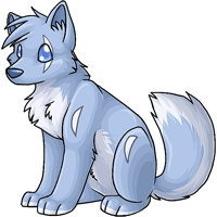
That's the old one I assume?
The shade looks nicer, more fur-like
And I can't decide if I like the new Darkonite more xP Something just doesn't feel right, though it really has gotten a lot cuter.
What changed on the Kumos? XD
I like the new Darkonite, though, it looks much more up-to-par with the other species' art style now than it did before.
I like the new Darkonite, though, it looks much more up-to-par with the other species' art style now than it did before.
I have to agree with Creep that the new Darkonite's pose reminds me of something...somewhere...>_< Can't put my finger on it, though. As for the tail, maybe make it a little less curved. It looks a little too curved to match the Darkonite's menacing personality XD
the new kumos shading looks really great! so nice to see it updated, especially when there are so many base colors floating around.
very happy with the new darkonite, but as a weird question, um what happened with the tigrean?
Ah much love for the update on the Darkonite! I was half afraid it had been forgotten =D looking great.
Can't say I remember what the Kumos did look like ^^;
Can't say I remember what the Kumos did look like ^^;
I do like how it's a new version of the older one, you didn't change too much, but something about the new Darkonite still looks too cutesy to me.
Why does the new Darkonite body look so familiar, as if I've seen it used a lot and frequently?
The update is obviously much better, and stays very true to the original. I enjoy it a lot, a great update with pretty shading. Would like a less chibi looking face, but I think that's probably specific to the type of pet that the Darkonite is ( like a pug's face, to a pug ), so it's OK. A great improvement that was drastically needed.
Thank you, lovely artist. Definitely voting for the new Darkonite.
For the Kumos, I would need an old picture to know what's changed. Still pretty, though.
I'd love to see what the old Kumos looked like XD But yay for slight Kumos colors update! :D