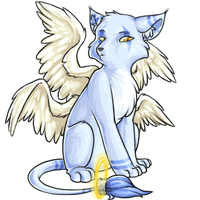
Proposed Montre Revamp!

We\'ve got a new poll for you to participate in! BUT WHAT ABOUT THE MONTR...oh wait :O
The montre is going through a revamp! We\'d like to hear your feedback - both what you like about the proposed revamp and what you dislike. Please take feedback over to the revamp feedback forum as it\'s easier for us to go through it there.
Note: We have not forgotten about the manchu revamp! The artist is still working on the feedback amongst their other duties, and it won\'t be released until we\'re completely satisfied. Thank you for your patience!

Posted by Rah
Load this on 🆕 Kumos site
Autocracy
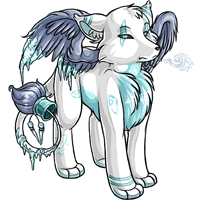
The ears are off and the body is very stiff.

The face is off to me.. I don't like the roman nose it seems to have. I like the rest of it, especially the wings, oh my, but the face.. I like the muzzles they have now, not this roman nose style. It needs to have a more defined nose bridge/stop o.o Like what other users have posted in their alterations.
I like the shading and pose of the new montre, but it's lacking that sly look that the original one has, as well as a clear muzzle. In my opinion, the muzzle is too round, and doesn't resemble a canine muzzle as well as it could.
I think my issue with the nose is that it reminds me too much of a Bull Terrier and (no offense to bull terrier lovers!) they have always looked ridiculous to me XD
It doesn't fit the Montre in my head.
It doesn't fit the Montre in my head.
Well I was going to respond in the thread but it is locked.
I like everything in the revamp better except the face. I much much prefer the smaller snout of the older version, with the curvier look instead of the straight-nosed look (if that makes any sense). Everything else on the update looks really nice, but the face 100% made me vote for the older art.
I like everything in the revamp better except the face. I much much prefer the smaller snout of the older version, with the curvier look instead of the straight-nosed look (if that makes any sense). Everything else on the update looks really nice, but the face 100% made me vote for the older art.

I feel like the tail needs to be longer and also the face looks flat and the eyes look weird. I prefer the old art. ):
I haven't read any of the other comments, so I apologies in advance if this comment repeats what many others have said. Although I really like the shading of the body and the colour is very rich and the pose is very shy/cute like I originally read the montre to be; the face is very strange. I think it's because of the rounded face and awkwardly sloping snout/nose bridge. The nose seems lower than it should be, and lacks any hint of a defining point. The legs also seem short, and imply a younger animal. The original montre has longer/thicker legs (not too much though, because at least one is not relaxed, but bracing against the ground), and I would like to see the new montre reflect that a little more. Special recolours often have slightly longer looking legs as well, it would be nice to see it as a common trait between colours. I also feel there is something amiss between the shading through the light-touching areas of the body and the head, but I'm not good enough with art and perspective/lighting to really know what I want to say/describe. It looks nice, and I would prefer it to the old montre, but I would be lying if I said it were an overall great revamp.
Leave the watches alone please. After finally giving my first (and favorite) pet an original Bloodred pose, you're going to ruin him. Enough is enough.
Also i want to mention that I think the reason people are thinking this montre looks like a chibi is because the legs are really short, especially compared to the long elegant legs of the previous montre.
I agree with Ahreinya. I like the new body, but I prefer the old face. Montre is my all time favorite pet so this is a big deal to me.
I agree with Ahreinya. I like the new body, but I prefer the old face. Montre is my all time favorite pet so this is a big deal to me.

Also it's front leggs are too short compared to the old version and all the other colors.
There's a lot of wasted space so I just moved the image up in the 200x200 square and enlongated front legs (done quick and dirty) as an example:

There's a lot of wasted space so I just moved the image up in the 200x200 square and enlongated front legs (done quick and dirty) as an example:
Here's what I did:
-moved actual nostral area (black part) on the nose more towards the top of the snout
-shortened snout
-upturned snout slightly to give a stop (which is missing completely in original)
-shortened eye
-realigned eye
-added brown shading into the neck more so the head doesn't look so detached from the body
-widened ear a bit so there's not a weird gap between it an the head

Still needs work though...i'm tired and didn't feel like going crazy with it lol
-moved actual nostral area (black part) on the nose more towards the top of the snout
-shortened snout
-upturned snout slightly to give a stop (which is missing completely in original)
-shortened eye
-realigned eye
-added brown shading into the neck more so the head doesn't look so detached from the body
-widened ear a bit so there's not a weird gap between it an the head
Still needs work though...i'm tired and didn't feel like going crazy with it lol
Eh, I think I'll abstain from this one. The art is obviously higher quality on the new one, but I don't like the changes to the actual design. The face looks narrower (not ugly by any means, even more dignified, but I'm a sucker for the cute fluffy face) and the pose is more confident and less shy. I like the little tucked-away cute fluff face.
I don't want to vote for the old design though, since like I said, the art is older and of lower quality. Ah, well, at least I zapped my Montre so I don't have one anymore, so I don't need to worry about it. >>
I don't want to vote for the old design though, since like I said, the art is older and of lower quality. Ah, well, at least I zapped my Montre so I don't have one anymore, so I don't need to worry about it. >>
I knew the Montre art was dated, but up against this new art its just shameful.
New art is SO damn nice. Much better posture, but still has the same attitude.
I think I want one.
New art is SO damn nice. Much better posture, but still has the same attitude.
I think I want one.
I'm not sure why everyone's worried about it looking less like a fox. I never saw it as a fox anyway.
I think the muzzle needs to be thinner and more straight out from the face rather than a gradual slope and a wide muzzle. (more fox less canine) otherwise i think it's good! Would have posted on the topic but it's closed and I still wanted to say what I thought haha
@Saint
.. this is for the original montre tho and the original montre has never had a mouth??
.. this is for the original montre tho and the original montre has never had a mouth??
There's something so awkward about it. I normally love revamps but I can't get behind this one at all. It's definitely something with the face and wings. The wings look so tiny, the head to big and awkwardly angled. I wish I could pinpoint it. But this definitely needs some final touches.

Yay for updated art!! <3 Nicely done!
Not to be the odd one out but, am I the only one who doesn't follow the logic of anatomy issues? These pets are artistic representations of imaginary creatures... They could have boneless skulls and feet on their heads... or bendable bones with a consistency similar to taffy... or joints that are more like sleeves than a hinge or ball and socket.... I get that the artists may use real world animals as references, but I don't get the picking...
That being said, I love the face on User not found: ryxe's drawing. ^_^
I voted for the old because... I can not stand that face. It just, doesn't look... correct. I'm sure it's the snout as others have mentioned but sadly even the edits aren't looking enough corrected for me. They're relying more on shading to add a bridge and that isn't what it needs. It needs to be more like the old face/skull and actually slope outward.
Everything else about it is fine, in my opinion, but that snout needs work. The wings and tail are lovely. I love how soft the tail seems, even in image alone.
Everything else about it is fine, in my opinion, but that snout needs work. The wings and tail are lovely. I love how soft the tail seems, even in image alone.

I forgot to mention, I noticed everyone loving the wings, however being someone who studies wing anatomy, the wings are horribly mangled and broken. They LOOK pretty but they are very non functional. Again, a great start but it needs a lot of work.
I want to say the new one..... and rarely do I vote the old design. But something about the new one is disturbing, maybe it is the facial anatomy (which is horribly broken) or the very stiff not very montre like anatomy. I agree there needs to be a revamp but this just isn't it..... I'll post more issues on the forums when classes are over. It's a good attempt but it needs a lot of work.
I'm going with the old design. I do love the wings, the shading, and lineart look amazing in the new one too, but as everyone has pointed out something is wrong with the face. I also don't like the pose, it's very stiff. The old montre is more sort of leaning a bit and sitting casually. The muzzle is too large and just oddly slanted down, and the head looks detached to me for some reason. Like he's a bobblehead or something of the likes. In fact the more I look at the new Montre design, it just looks like a winged Kumos with very faint differences.
I do love the overall design, but I have to agree with what others have said about the head. (Personally, I like the original narrow-nose-look) The new one seems a bit off, but if the head was fixed, it would be perfect.

It is quite nice, but I prefer the old one.
The new one is to way to stiff and distanced for my opinion. D:
The new one is to way to stiff and distanced for my opinion. D:
The downward facing muzzle reminds me almost of a Koala. I love the old pose, it just needs to be exactly the same with updated shading!
Great revamp, though I certainly agree that the muzzle is not correct/ seems off. I would correct this before continuing :)
looks pretty good, but there is hardly any face shading, the muzzle doesnt look quite right....and need to see more of the second wing

I definitely like the new version better, although the head does seem a bit off -- it also has less shading compared to the body, which makes it look rather flat looking.
I may be partial but I think it'd be nice to see a bit of wing on the other side, it really looks like the montre only has one at the moment (and not just because perspective is hiding the second wing!)
I may be partial but I think it'd be nice to see a bit of wing on the other side, it really looks like the montre only has one at the moment (and not just because perspective is hiding the second wing!)
It's really well drawn but there's something really off about the head. If they'd redrawn the head it would look so much better.
I liked the broader face on the original Montre, but the art is definitely a huge improvement!
This is my favorite pet hands down. I'm pleased to see it getting some lovin' but I agree that there is something off about the snout/face. Overall the details are lovely but the face suggestions down below are great critiques!
Most peeps here stated it already, just gonna give my 2 cents:
The overall improved a lot, I like that the details from the old one, like the feathers on its tail and the grey strips still remained. And it looks way fluffier now, which makes it just 10 times cuter. Just the snout seems a bit off and (what I haven't read up until now), its ears are a tad too thick and bulky, the ones from the old one are way slimmer.
Overall, yes, I approve :D

I don't personally have a Montre but have thought of getting one.. that being said, I prefer the older version and honestly think it should just be built up more. Like add more texture and detail, not completely revamp like the suggested new version. It's absolutely no offense to the artist, the art is really great, it just doesn't look like a Montre? It seems the newer is winning the poll so far, though, so I can always just use an overlay if I choose to still adopt a Montre :)

The face reminds me too much of a bull terrier. The muzzle is too flat and long, somehow :/
It's the only thing really that bothers me about the revamp.
It's the only thing really that bothers me about the revamp.
I like the update from the neck down, but the head just looks off. Flat, and uninteresting, and wrong.
I like it personally. I believe one time a long time ago it was said that Subeta pets are not always one breed of animal. I am almost sure it was said that a sheeta was a combination of a cheetah and a sheep. That could explain the reason that the montre's facial features are not 100 percent canine.
Now my only beef with revamps and new pets is I wish all the current pets were drawn in every color that that is available on Subeta before moving on to revamps and new species.
Now my only beef with revamps and new pets is I wish all the current pets were drawn in every color that that is available on Subeta before moving on to revamps and new species.

The details on the new one are great. ^^
I still voted for the old one as I like the head more. It looks more elgant and the head as well as the ears look.. thinner, which gave the old one a more fox-like look.
I still voted for the old one as I like the head more. It looks more elgant and the head as well as the ears look.. thinner, which gave the old one a more fox-like look.
Love the design overall. It's one of my favorite species. I would like to see the head either more fox-like or more coyote-like. When I envision them, I go back and forth between those to body types in my head. I agree with others that the muzzle should be more pronounced and canidae-like. Minus the pickiness of the anatomical structures (head, legs), I do like the redraw and can't wait to see the final result.
This is the first time I've liked a design the way it is better than the revamp. The old one has a little more movement to it, the new one looks strangely static and uncomfortably posed.
I think the main thing that is bothering me is that the face/head looks a little off, particularly the muzzle and the eye that is farthest away.
I think if maybe it was more pointed it may look better?
Love the legs and wings though! Just the face needs a bit of tweaking!
I think if maybe it was more pointed it may look better?
Love the legs and wings though! Just the face needs a bit of tweaking!
I think the art is certainly an improvement, but it could use some tweaking:
The silhouette of the skull moves in a smooth line from forehead to snout and the nose is positioned very low in a way that is really reminiscent of a Bull Terrier - which seems a weird change from a pet that had a strong fox vibe before, and a weird choice for a sad, soulful pet.
The ears are pointing in two different directions, which I know is possible for a lot of animals, but seems an odd choice for a 'resting' pose. I think we should be able to see some of the ear fluff on the far ear.
I dislike the scruffy fur on the head being moulded into a more obviously cartoony 'quiff'.
The pose is very upright, with its chest puffed out and all the paws point neatly forward; I preferred the old one's more characterful sad, stoop-shouldered, splay-footed pose.
On the other hand:
The wings look great
The only thing I personally dislike about the new proposed version is that the montre now looks right at you. I like that the other one is looking elsewhere, but that's a minor problem - one I can live with if need be.
Okay, stoic wasn't the right word because, actually, that "attitude" is what makes the Montre. Still, something about the expression just feels off.
Could you perhaps add some whiskers? For me the snout doesn't really have enough definition. Also, I'm not keen on the dark lines that differentiate each toe on the paws. They look too plastic. Lastly I do not like the colour scheme of the brown body with grey wings and tail. If you are proposing a revamp, can you not also look at the colour scheme? Sorry to others if you love the combination of colours.
As I was scrolling down, I thought to myself, "oh, someone's custom pet must have won the pet spotlight."
Something about this doesn't match Subeta's style. I can't pinpoint what it is, but it seems really off. The face, for sure, but I think enough people have pointed that out already. It also seems to have lost a lot of personality.
Something about this doesn't match Subeta's style. I can't pinpoint what it is, but it seems really off. The face, for sure, but I think enough people have pointed that out already. It also seems to have lost a lot of personality.

Don't like it. The art of the old one is rather out-dated (being older and all), but still looks more appealing to me.
Not gonna lie, I like the pose/face of the old design more- it gives the Montre a more sly, almost sneaky look which is pretty nice. The new one is too upright, and just something about the entire muzzle + cheeks are off. The sharper face of the old Montre with the smaller ears is much more pleasing to look at.
I think it's perfect, honestly.
The face and ears could be tweaked but the body, legs, tail, and everything else is amazing. Nice job as always! :3
The face and ears could be tweaked but the body, legs, tail, and everything else is amazing. Nice job as always! :3
Also, I've noticed that the current artist seems to draw all her montres with a bobble head effect. All her heads seem to be floating over the body rather than connected to it. It's understandable that the storm's head has sort of that effect, due to where it is, but all the montres that came out recently have that same detached head look, even when they probably shouldn't.
Gonna have to agree with everyone on the face/legs being weird, but I also find the ears odd looking, too. Like, the far ear looks rather flat and disconnected as well, and the closer one looks like it's a bit too far back on the skull. That little tuft of fur on the top of the head is going to forever bother me. I like how much smaller it used to be than the kumos' emo bangs. I'd much prefer a shorter fluff on the top of the head, akin to the spectrum/current common pose's 'haircut'.

Its a much needed revamp and a very big improvement! But still something I don't know what but SOMETHING seems of to me. I think it's in the head/face. Overall its great though!
I don't want to be mean but...
In all seriousness, come on artist! You've proven you can do much better than this.
In all seriousness, come on artist! You've proven you can do much better than this.
I....thought it was a chibi montre at first.
Not a huge fan of the head/face. Something's off, but I'm not sure what exactly sure what it is.
All in all, its a good start!
Not a huge fan of the head/face. Something's off, but I'm not sure what exactly sure what it is.
All in all, its a good start!
not a fan, but i will try to touch on this tomorrow after errands if this crappy laptop will allow me to do a redline (or several, i can dream)
A think I should apologise to the artist for this, but honestly?
Our kneejerk reaction to seeing that image on the news page was roughly "what the flip is that, some kind of horrifying alteration of the poor chibi montre??" And... well. It just. It is still horrifying to us? It's just so. Ugly. To us.
The pose seems so weirdly stiff, like an attempt at being regal that just isn't working. The head-neck-body connection seems off. Compared to the current montre's more secretive pose the old one has a pose that seems relaxed, but it's also one that seems to us like it could take off at any moment (fitting with the montre's Subetapedia article about their evasive and mysterious nature.)
And the head.
The wing and shading might earn it points, but. That head just takes so many points away. A`_A I spent ages looking at coyote skulls and heads when we make Sophos- our own montre- her overlay, and that potential update... Where's its stop? ("the angle between the forehead and muzzle of a dog or cat") It's like a weird bullterrier? Backfire's got some good edits there, lowering the head more into the old pose, and giving its head a stop.
The eyes, too. The proposed update has eyes that have an expression like... an uncaring dismissal, while the current montre's eyes seem keen and focused (is it in the eyebrows, maybe? Or maybe because of the previously mentioned lack of stop/head shape?)

I like the new body shape but dont like the wings or face. I much prefer the old sleeker wings. A well groomed animal isnt gonna have ruffled feathers. As for the face a few things. The ears are slightly too wide, the slashes over the eyes arent supposed to curve inward and the expression annoys me. Half the reason I have a montre is the expression of "what makes you think I want my picture taken." The new expression more screams teen angst instead of annoyance.
But again the rest of the body looks way better in the new style. Just not the face and wings.
But again the rest of the body looks way better in the new style. Just not the face and wings.
It looks like a bull terrier, and the ears hardly look like they were redrawn at all. The rest of it? Love. That head though looks like it was done last and was very, very rushed. Isn't the montre supposed to be vulpine?
The face is very awkwardly shaped. The ears seem tacked on, the snout too cone-like (difficult to imagine a skull in that shape), its nose is basically vanishing at the end of it. The eyes also don't seem to be even? The one facing us is so much higher, the tilt of the head doesn't match up. The wing looks nice, the hindquarters, too. But the front leg seems massive and the shoulder juts REALLY far back... and overall, it just looks so stiff. I would be pretty disappointed if this went live as is.
Well... That's the one news post I absolutely didn't expect.
I'm a bit eh on the new one, the head/neck throw me off. I can't figure out why I don't like it though.
It got a bit a stiff look overall :(
I'm a bit eh on the new one, the head/neck throw me off. I can't figure out why I don't like it though.
It got a bit a stiff look overall :(

As someone who has a montra, and actually switched pet colors after one of the color revamps because I didn't like it..
I actually like this, the body looks much more anotomically correct.. the only thing I don't like is the head/face. :C I'm not sure why but it looks off to me.
I actually like this, the body looks much more anotomically correct.. the only thing I don't like is the head/face. :C I'm not sure why but it looks off to me.
In my mind, a vote for the revamped version says "if this went live today I would be 100% satisfied with it."
Quote by @Artist:
That's exactly how I feel, and why I vote for the old version in these situations. I'm not saying "nooo don't revamp it the new version is ugly," because it clearly isn't, and we all know it needs the revamp. It's more like "the revamp isn't quite there yet, so let's hold off until it can be improved."I want to cast my vote to the new one because it's a huge and obvious improvement, but it's still not quite right... you know?
But if I had to choose between the new and old I'd go with the new... but that doesn't mean I want the new one the way it is right now...? u feel me
YES!!! THANK YOU! Now Im going to have to get another pet slot with my LB in January. I always loved Montres but I never got one because the art was outdated and I didnt like the wings too much. but these are just amazing. I cant wait to see the the other colored revamps. AND PLEASE MAKE A NUCLEAR MONTRE!
But I agree with the other posts about the snout looking weird. It should be more narrow, but Im not complaining.
But I agree with the other posts about the snout looking weird. It should be more narrow, but Im not complaining.
while a vast improvement there's some wonky anatomy going on but ppl have already pointed out exactly what I was thinking about it tbh so I'll just second them and those examples given rather than repeating everything tbh
I want to cast my vote to the new one because it's a huge and obvious improvement, but it's still not quite right... you know?
But if I had to choose between the new and old I'd go with the new... but that doesn't mean I want the new one the way it is right now...? u feel me
on a more serious note, I don't have much knowledge to give about the anatomy but the snout feels a bit too straight, some edits down here have my total support
- The shading on the legs looks kinda strange. Like...you've got all this streaky shading on the back part of the hindquarter and then all this mostly flat color near the knee area and it looks odd to me
- The legs look weird like the montre is slightly squatting to take a crap, or about to pitch forward or something. I think the leg angles are kinda off.
- I don't like the head that much - it's all round/long now. Everything is just too rounded on this one I think, whereas the old montre has more angles which I think works better. I also prefer the cheek fluff on the old montre, too. It's more wispish and less round-chunky. I like the faces on the storm and bloodred montres, and think this one should lean more towards those kind of faces instead.
- The wings are amazingly better
the art looks better obviously, but what has been bothering me about the majority of latest pet revamps is that the poses all seem to look stiffer than the original ones. even though the old montre was siting almost exactly in the same pose, it still looked lively due to its back being slightly arched, head tilting down, tail end raised high up, and front legs being very straight which made it look like the montre was leaning its body weight on them. it was a dynamic pose. this one looks timid and a bit bleak in comparison. i'd also like the head to be more angular in its shape but that's more of a stylistic preference. otherwise the art is good and is definitely an improvement. thank you for giving this pet some attention! the montre needed it badly.
@czar I like the track that you're on...if you shortened the nose wome while adding that dip, you may be onto something. Thinning the legs and paws up would help some too.
The anatomy is off a little bit. I feel like if you brought that one leg down a bit more it'd help an awful lot with the position. Concerning the head; it looks a bit too large to me, personally. The eyes don't line up correctly and the whole muzzle structure looks a bit too low. I feel like the neck's structure is also a bit awkward / doesn't define the shoulder as well as it could. The backleg's actually missing part of the anatomy entirely (just having the knee go to the ankle indirectly is incorrect). And ultimately, the tail would be positioned a little differently. Since this is probably confusing as to what I mean specifically, I've made a redline.

Overall though the shading is vastly improved and I really love the way the wings are done especially!
Overall though the shading is vastly improved and I really love the way the wings are done especially!
AND I FORGOT TO MENTION I moved the head forward a bit a altered the nose slightly.
I need to pay more attention to what I'm posting :x
I need to pay more attention to what I'm posting :x
I posted this in the feedback thread but I'm gonna put it here to to see what people think, don't mind me

returns to trash pile from whence I came
returns to trash pile from whence I came
While I absolutely love the new Montre and its obvious fixes to the original anatomy, there's one part that really bothers me. And that's the distinct lack of a nose bridge.
First of all, I love the edited pose, I love the shading. I also love how fluffy the wings are. But the glaring issue of the nose bridge really distracts from the entire composition as a whole. It's like a grammatical error in the middle of a paragraph in a book; it SERIOUSLY distracts from the narrative and people can't help but look back at that mistake and think "How could the editors miss this?".
Taking Subeta's other loveable canine pet, the Kumos as an example, it obviously has a nose bridge where the skull dips down:


Because that's what canidae skulls do:

(skull from skullsite.co.uk)
Honestly, it's just a small edit that would make a whole lot of difference! Here's a botched edit because I'm tired and I really need to shower and go to bed, lol.

First of all, I love the edited pose, I love the shading. I also love how fluffy the wings are. But the glaring issue of the nose bridge really distracts from the entire composition as a whole. It's like a grammatical error in the middle of a paragraph in a book; it SERIOUSLY distracts from the narrative and people can't help but look back at that mistake and think "How could the editors miss this?".
Taking Subeta's other loveable canine pet, the Kumos as an example, it obviously has a nose bridge where the skull dips down:
Because that's what canidae skulls do:
(skull from skullsite.co.uk)
Honestly, it's just a small edit that would make a whole lot of difference! Here's a botched edit because I'm tired and I really need to shower and go to bed, lol.
With the way the new Montres head is slanted, it reminds me of a bull terrier face.
It also looks weird in a way I can't describe, but it's not the worst thing in the world, just something that could be touched up to look less angular given the montre is more foxy over dog/wolfy.
Otherwise the new montre is very pretty!
Shading, wings, the pose!
All gorgeous.
Thanks for the poll Rah.
You are...
Rahmazing?
Ahaha.
I'm... . not really digging the new Montre too much. The pose in particular is reading /really/ stiff and is a lot less dynamic than the original. I'd love for this to be a little more dynamic , because there's obvious improvement on a technical level. The line of action is basically a straight vertical, as opposed to a soft curve.
No. No no no no no. It looks WAY too much like the Kumos! The Montre was supposed to be more fox-like. I don't like at all how it's turning so Kumos-like. Please don't take the foxiness away from the Montre! :/ The legs are too thick, the paws are too big, the nose is too big the eyes are too squinty. No. Just no.
Woah don't be messing with my favorite pet now.
Just kidding it looks nice. The legs make me very happy, but something about the angle of the head seems off - particularly the muzzle.
Just kidding it looks nice. The legs make me very happy, but something about the angle of the head seems off - particularly the muzzle.
It's notably better overall, although from an angle the head doesn't look as wide as a coyote so it seems similar to a Kumos.
I feel like this needs some major fiddling with. Something seems really off to me about the shape of the head. Quality of the art itself is great as always, though.
I'm going to end up repeating everyone else... the body is lovely, but the head looks incredibly out if place. Sorry.
OMG, I love it! Can't wait to see how my Storm Montre turns out!
They have a much more inspired mopey look to them now. It's just, I can't put my finger on it, but there's just a much more SOMETHING aire to it.
They have a much more inspired mopey look to them now. It's just, I can't put my finger on it, but there's just a much more SOMETHING aire to it.
The tail seems really long, like a little too long, it kinda bothers me.... Nothing serious though. I also agree on the face shading it seems off. Other than that I like the revamp.
This is an improvement from the old montre, but it suffers the wonky face syndrome that most of this artist's montres have. Can she try to get facial proportions like the storm montre has? That's the best montre this artist has produced.
new one looks very stiff and unnatural :/ the muzzle/face is also kind of off-putting? it's like... to short or something? idk
I like the wings, ear tufts, and elbow feathering, adds nice texture. Something about the face looks very 1-dimensional. It's mainly the eye and muzzle area that bugs me. If I put my thumb over that area I don't see a problem with anything else.
The current art is really outdated, in my opinion, so I say, I'm all for the revamp. The new art looks so much better. But, I also must agree - where is the mouth?
I like the new one but the face around the nose looks like his face is stuffed with food or swollen like it got stung by bees.


I'm torn. I think the new one looks better drawn but also less regal and dignified and more fluffy. I like the angle better on the original too. ;_; What do.

I don't mean for this to sound rude, but I don't really see how this is a poll-worthy change? It just looks like an updated version of the same design to me
Hngh, the body and the wings look amazing. Something about the head looks a bit off to me, but I can't put my finger on it. I ain't the best critique sheepish laugh
The body and wings are great, but the shading on the face looks a little flat (does it even have a mouth?)
Is anyone else bothered by the weirdly short snout? I love everything else about it....but that nose...
Quote:
I spit drink.We've got a new poll for you to participate in! BUT WHAT ABOUT THE MONTR...oh wait :O