Steamwork Ruffie Revamp


Posted by [NPC] Jules Yun
Load this on 🆕 Kumos site

Very very good, only thing that sucks is I miss the mess flying out of the ear. But it's still super quality.
I'm disappointed it has been changed, can't deny that. My main pet has been steamwork ruffie for a long time - I can't even remember how many years. I miss seeing the steamwork fleas flying in all directions too. Looks quite bland now, but I gotta like it or lump it!

Awww I really liked the little springs flying off, but I still prefer this revamp to the old!

Def like the change in the eye color. Kinda combines the steampunk aspect with the whole rave side of it too.

i definitely like this better than the old one; the eyes on this one feel way more realistic / emotive than the other one. i feel like there are other pets that needed a revamp like...way more than this guy though. /side eyes chibi sheeta
Definitely needed a revamp! The old one I had no idea where the leg even was! Wish it still had a few screws though!

I don't get why people are complaining about it looking too "clean". Since when can't steampunk be clean and simple? It looks like a steam-powered machine, which I'm pretty sure is the whole point of STEAMpunk. The old one looks like it's falling apart. The new one looks more functional and alive. Although I do kinda wish it still had the little claws that the old one has.
Scratching its ear in either case really doesn't make sense, but maybe it was programmed to do that just to look cute.
Scratching its ear in either case really doesn't make sense, but maybe it was programmed to do that just to look cute.

I think the revamp is an improvement, for the most part.
I've always liked the idea of steamwork pets, but I never bothered with one because a lot the designs on the pets I like have been so busy I haven't been able to comprehend what I'm actually looking at. An extra visible cog or two would have been nice but it still has the steampunk vibe, I think.
Also, cute as it might look, having screws and things that come flying out so easily is a good way to quickly find yourself with a nonfunctional Ruffie... no wonder Jules redesigned it :x

It's cute, but looks more like a clean robo nostalgic pet to a steamwork one. Somewhere in the middle of the new and old would be my preference, not so busy but still keeping the gears and wires that make steamwork such a riveting (/shot) aesthetic.
Still loving the new eyes though :o
Still loving the new eyes though :o

I strongly agree with Rogue and shylarah. I can't say I'm a fan of this new revamp, cute as it is. The old one was so much more fun to look at.
I really hope Steamwork isn't going for a cleaner look. Please let me keep my cogs, gears, loose bolts, and frayed electrical wires!
I really hope Steamwork isn't going for a cleaner look. Please let me keep my cogs, gears, loose bolts, and frayed electrical wires!

Poo-Chi, is that you?
Despite being metal, it looks "soft" in a way. o.o
But, since it's a doggo, it works. XD
Despite being metal, it looks "soft" in a way. o.o
But, since it's a doggo, it works. XD

This is so much easier to look at and understand, it looks a ton less cluttered! Nicely done :D I'm not big on steamworks pets but this is one I'd consider having, I think. (If only there weren't 9839 other pets on my 'I need this' list ;_; Damn talented Subeta artists...)
It kind of looks like the "old" version was the inner workings, and for the "new" version the factory slapped a casing on it.
Maybe they were always meant to look this way and the old ones just got shipped out too early?
Maybe they were always meant to look this way and the old ones just got shipped out too early?


The one was super detailed, but this one seems too simple.
It's a radical revamp of design AND art, rather than just art.
It's a radical revamp of design AND art, rather than just art.
i do like the new version! however i will miss all the parts flying about from a good ear-scritching haha.
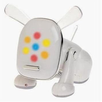
I like the new version, it is easier to tell what body part is where now. The previous one made it difficult to see the body parts, they sort of blended together and it was tough to distinguish what was where. The parts themselves were fabulously detailed, but overall they melded into a maze of lines, where I expected to find Waldo. Now, it's easier to see what the little metal ruffie is doing and its eyes have more of a "lifelike" glow to them, than before. I also like the furnace chest chamber, and head vent, both of which are smoking. I miss seeing the cogs and gears from the original (the back leg looks more like a rivet now). But, overall I give it two paws up! Great work artists!
I think it's fantastic--looks like a toy, but in the best way. There were good elements of the original, but this is a much better piece overall. Good take on the original, real improvements!

That face is so darn adorable! I love the blue eyes and tail globe - the color contrast in general makes this design pop! I definitely want one of these "puppies" (ohoho bad pun). Seriously though, this redesign does the Ruffie justice and was clearly drawn with a lot of thought and care (by someone both detail-oriented and organized!) Very well done! :heart:
I love it!
I also liked the older version too, but it's easy to combine both new and old art into a custom overlay ^^
P.S.
I'm loving the new blue eyes!
I also liked the older version too, but it's easy to combine both new and old art into a custom overlay ^^
P.S.
I'm loving the new blue eyes!
I think I'm in agreement with Rogue. I love the blue eyes of newer steamworks pets, and there's something to be said for them being a shade less busy, but while the art is lovely it feels like this and the zasaba lack the rough charm that so appealed to me for pets like my Jean (steamwork jollin). It looks like the aesthetic is going from steampunk to cleaner mecha, and part of the fun of steamworks is all the cogs and gears.
While this version is definitely 'cuter', I like the old version. This one doesn't really look like a Steamworks pet, it's too soft. It looks more like it is made out of cardboard boxes than gears. There is no visible intricacy.
I LOVE IT
also I especially love how probable it is for a robot pet to be revamped, compared to other pet revamps, in a literal sense hahahaha
also I especially love how probable it is for a robot pet to be revamped, compared to other pet revamps, in a literal sense hahahaha
Adore It! Now you can actually see it's a ruffie! The previous one was an overkill. Never liked it Good Job!

steamworks is really decluttering its cling-clang mcbling-bang cog-sprocket look.
steamline no more, it's streamline now
steamline no more, it's streamline now
aw i actually kinda liked the old ruffie's clutter. it was messy but i think a tiny cleanup wouldve been nice
It's cute!
I wonder however if it was revamped for looking too busy because another rather busy-looking one is my favorite Steamwork Pet. clings to Endeavor
I wonder however if it was revamped for looking too busy because another rather busy-looking one is my favorite Steamwork Pet. clings to Endeavor
I kind of liked the little parts flying off on the old one, but overall the revamp is nice. I do prefer the newer versions of Steamwork pets where they aren't so cluttered and busy, it's easier to make out the details.
I adore this! The old one was really busy and I couldn't tell what was going on. Love the eyes!
Oh noooo. I chose the Celinox because of how busy the Ruffie was, and now I like the Ruffie better. I guess I have a decision to make, haha.
"while standards may be slipping elsewhere"
That made me lol XD
I like this version much better. I can see what's going on. And the steam out of the top of the head is A+
That made me lol XD
I like this version much better. I can see what's going on. And the steam out of the top of the head is A+

AHHH what a good revamp!! the old one looked really busy and wasn't super pleasant to look at, while this one is super cute!! ' v '
 new
new 

Might even consider having one! :)