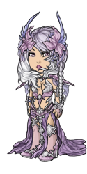
Cash Shop: Delish Can & Ser


Posted by SubetaTeam
Load this on 🆕 Kumos site
Lee
such a beautiful set! it reminds me of the leafeather armour but with more of a dreamy quality. love it!

I love these colours, and a lot of the pieces, but I'm noticing a trend in the Delish sets: the hair all looks a bit similar. I know it's one artist doing the sets, so obviously there's style to account for, but even just the wig shapes are starting to repeat. (also they are really weirdly gravity-defying wigs but that is just a personal taste thing)

LOL @Silvanesti, I bought it as soon as i got online and saw it! I wasn't passing this one by! hahahaaa (heh. haven't passed on any of them, but ESPECIALLY NOT THIS ONE!) :D
LOVE the color and pieces!
LOVE the color and pieces!
Unless we get more of these soft colors in the future, these are gonna be tricky to use.
On the other hand, dang these sets are like classic impractical armor lol
On the other hand, dang these sets are like classic impractical armor lol
Beautiful colorations, I like especially the Can set.
The shoes look somehow wobbly, though and hair and mouth a little bit unreal.
I love the abundance of clothes combinations, though, very nice for layering! <3
The shoes look somehow wobbly, though and hair and mouth a little bit unreal.
I love the abundance of clothes combinations, though, very nice for layering! <3
Very pretty colors, but I agree with some of the other comments- not a huge fan of the wigs looking the way they do- "stuck to the face" and all that.
Both sets look quite cluttered. Love all the options, but sometimes less is more.
Always nice to see new outfits, but I think I'll skip this one :c
Both sets look quite cluttered. Love all the options, but sometimes less is more.
Always nice to see new outfits, but I think I'll skip this one :c


These are pretty!!! however, all of these zodiac delish lines arent really all that versatile.. majority of the items just look weird outside of the set. they just arent very practical? the colors are gorgeous, but hard to apply outside of the set. also, the outfits are really really busy... a lot of the pieces are just too complicated.


Not a fan of this trend where the wigs flow unnaturally and look like they're stuck onto the face, a shame.
Maybe it's part of the aesthetic but I just don't get it.
Maybe it's part of the aesthetic but I just don't get it.
Color pallet oh my! Super pretty, sort of tricky to use.
The horn perspective is getting better IMO. Prolly going to end up with a few pieces from this set. ♥
The horn perspective is getting better IMO. Prolly going to end up with a few pieces from this set. ♥

They look pretty cool all put together, but I can't see being able to really use them as separate pieces, especially because I don't think there are many other wearables in that colour range (or maybe I just don't own any).

aahhhh, I wish I could have loved my sign's set as much as I love this one. I want like all of this.
the designs are great, but there is a whole lotta pillow shading happening here.
these would be very hard to use with other items
these would be very hard to use with other items
This is beauuuutiful. But.
For me, this has less individual pieces I could work with than the other sets. And that makes me sad faced
For me, this has less individual pieces I could work with than the other sets. And that makes me sad faced


They are beautiful sets but I can't help but feel that the sign isn't as well represented in the set as the others were.


The sets look beautiful together! I really really love the colors. However, except for the female eyes, I don't really like the pieces separately. Since I don't like to just wear a whole set together, I will probably not buy it, except for the eyes maybe... I would really like to see a set where the pieces can actually stand alone. But still, as a set, the items do look really gorgeous!
I feel like far too much effort went into omg-details for this one, they look super cluttered and unreadable all together, separately most of the pieces look odd, the hair in particular looks frankly terrible alone, like it's been glued into awkward angles and a lot of the shading is off, really visible on the male trousers. This'll be another set I pass over entirely. I might bother with the male eyes but considering how likely I am to bother fighting with the wardrobe... even that's not a promise.
My birth sign and its purple double happy :) now if only i had the csc to buy all these delish sets

I hope these and the Aeries sets are still around for a sale. Dx I have 4 sets I want to buy now. -lol-
Not impressed....not much thought has gone into these, they're VERY similar to other recently released cash shop sets, just a different colour.
@Wolf_Spirit
I believe the actual crab representation is reflected by the armor and pointy ends in the set. Defensive yet elegant and sensitive. Cancer is generally pretty difficult to show off as an actual crab lol Like the same goes for signs like Gemini, Libra, and Aquarius. Their literal representations can be tricky. This set comes across as very fitting for the sign imo, being a cancer myself.
I believe the actual crab representation is reflected by the armor and pointy ends in the set. Defensive yet elegant and sensitive. Cancer is generally pretty difficult to show off as an actual crab lol Like the same goes for signs like Gemini, Libra, and Aquarius. Their literal representations can be tricky. This set comes across as very fitting for the sign imo, being a cancer myself.
Even with that being said, @Lantern, and although I agree with you in that sense (lunar representation), the pieces I mentioned still could be way better drawn/positioned/sized.
I still don't see any crab like representation and it would've been nice if there was something small - heck even the medallions on the belts/sashes.
I still don't see any crab like representation and it would've been nice if there was something small - heck even the medallions on the belts/sashes.
@Wolf_Spirit
With astrological signs, the ruling planet of Cancer is the Moon; which the vibe this set is seriously giving off. And the headpieces do resemble pincers. Cancers are also sensitive and delicate, yet protective, which is also reflected in these sets. Not everything needs to be literal like OMG LOOK AT THIS CRAB ;)
With astrological signs, the ruling planet of Cancer is the Moon; which the vibe this set is seriously giving off. And the headpieces do resemble pincers. Cancers are also sensitive and delicate, yet protective, which is also reflected in these sets. Not everything needs to be literal like OMG LOOK AT THIS CRAB ;)
(Screaming) this is gorgeous I need it so badly. maybe I can convince my mum to lemme borrow like 20 bucks to buy csc for my birthday aaaaaaa these are fucking beautiful the colour schemes perfect
Such a pretty color scheme. I'd love to know the thought process that goes into coming up with them, like how they correlate to the sign.
I wonder if I should start matching my Extremely Strong ribbons with these bustles (Can, Ayr, and Pye) like I did the Tor bow. Maybe even capes (Ser, Ini).
I wonder if I should start matching my Extremely Strong ribbons with these bustles (Can, Ayr, and Pye) like I did the Tor bow. Maybe even capes (Ser, Ini).
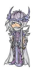
Okay but the Delish Ser Shoes tho. Can we get more shoes that look like this? o I feel like the perspective on those shoes in particular is spot on-- I don't know what it is but for once shoes that aren't boots look good to me.
The colours are really the only things going for this set. The art is good but there's a lot that's wrong with the sets. First off - it doesn't say "crab" at all, which is what this sign is.
Secondly - so many items in the female set are off - the eyes are funny in size, shape and placement. The mouth is not center (again). The bustle doesn't follow the angle of the body (so many things on this site don't and it's maddening to try and make HAs because of this. The hairstyle would've been lovely had the braid not been there. The flowers on the headdress. It's an aquatic animal. It should have been shells at the very least.
The male set is better but still odd-looking. A scarf wrapped up around the face? The cloak not following the body angle.
The colours are gorgeous. Just disappointed that this set is so far from the mark. Thank goodness I only want a couple of the male pieces. Hope Leo is way better.

oooh...love it, and such pretty shades of purple! (Purple is my favorite, ha)
XD I'll have to wait until I have splurge money again but I'm definitely buying these.
XD I'll have to wait until I have splurge money again but I'm definitely buying these.

Two days earlier than I expected. I guess so people can take part in the bonus weekend, so that's cool. :P
Lilac's not my thing, so I think I'll wait for the next set. (Lee and Ohh?)
Lilac's not my thing, so I think I'll wait for the next set. (Lee and Ohh?)
I am just not feeling the coloring style on these Delish lines lately, which breaks my heart because in theory these are beautiful pieces. The shading not only leaves the item looking flat but the multitude of unnecessary shadows and internal lines also makes the pieces feel woefully overworked.
I might cry. This is the first time I've ever bought an entire set before...this is the first time I've ever bought both the male and female ones as well ;u;
@Amber Didn't stop me from buying the whole Can set, and I never do that, and never on the first day of release. But this one is over the moon! <3
Eeeeeehhhh...
I like so much Delish took the signs as concept for these sets, but everything is looking so flat, and the folds and shape are just too weird. Feels like the art quality has gotten worse each year, very little thing appealing anymore.
I miss having the urge to get the full sets like Mocha and Tea did to me, but in a way I'm glad since I get to save my CSC for prettier CS stuff.
Amber
STAFF
@GreenRowan Fixed! (I had to change all the names 'cer' to 'ser' that I ... didn't notice the guard gaurd thing whoops)

So beautiful, and I really love the pastel purples and blues. Only thing is I wish the Can Mascara eyes were a little more even.
@GreenRowan
You are seeing right,It's been wrongly spelled on the can and ser parts except one piece :P
Apparently subeta as a whole needs more coffee xD
@Amber I think there might be a spelling error,it says gaurd instead of guard on some.
You are seeing right,It's been wrongly spelled on the can and ser parts except one piece :P
Apparently subeta as a whole needs more coffee xD
@Amber I think there might be a spelling error,it says gaurd instead of guard on some.
I'll need a moment to pull my jaw off the desk. These pieces are beyond beautiful! I love the shade of purple! Kudos to the artist.
Oh, and is the spelling of "guard" on the Ser titles meant to be that way? Ignore this comment if it is. Art is so lovely!
As a Cancer, I'm so happy the artist went with lunar colors instead of going HURR DURR ITS A CRAB SO LETS MAKE IT RED

Oh how pretty. Too much purple though so probably won't be buying any. Wish there was more blue.