Galactic Ontra Revamp

Posted by SubetaTeam
Load this on 🆕 Kumos site

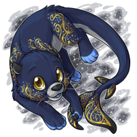
It looks cute, but a little too plain. The moon was an adorable detail, if it was taken out because it doesn't match the new galactic style, there should at least be something else to cover its big forehead. There was no reason to take out the paw markings... And the back also looks empty

Beautiful! That ontra definitely deserved a revamp ;) It looks so sweet and cute <3 Also, I love the eyes, they look so lively. Kudos to the artist~!

Oh! Galactic is my favorite color - I have 11 of them, it's a sickness - so it's always exciting to see the color getting some attention!
I liked the moon, but understand and agree with the reasons for its removal. :) There was really no rhyme or reason for it to be there except that the Ontra has a massive fivehead, and it didn't match the other Galactic pets.
I do see what others are saying about plainness/empty space, though. This revamp is so very pretty, but I think it would have made a world of difference just to include some of the random stardust specklings down its tail, forelegs, and possibly forehead, like the Telenine has:
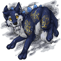
Your work is always appreciated, artists. Big fan of the soft luminous eyes and tail markings.
I liked the moon, but understand and agree with the reasons for its removal. :) There was really no rhyme or reason for it to be there except that the Ontra has a massive fivehead, and it didn't match the other Galactic pets.
I do see what others are saying about plainness/empty space, though. This revamp is so very pretty, but I think it would have made a world of difference just to include some of the random stardust specklings down its tail, forelegs, and possibly forehead, like the Telenine has:
Your work is always appreciated, artists. Big fan of the soft luminous eyes and tail markings.
Ah yes thank yoooou this is much more adorable
fond memories attached to the original but it was at least 10 years old
fond memories attached to the original but it was at least 10 years old
"Oh, Jerry, don't let's ask for the moon. We have the stars."
I do agree with some, there seems to be some empty space... but it just looks so elegant and pretty, it doesn't need to be overdone. :)
I do agree with some, there seems to be some empty space... but it just looks so elegant and pretty, it doesn't need to be overdone. :)
I love the revamp! Definitely looks much better, in my opinion!
I always liked Ontras, but with the revamps, they're all much more realistic and the art is definitely more on par with the current site art overall ^^
I always liked Ontras, but with the revamps, they're all much more realistic and the art is definitely more on par with the current site art overall ^^

I really love the Ontra species revamp as a whole. The old ones were cute, but they looked a bit too cartoon-y while the updated version looks more like a realistic animal.
This revamp is very nice too! I'm always a fan when the artist keeps the same general pose but just updates the art. Keeping the crescent moon would have been cute, but then it wouldn't really have matched with the rest of the galactic pets so I can understand why it was removed.
Overall, very well done! It looks so much better :)


It looks so cute! I think it looks fine both with and without the moon. I do wish the marking on the front paws had stayed though.

Aaaaw this looks amazing! All the power to galactic revamps, but I wish you guys would have kept the moon mark :(
The redraw looks absolutely gorgeous but please add the crescent moon back! It was adorable and it the forehead looks really plain without it.
The revamp is so beautiful. I like it better without the moon. The face was too busy and my eyes had a hard time finding the features in the old version. Without the moon, I immediately see his cute face. I think this is one of my favorite revamps actually, I might need one. :P

i like the new tail and looks better without the moon - which i had no idea it had on the forehead XD
I like every aspect of the new version better: the removal of the moon, the blue tongue, the tail detail. It’s such a cute little creature! Great job whoever the artist was! I wish I had a pet slot!

If my pet Benton Fraser hadn't been a fanpet and I hadn't already drawn art for his profile that's clearly based on the marsh ontra that he is now, I would be very tempted to turn him into a galactic one now <3 I absolutely LOVE this revamp, although I do agree it would look even better if it had kept the old crescent on its forehead... i do prefer the new silver muzzle though, it stands out more, the eyes are also a lot better <3
Oh I like this a lot! I really preferred the old muzzle, and like many have said wish the new one had the crescent moon.
I like the revamp a lot. I think the markings are well done and don't make the ontra seem "crowded". The blue tongue is a cute touch too!

I'm not usually a Ontra fan, or a Galactic fan, but I really like this one. I might have to get one when I have the room.
I hadn't seen the old version until it was posted in the comments. The new one looks good overall, but I agree with the few other comments that said the front limbs and back look a little bare without markings, and I definitely liked the little forehead moon on the old version; however I do really love the way the tail looks on the new one. The eyes look fine either way in my opinion, but I agree after a second look that the blue tongue vs. the pink tongue does look a tiny bit weird to me. It's almost like the old version is the cute fuzzy baby ontra and the new one is the pretty sleek adult. :)
I got one, but I am sad the crescent moon, swirl and little markings on the face didn't make it in the revamp, I see they tried with the silver muzzle but I would rather it be blue and get the sweet markings back. It would be super awesome if the artists listened to constructive crit, because it is a great piece of art and I love the update on the golden swirls, the tail is magical.
This is a splendid revamp! It's so sleek and elegant <3 I will miss the moon and eye makeup, though.
I'm gonna miss the moon and the back markings, but /woah/ this art is so much better. What a cutie!
YEEEEEEES, new color for space cadet!! i am in love with the art on every single ontra... my babies..

Wish it still had the crescent, but aside from that this is super cute and I definitely need fifty of them.
Ahhhh! I was just thinking about this baby needing some love the other day, and this revamp turned out some lively and adorable. :heart:
The line art is definitely cleaner but MAN did it ever get boring. Why not have the golden swirls go down it's head and back instead of leaving all that empty space to bore the viewer? Also, bring back the moon.
Very lovely, just wish it kept the markings being as bold. Places like the limbs feel really bare, but that's not something an overlay can't fix I guess! Love the movement of the tail fins and that cute smooshy face!
Wish I could edit my first comment hurrdedurr
Iltallo raises the crystals into the air over Sport and a light engulfs the entire surrounding area!
When the light fades, you notice that Sport is now Galactic!
I just wanted to come back and just praise the tail, like, it looks so fluid and perfect and I don't know there's just something about it that I keep gawking at ♥

This revamp is so pretty.
I won't lie, I am a little, just a littletinybitalittleteenybit, sad that it no longer has the moon mark and sporadic 'star' dots. But it's still an A+ revamp.
I won't lie, I am a little, just a littletinybitalittleteenybit, sad that it no longer has the moon mark and sporadic 'star' dots. But it's still an A+ revamp.
Better and clearer, except I liked the original's eyes a lot better (stood out more and shiny and magical!) and why why why would you remove the crescent?? :o
It doesn't even look like the same species that it used to be. Can't say I'm a fan. Preferred the fluffy cuteness it was before, especially the muzzle area.
that revamp is SO SO GOOD!!!!!! a little sad it lost its forehead moon crescent, legit have no idea why they would remove it, but otherwise it is indeed 100% positive changes, woo!!
Oh! I've been really hoping for a revamp for this, wow, Reimund finally has a new look. I feel like this'll take some getting used to since I've been seeing the old art for soo many years haha, but the art quality is so much better! I love the shading and the galactic swirl markings are really beautifully done, especially on the tail.
 -
- 

TJPanda