Subeautique: Royale Ligero


Posted by SubetaTeam
Load this on 🆕 Kumos site

Pheon
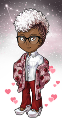
I love pastel and Im so glad it came out but I will admit the colours for a pastel line are very washed out the gray overtakes the rest of the colour. I might have to unfortunately pass on most of this the hair is where its really noticeable. As someone said before artists have different tastes but I do think they needed to play with the colours a bit more and make it more vibrant, its a lovely set that would look great with a bright background, I just really think we need to take a look at the shading since it ruins the hair most definitely.

big agree with Rakumel... i love this style but it still has that dingy gray look to it... the shading is just too harsh, unsaturated, and looks like a straight reduction of brightness without shifting the hue on the color wheel at all. some of them may look fine on their own, but on the avatar base and combined with other wearables, the grayness really shows. especially those hairs, i just can't make sense of them...
Can we have a few more retirements please? The shop us always completely clogged with junk


Ouch, price gouging hit hard and fast on the retiring lines :( Thankfully I only needed a few pieces.
i never used to be a fan of pastels and pinks but now all i see is layerability (you've ruined me subeta). i see the stockings and the striped shirt and just want to make a twisted jester...maybe once i get enough of the pieces anyway. c'mon Esmeralda, drop me some more of those Invites!
Nice to have new stuff. I don't like pink or pastel stuff in general so glad I don't need to get any of these.

This set is much too pastel and ruffly to be my cup of tea, but I do really like the eyes and cloud jacket!

I dearly want to like this set, it's well drawn. But it's got that gray shading and I just...can't. I'm sorry. :c The clothing's not so bad, but the wigs especially look very murky. I mean, if that's the look we're going for, then never mind the rest of this comment and carry on. But I really want to encourage the artist to please experiment with some different colors for shading, if they haven't already.
I don't mean that in a negative manner, by the way. It's just that this is not the first time I've seen people criticize the gray shading and I think it's a valid point. On one hand you can always say it's a matter of taste - art's subjective after all, and there are also plenty of people, their opinions just as valid, who don't seem to mind the gray. And true, pleasing everyone is impossible. XD But on the other, trying different things is good for artists of any level because that's how they refine their style and it's a way to improve overall.
If keeping this style as-is works for enough people, cool. Keep on keepin' on. But don't completely tune out the criticism either, as long as it's specific and constructive - please consider it.


both hairs have way too much gray/black shading which robs them of their pastel colors and makes them look harsh D: pity because I love the theme
I really, really, really love these items, but I wish you guys would pay more attention to matching colours across lines, because while the pink matches my beloved Celeste items from this year's Steamworks set perfectly, the blue is off, and those items would be so perfect together. Some of them still are, but it would be nice if the whole set matched.
Still buying everything. It's My Aesthetic.
Still buying everything. It's My Aesthetic.
This set has some really cute pieces and others (like the wigs) that are in need (as other users have pointed out). Sadly I wanted to love it all but could not love it all. I do love the socks though - both pairs are very nice indeed! ^^ I also loved the eyes and bow tie shoes!
The items are nice, although I kind of wish the had a bit more of the pinkish color that does. But still cute ~


Love the 'I can see clearly now' reference in the description of <3
Wish you all a bright, sunshiny day!
Wish you all a bright, sunshiny day!
Now that you mention it, they do look like the trans flag! Wasn't there a SubQ line with a similar color scheme by the way?
I guess we'll only know if it was intentional or not from the artist who drew these items then.
Amber
STAFF
just fyi: I didn't make the trans-flag colors connection until after the news post, so the pride bit isn't about that! I legit was just like U WEAR THOSE RUFFLES YALL
I don't think the trans colours are an accident. The news post even mentions pride.
So, does this mean Royale is trans like Mimi Moe is? (I don't even know what their gender is, I'm assuming female because this new line is very feminine). It's just interesting to have lore about the subq designers even if we never see what they look like.
So, does this mean Royale is trans like Mimi Moe is? (I don't even know what their gender is, I'm assuming female because this new line is very feminine). It's just interesting to have lore about the subq designers even if we never see what they look like.

Oh wow that's adorable! That'd suit my HA's style so well.
Now the difficult part is to actually get these items lol!
Now the difficult part is to actually get these items lol!