A huge endeavor (revamp)!
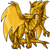
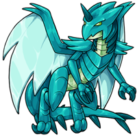
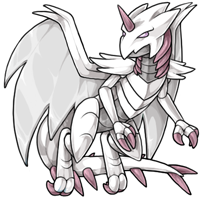
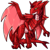
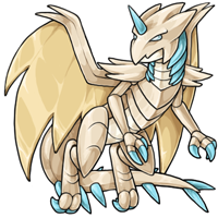
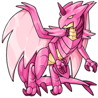
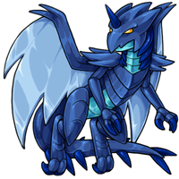
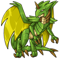
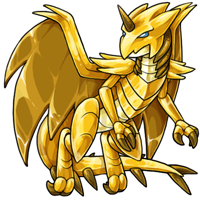
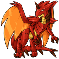
The endeavor has been revamped! We've tried to keep it close to the old one, and just update the lines and colors to better represent our palettes. We hope that you enjoy your new robot overlor....uh, your new pets!

Posted by SubetaTeam
Load this on 🆕 Kumos site

NeonDinosaur
I kinda liked the old art better but I don't even have one of these pets

These look really good-- the shading is excellent and while, yes, they're a tiny bit less pointy, they're still VERY pointy.
The eyes look a bit crankier than before which is kinda :/ but that's my only complaint! They really are lovely.
The eyes look a bit crankier than before which is kinda :/ but that's my only complaint! They really are lovely.

Art wise it is objectively good, but it looks way too friendly and harmless due to the rounded shapes. So I'm kind of sad it doesn't perfectly fit my character/pet Ninth anymore.
If I'm not mistaken, it seems like a trend to make the new art always rounder and softer, but I think it would be more interesting to have more shape diversity in the revamps, as to convey different personality types.
If I'm not mistaken, it seems like a trend to make the new art always rounder and softer, but I think it would be more interesting to have more shape diversity in the revamps, as to convey different personality types.

@ForsakenLykaios
lol... you tealize people cringe at the graveyard/bloodred/etc pets because they're horror themed pets, right? not because they don't agree with the art style? just because other people negatively comment like you on other releases do doesn't mean it's okay either. just because no one says anything doesn't mean it's fine to do. and you aren't the only one on this news post to be this way either - that's why I never pinged you directly, because even though I quoted you and commented, it was to ALL the pointless negative comments.
your comment literally added nothing, whether you think your comparison was accurate or not. because telling chevy or ford to be more like the other means absolute zero to them.
other people DID comment on the rounded edges but you know what they did? they either talked about them in a respectful way (ie "I understand it had to be done for a more updated look"), they found they actually liked them, or they at least briefly mentioned what they thought could be done to better the art if it were to be edited. you did none of these. you cringed and made a somewhat obscure comparison to two american car brands that many people didn't get -- whether we aren't car people (like me, I can't tell the difference, partially due to a mental issue with memory and recognition) or just straight up don't even know the brands at all.
in order to prevent further issues (as I've already made my point), I'm bowing out of the conversation. I ask you - and all others - to be considerate of the people behind the art, please.
@Malachi BTW, how the hell is saying its "bubbly" an /insulting/ word? Its not boxy, its bubbly. Its a descriptive word, not an insult.
My god y'all. All I was getting at was the fact that it went from being more Chevy style to more Ford style.
Not talking shit on the artist. Just because someone doesn't like something, does not make the artist bad. It's ones preference.
Someone can absolutely love the vibrant pets and others absolutely can't stand them. Or some love the angelic peaceful critters, but they come across a bloodred or graveyard critter and they cringe.
That doesn't mean the art is bad. Just means that particular person has a different thought on the matter.
And yes I cringe to the more bubbly version, many others are not too keen on the more apparently insulting word, "bubbly" appearance.
As about has pointed out, more and more of the revamps are being turned out with less sharp points.
So I'm not the only one that thinks that.
@Malachi
Love how you think "I think im being funny and witty". When it's just a comparison... A reference. Anyone can look up Chevy and Ford and clearly see the difference in the more sharp contour of Chevy or the more rounded bubbly of Ford. I'm not the only one that's pointing out the fact that they are so rounded out.
Also, didn't know it was considered to be"funny or witty" to give ones opinion.
Don't like my opinion, then move on to the next.


Endeavor my beloved <3 they look so nice!
Ah yes.. time to continue my endeavors for endeavor collecting! One of each color lessgoooo
Ah yes.. time to continue my endeavors for endeavor collecting! One of each color lessgoooo
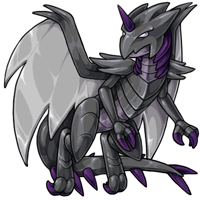
I did the old revamp and have to say, happy to see the endeavors getting a fresh coat of paint. :) The old shading was really grey so nice to see it more vibrant and dynamic. (Now hoping someone updates the Illumis...lol)
a great revamp! this revamp makes the endeavor appeal to me - so thank you for this update! i especially love the silver and nuclear ones. shiny
Dang, all the revamps are much-needed improvements, but this one in particular is SUCH an upgrade!
The Endeavors feel so organic now- far more creature-esque than before. Totally loving the polished highlights, too~
The Endeavors feel so organic now- far more creature-esque than before. Totally loving the polished highlights, too~
[Staff] Feel free to throw a party when you hear this, but I have absolutely no problems with this revamp! I'm glad you guys have learned from experience about the line art and trying to keep it as close to the original as possible to avoid upset, though ironically enough, I do think that the tail spikes could have been rearranged a little as they kind of don't make sense where they are. lol But aside from that, no complaints. And it's the first time in a long time I have to agree with those saying others are nitpicking, because they are. The dragon still looks sharp, it's just softer line art that's throwing you off. Maybe they could have circumvented that by making it more shiny looking but I actually love the sheen on the wings and love the new headshape. The horn is coming out of the forehead properly now instead of between the eyes. It also looks more serious, more mature, and more in line with the new art style. A++
Wowowow these are absolutely gorgeous! Very pleased I've got one already, saves me the trouble of deciding who to change into one lmao. Absolute baller improvement, huge kudos to the artist!
They definitely were due for a revamp. It's nice artwork, but I do prefer the sharper look of the old art.
These look AMAZING!! I'm so happy the default colors got these beautiful revamps and look like the more modern endeavors!! They look fantastic. Always a hard disagree that robotic stuff should always be extremely angular with super sharp points. I think these ones look more uh, "realistic" in a way, it just looks entirely better and like they won't shred everything they walk by, LOL. 20/10 amazing! So happy for the endeavors!! The Sun is absolutely my favorite, it's GLORIOUS!
I love the revamp! The shine in the wings is particularly good, I think, especially on the gold, where it looks like it is actually made of gold metal. Personally, I don't really notice the 'less robotic/less sharp' aspects some are talking about; I still think they look very much robotic. I do still love the old ones, but the new are definitely beautifully done.

Omg, I did not expect that scared emoji to come up in my previous comment. I meant to just use a happy gasp.
They got buffed and shined! :-O
I really like that this keeps the same pose as the old art. It's truly like a revamp instead of a rework.
@Capricious_Fairy Your cookies might still have the old images loaded from before the update, so if you delete them the new images should show. Subeta is showing the new art on my end.
I really like that this keeps the same pose as the old art. It's truly like a revamp instead of a rework.
@Capricious_Fairy Your cookies might still have the old images loaded from before the update, so if you delete them the new images should show. Subeta is showing the new art on my end.
They all look so Shiny and new! ;) lol
I can't really tell Exactly the differences, but I can tell there is something sharper about them. Nice work ya'll! ^_^ <3
I can't really tell Exactly the differences, but I can tell there is something sharper about them. Nice work ya'll! ^_^ <3
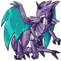
Personally I prefer the sharper look, too, but that's such a small detail in what's otherwise an overall improvement, and it doesn't really seem like a design change so much as a slight difference in style. The artist did a good job in keeping it faithful, which is something I personally don't care so much about, but many people do so it's good to see when artists take that into consideration. Also I'm glad the silver actually looks metallic silver and the gold actually looks metallic gold, unlike many pets of those colors (though in this case ALL the colors are metallic).
Since it got brought up: my little jab with "chevy vs ford" was not meant to say "you can't have a negative opinion about the revamp" but rather "please provide something of value if you're going to be negative regarding the revamp, rather than making comments that contribute nothing other than likely bringing the artist down".
this is a common issue I've seen on subeta through the years and it will never not grind my gears. if you're going to criticize then be helpful. contribute. say something to better the art, rather than treat the artists' work poorly. they already get underpaid I can assure you that. this is a virtual pet site where the entire staff is working more out of passion than for profit and I can't imagine it feels great when even one user comes out the woodwork to cringe at your art and put you down for it.
stop treating the artists like shit and start giving them feedback if you don't like what's being put out. saying you hate something or it looks weird/ugly/bubbly/(insert other insulting word here) just makes you look like a whiny child and not an adult who can properly communicate what they think could be better.
I've said it before and I'll say it again: Subeta's artists will never get paid enough for this.
loving these revamps. a little annoyed at the nitpicking around the 'less sharp' lines and less robotic look. i get it's supposed to be a dragon and robot type of pet, but not all robots are sharp & pointed. not anymore. its SUCH a small detail thats not worth debating over- i just see it as a symptom of the updated subeta art style. and i'm fine with that. kudos to the artist for doing an awesome job :) endeavors were never my favorite but i can appreciate them a bit more now

ahhhh i've been hoping endeavors would get revamped!! super excited, they're looking so cool now! :D

I really enjoy more subtle revamps like this. The shading is a huge improvement, and the pose and attitude are pretty loyal to the old version. I especially like the more narrowed eyes. While there are areas that look more soft/rounded out, the old eandeavor had thicker lines (the sides of the wings and claws) that likely contributed to this.
It's fine to not like something, but it'd be a lot more productive to give constructive feedback that's relevant to the art at hand.
It's fine to not like something, but it'd be a lot more productive to give constructive feedback that's relevant to the art at hand.

@GLaDOS
I think for me, it's not disparaging someone not liking the art. Everyone is entitled to their own view, and there have been plenty of revamps that I and others don't like.
However, there's constructive criticism, and then there's "Chevy vs Ford". It doesn't help frame what you don't like, or changes you'd like to see, or actual critique. It's just lazy negativity.
Tbh I'm not a huge fan of the softer look most of these revamps have had lately, but the art is superb regardless of my particular aesthetic tastes.
I do think that jumping on people for being snippy about not liking the design ("chevy vs ford") is a little unpleasant to see, since everyone's entitled to their opinions and there's no need to white knight the artist when most of these comments are full of support and there's no guarantee that everyone will like something.
I do think that jumping on people for being snippy about not liking the design ("chevy vs ford") is a little unpleasant to see, since everyone's entitled to their opinions and there's no need to white knight the artist when most of these comments are full of support and there's no guarantee that everyone will like something.
Wow, I don't have an endeavor, but this revamp almost makes me want one! (maybe I'll get one during Masq...)
I love that y'all kept the same feel and personality it had before, just with updated art. Very nice revamp, thank you to the artist! <3
I love that y'all kept the same feel and personality it had before, just with updated art. Very nice revamp, thank you to the artist! <3


Aaaaaaaaaaaaaaaaaaaaaaa they look wonderful!! Thank you for keeping the original pose, I love that the integrity of the original design was maintained and improved upon <3 And good gosh, well done on the shading, they do look shiny AF ♦
Here's me regretting re-homing my only endeavor years ago.... The metallic sheen on these are so lovely now!

Endeavors are one of my favorite pets on the site (I have a whole gallery dedicated to 'em!) and I ADORE this revamp. Its personality and feel is totally intact, and it looks much more keen! While I do like the sharpness of the previous art, I disagree that it looks less robotic for being a little rounder. Instead, it looks like the newest generation of bots, built with better and more precise machinery!
Ooooooo. I'm excited to see if/when the rest of his variants get updates too. Because now it's just so shiny & I love it. Also, it's much easier to notice the little details. Like the unicorn horn I just straight up never noticed 😂😂
YESSSSSSSSSSSSSSSS
they still look scary, they match the existing redraws in terms of proportions, and they're S H I N Y
they still look scary, they match the existing redraws in terms of proportions, and they're S H I N Y
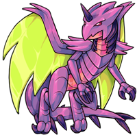
Gotta admit, the 'roundness' doesn't bother me a ton. It's still clearly supposed to be sharp to me. I like the Vibrant!
echoing the sentiment about these shiny new lads looking very snazzy ... however the spikes, claws, and horn don't look as sharp as they do on their predecessors. the tips are rounded off a bit too much. the detail in the wings is fantastic and the shading on the chest plates is gorgeous.

Overall I think the new revamp looks good. I really like the added definition in the wings. However, I like the horns and tail spikes on the old one better. It's the same complaint I have had with a lot of the new weapon revamps, instead of looking like sharp pointy metal, they look more like plastic/foam and soft.
I love how the nuclear one has glowing eyes, kinda wish they all had glowing eyes!
It's a great update! <3
It's a great update! <3

What a lovely revamp! I think the artist did a great job updating the pet while preserving the feel of the original!
Awww yus, this is a revamp done right. Exact same spirit, just more polished. Almost tempted me to get one.
i always loved the old endeavor art, but this revamp is absolutely gorgeous!! the soft metallic shading is especially nice! <3
they look so much nicer, the updated color palettes and metal shading especially.
@ForsakenLykaios
i would love to see your upload your artwork as well, maybe we can all offer you some similar constructive criticism. :)
@ForsakenLykaios
i would love to see your upload your artwork as well, maybe we can all offer you some similar constructive criticism. :)
I love the new revamp, and would love to see a similar revamp of the current Reborn Endeavor in the future!
this looks SO GOOD omg???? I didn't really want any before but now,,,,,, unholy sobbing because I don't know which pet(s??) to change... 🥺
also "chevy vs ford" lmao just say you hate the new art and go, stop trying to act like you're being so funny and witty and relatable. or, you know idk maybe, give legitimate criticism to help the artist out so the things you say have any actual value.
also "chevy vs ford" lmao just say you hate the new art and go, stop trying to act like you're being so funny and witty and relatable. or, you know idk maybe, give legitimate criticism to help the artist out so the things you say have any actual value.
Oh wow the rendering (shading + highlights) on these is such a massive improvement! I was actually wondering when Endeavor would get an update (you can tell by the thicker line-art it had some catching up to do- xP) and this looks so cool! I know the lines are less sharp and people are gonna miss that but overall this is such a huge upgrade :O <3
I love the new update, however the less sharp lines make them look less robot, especially in the body.
I love it! Not that the old one was bad, but it definitely looked a bit dated. I do agree with another comment saying that the slightly less sharp lines are a little less robotic-looking, but I personally think the updated shading more than makes up for it, as it looks beautifully metal-y now.
Omg finally!! I always liked the design of this species but never wanted to create one because of the olde art(I don't like any of it), I think it is time to revisit my list o pet projects :)
Oh my god this is amazing!! It’s so close to the original so it doesn’t disrupt but you can see the improvements ❤️ Great work to the artist!
I really love the update. It looks like the same person did these after a lot of growth as an artist. Keeps most of the original charm but more modern looking artwork. Really well done!
I really dig the update. The old one was nice, but it had slightly more of a plastic vibe to it. The sheen on the new ones is just really nice and metallic-looking. :eyes: The silver one is so shiny and chrome.
Awesome revamp! I need an actual army of these. I have three but they're all either special poses or have a custom overlay.
Interesting. My top battle pet is a silver and I also have a sun. But 2 of my others are dark matter and blacklight. Will those get revamps also?
I don't mind the revamp.
The older design was a little sharper, which was nice for the robotic element. So I wish the new didn't have as many curves at the ends (eg, head, shoulder, & tail points.)
But the new art is lovely, with very nice colors.
The older design was a little sharper, which was nice for the robotic element. So I wish the new didn't have as many curves at the ends (eg, head, shoulder, & tail points.)
But the new art is lovely, with very nice colors.
i absolutely adore how the artist (sorry i don't know who it is!) managed to keep them so close to the originals while absolutely knocking the lineart out of the park. great job!
I was afraid of these guys getting a revamp, but I love the subtle update! You really get that made of metal vibe from them now. They are the shiny overlords we needed. Thank you!
I have to admit, I was concerned about how the revamp will look (and it certainly needed it!) but it looks amazing! The wings are perfect and the updated shine is superb! I do think the eyes are a little too narrow but it does go well with the robotic aesthetic. Great work!


They honestly look so cool?? I really adore both the revamp and the old ones, both are equally good.