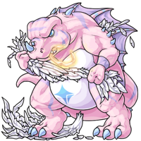
Angelic Mortiking Revamp

Posted by SubetaTeam
Load this on 🆕 Kumos site

LilyValentine
He's perfect.

I think the new one actually looks angrier than the old one. The old one looked more like '**** this, I'm too cool for this sh*t' to me. The new one looks angry at what had happend to him, in my opinion.
Pretty revamp. :)
I just wish the halo was a bit better visible as I have a hard time telling where it even begins and ends.
Pretty revamp. :)
I just wish the halo was a bit better visible as I have a hard time telling where it even begins and ends.

I would like to thank the artist for this wonderful revamp. I was worried about this guy changing too much.
I had chosen this guy to be my pet to honor my nephew who, besides being born at 27 weeks, had refused to be an angel and is now a happy 13 year old :)
Im so glad the attitude of the pet didnt change :)
I had chosen this guy to be my pet to honor my nephew who, besides being born at 27 weeks, had refused to be an angel and is now a happy 13 year old :)
Im so glad the attitude of the pet didnt change :)
shrug
i like it. feels more dynamic than the previous one. and chunky mortikings are better fight me
i like it. feels more dynamic than the previous one. and chunky mortikings are better fight me

Well it must be a cold day in hell because I don't have a problem with this revamp. I think there's some truth in that the bite on the halo and wing structure could be improved but the feet? Can't agree with that one, nor do I find the former all that game breaking. I honestly don't miss the red markings or eyes because if there are two colors that don't go together, it's that shade of pink and red. I do think the glow gives the Mortiking this really pronounced jowl that isn't there in any of the others but again, none of these warrant a revamp in my eyes. A+
To address some of the others when it comes to criticism:
1) Criticizing is not nitpicking nor is it rude. Do not gaslight/shame critics into silence please.
2) If you're going to criticize the critical on doing it right, you might wanna do it right yourself.
To address some of the others when it comes to criticism:
1) Criticizing is not nitpicking nor is it rude. Do not gaslight/shame critics into silence please.
2) If you're going to criticize the critical on doing it right, you might wanna do it right yourself.

you can always count on the comments in the revamp news posts to redefine the lengths to which nitpicking can be pushed, lol.
anyway, i always liked the angelic pose for mortikings, glad they finally got an updated look.
anyway, i always liked the angelic pose for mortikings, glad they finally got an updated look.
Angry Pastel Chonksaurus is my aesthetic! Been waiting on this revamp for sooooooo long <3

People are saying there's mean comments, but I haven't seen a single one. Am I missing something?

"it seems determined to be a trash dinosaur who can't have anything nice."
Excuse me I don't appreciate being called out like this.
Excuse me I don't appreciate being called out like this.

This is the ideal male body. You may not like it, but this is what peak performance looks like.
lol ppl trying to critique & thinking "x looks bad" is proper crit
nah, learn to crit properly before using it as an excuse to be rude & condescending
in other news i love the colors on this boi! (:
nah, learn to crit properly before using it as an excuse to be rude & condescending
in other news i love the colors on this boi! (:
WOW! I myself am a major artist and that one is PERFECT, seriously! The colors, the mood, the pose and everything... is just RIGHT! Well done!
I'm an artist myself, so please don't think I'm being rude, etc.
I like the color scheme of the new one, but the old one still has more personality. You can literally see the rage in it being Angelic whereas the new one is kinda like, "I don't really think I like this".
To make the new one better, I would suggest lowering the tail some as whenever animals lower their tails, it usually means they aren't happy. Make the pointy back spikes, well, pointy. As that small detail gives off a more rage type of vibe. I personally do prefer smaller feet and red eyes, but that's just my opinion. I think the legs being at two different angles further add to the story of the rage because it suggests that he is about to stomp on the wing in his hand. The new one has both legs facing the same way which sort of makes it feel like he is caressing the wing.
I also do agree with the other critiques mentioned. Oh and I don't know the current staff artists now, but artists are trained to assess all sorts of critiques, especially if they go to art school. It is up to them whether or not to take it and improve upon it. Honestly, my time in art classes in college taught me to distinguish between criticism and outright hatred. I'm sure if the staff artists are good enough to be hired, they are good enough to understand the difference between criticism and plain troll comments.

i'm torn about this revamp
on one hand, the lineart, colors and lighting are obviously much improved over the original. it's very smooth and pleasant to look at, and it definitely matches the quality of the other revamps. the dents in the halo are also a nice touch, and i much prefer the pastels to the previous color scheme.
but on the other hand this new pose is very, well... posed. i get the unfortunate and very distinct impression that the body was drawn first and that the wings and halo were added in after the fact, namely because there's very little actual overlap between the wings and the limbs. the halo has two teeth sort of barely keeping it 'inside' the mouth (where the old version is clamped down hard enough to distort its shape), which makes it seem less like it was 'meant' to be there. the way the feathers come out of the right (->this side) fist don't look like they're actually coming out of the fist, but from behind it.
it's not a bad revamp, but it has lost quite a bit of the sense of motion and distinct anger/frustration that made the angelic mortiking visually distinct.
i also think that people pretending critique is the same as a unilateral hatred and lack of gratefulness for art is very... silly.
i'm a visual artist. i went to school for visual arts. the most frustrating thing for me is and has always been when people tiptoe around saying what they actually do and don't find successful about my work in favor of 'praise' that doesn't say anything more in-depth than a Good Job! sticker. artists need critique (and specific critique, at that) to develop their skills. the whole point of doing art is that you're always learning and always working to improve. a couple people saying 'actually, i don't think [x] works because [y]' in a sea of 'i love it! :)' isn't nitpicking, it's literally a part of the process.

Nooo ;-;
The revamp is good but it lacks the personality and colors I loved so much from the old. Now I'm going to have to change my old boy. D:
The revamp is good but it lacks the personality and colors I loved so much from the old. Now I'm going to have to change my old boy. D:
Nice revamp, and one that was sorely needed. Got some mass now, and I love the little detail of teeth marks on the halo XD
I prefer the more dynamic pose of the old one, but I don't see any other problems with the new art. Then again I've never really been a big fan of the Mortiking anyway so I don't really care that much.
"it seems determined to be a trash dinosaur who can't have anything nice"

In all seriousness, lovely revamp! I loved the old one quite a bit and I liked the sleaker body, but this one is much more consistent with the rest of the species, especially since the species was revamped many years ago lol. Definitely tempted to get one of these cuties someday, though.
In all seriousness, lovely revamp! I loved the old one quite a bit and I liked the sleaker body, but this one is much more consistent with the rest of the species, especially since the species was revamped many years ago lol. Definitely tempted to get one of these cuties someday, though.
imagine thinking your opinion is so crucial, you justify being condescending and rude. y i k e s
Gonna miss the old one ... But I do like the new one in some ways ... as a trash dino.
Trash Dino needs to be a forum title!
Trash Dino needs to be a forum title!


While the art quality is generally better, the old one gave me the impression that it was breaking the wing over its leg, while this one looks like it's just wrenching it like a rag, so I'll miss that look.
Trash dinosaur who can’t have anything nice is also my professional title. Diggin this absolute chonker and his leg day routine.
the art looks fantastic and who are we to judge or be nitpicky if he has a little more squishy chonk than the other morti's. good job artist!
And I have no idea by what you mean people are angry lol. Everyone here is chill. In fact, most people are taking to this revamp pretty well considering how long awaited it's been. Believe me, I've seen worse. This is as tame as a house cat.
@Memento_Mori
Welcome to the real world sweetheart. It's one thing when it's a comment of just "this art sucks" and left at that; it's another when we want to help other artists improve on their work. Anything you put out there is open to criticism, whether you ask for it or not. Let me stress that again: whether you ask for it or not. If you're good at what you do, you learn to be open and receptive to critique. If you're not, you're going nowhere. How can an artist learn to improve if they're missing some of the finer details here and there and nobody is allowed to point that out, only ever compliment good things?
Welcome to the real world sweetheart. It's one thing when it's a comment of just "this art sucks" and left at that; it's another when we want to help other artists improve on their work. Anything you put out there is open to criticism, whether you ask for it or not. Let me stress that again: whether you ask for it or not. If you're good at what you do, you learn to be open and receptive to critique. If you're not, you're going nowhere. How can an artist learn to improve if they're missing some of the finer details here and there and nobody is allowed to point that out, only ever compliment good things?

Personally I really like this new revamp, and it also has the feel of some mid-retro Subeta art too (in a really good way!) from how soft the linework is on this one. So it still keeps a retro look for those who were a fan of Subeta retro art (which I can totally relate to, being with Subeta for over a decade as well).
Also I just wanted to get this off my chest.. every time a new pet comes out, I feel so bad for the artists that people always have to critique them about it and tell them to take their time etc.. Just because it's not perfect (perfection is impossible to obtain for one thing) doesn't mean they're not taking a long time on the picture and worked hard to make it good.
Being an artist myself I can imagine this could have easily taken them a few hours to produce!
Not to mention, they may even be getting underpaid for drawing it at all.. I'll bet they're more doing it as a labor of love as it is.
I know sometimes we get angry when our favorite pet suddenly gets revamped, such a thing has happened to me quite a few times over the course of me being on Subeta too. But I personally really appreciate that the artists always try to make sure they make the pet in the same concept, and in the same pose as before, now. (This wasn't always the case before, and admittedly that did sometimes upset me and make me have to completely redo a pet).
Ever since this new revamp approach was made, I was never upset about it anymore and I can even appreciate the pets getting redone. This seems like a fair middle-ground to keep the site up-to-date but keep people's cherished pets, stories and art of them etc. in tact and relevant.
Just because a few people don't like the revamp, doesn't mean that there is even anything truly wrong with it - as they say, you can't please everybody.
So anyways, I just wanted to offer my good wishes to them. Good work Subeta Team Artists, keep it up! :)
No offense to the artist, but I don't think they captured the spirit of the old Mortiking well in their new art. It used to be one of my favorite species on the website, but with the Bloodred and now Angelic revamp, I don't think I'll ever have one. The old ones had weight to them, but seemed to be more lean and well proportioned compared to just the fat dinosaur we get right now. I guess I'll hold onto the Magnus as long as I can...
Mortiking refuses to be put in your unwanted pretty angel box. Strong, confident dino knows what it wants, and what it doesn’t.
Crap, my post in response got eaten cause got randomly logged out, ffs Subeta...STOP DOING THAT.
@Blake
Even though the old art is, well, old, you can still see and compare the toes and footpad on the common pose are a bit longer and leaner. The new Angelic one barely has much of a footpad, which might be why the toes or feet in general looks off. Even the subtle detail in the old angelic of the toes curling over the feathers on the ground is lost on the new one as the foot is just awkwardly placed on top of it.
I'm hoping maybe the artist will see this critique and consider making an updated release in the future, as they did with the DM Kerubi revamp and I think the spectrum Legeica with the weird eye. slow down and take your time, both to the artist and Rah, or whoever is responsible for screening or doing approval.
Aww actually i looked at it only a few hours ago and was like "haha i hope they never change it it looks so retro"
I loved the red eyes of mine :/
I am not sure if I like the new look...I have to get used to that...
I am not sure if I like the new look...I have to get used to that...
I AM SCREAMING IRL!!!!! This is awesome, I love the feathers!!!! Thank you so much, I'm totally getting one

A mush needed revamp, looks a lot better now. Only thing I would say, I miss the downward curvature of the held wing, old one looks like he is trying to break it, new one looks like he is hugging it and it doesnt really fit the chomping on halo stomping on wing theme.
@Blake
Tbf, the common one and its colourfills are old as the hill. They were originally done by the artist DNA when they were still part of staff. They're long gone now, but some of their art remains at least.
That's why I tried to pull more of the recolours to show how different the feet have been, since a new artist took over for them. This new Angelic one almost looks like the work of a completely different artist. Note the thin lineart compared to the thicker, bolder lineart of the spectrum and glade ones.
If new Mortis from here on out are gonna rely on the common pose ones, then the rest of the recolour art needs to follow suit, or update the common poses to match the newer art. I honestly prefer the leaner feet than the chunkier feet.
I mean in the sense of this one being a little chonkier, I'm actually loving the same posing revamps too!
Aaaaaaaaah I love that chonky boy!
Really, trash dinosaur, why can't you just accept your new chicken wings.
It looks like a spoiled fat cherub.
I'm ok with no two morties looking alike :O
Really, trash dinosaur, why can't you just accept your new chicken wings.
It looks like a spoiled fat cherub.
I'm ok with no two morties looking alike :O
I have at least been enjoying that most of the recent revamps have been keeping the same pose/personality, just with better art. <3
aaaa I love it! I was really worried he'd lose his attitude in the revamp, glad to see that's not the case ^^ I've said it before, but it bears repeating: I LOVE these more true-to-the-original-art revamps!!!!!! Much better than the revamps that totally change the whole pet!!
My only nitpick is I'm finding it harder to see the halo in the revamp, the lighter lines overall look good but the halo sort of gets lost because of them. Maybe that's just me, though.
My only nitpick is I'm finding it harder to see the halo in the revamp, the lighter lines overall look good but the halo sort of gets lost because of them. Maybe that's just me, though.


> it seems determined to be a trash dinosaur who can't have anything nice.
Maybe his ideal of nice is different than yours, Subeta! #LeaveMortiAlone
Maybe his ideal of nice is different than yours, Subeta! #LeaveMortiAlone
That looks so much better compared to the original. Also, the halo looks less like a nose piercing and more like it's being chewed on now, and the wings look properly torn as well.
Nice revamp.
Maybe the angelic mortiking wants to be nice on it's own way without obvious symbols.
Maybe the angelic mortiking wants to be nice on it's own way without obvious symbols.
Careful with the trash talk, you just ruffled some feathers there!
The revamp is fantastic, especially the details and expression! But brightness overload :O
The revamp is fantastic, especially the details and expression! But brightness overload :O
i was only thinking last night this dude needed a revamp, and today there is one?!
subeta, are you in my head?!
trash dinosaur = good boy
subeta, are you in my head?!
trash dinosaur = good boy
oof I meant to ACTUALLY comment on the art but my brain is dead from sleep - LOVE the (literal) glow up so much, like I might just design a character for the sake of getting one of these now LOL
 -
- 