
Proposed Pherret Revamp!
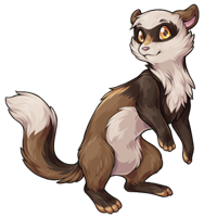
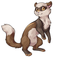
Note: If you had left a comment on the last news post and it isn't found at THIS LINK (google doc), you may need to repost it. Thank you for your time!

Posted by SubetaTeam
Celene
Sometimes I’m not a fan of the revamps but I love this one!

I love the look of the new art, and User not found: syfiri's edits cover pretty much any criticism I would've had (ie; removing the smile, and making the body/neck a bit thicker). Honestly I'm excited to see the revamp rolled out :)


@Batsquatch ~That's absolutely fair.
I was observing some really....non constructive comments, (IE arguments) that seemed to be more combative than anything. That doesn't help anyone, which is why I said what I said. shrugs I usually keep my opinion to myself, but people were being...mean.
I was observing some really....non constructive comments, (IE arguments) that seemed to be more combative than anything. That doesn't help anyone, which is why I said what I said. shrugs I usually keep my opinion to myself, but people were being...mean.

I'm one of those people who dreads revamps, but I like this one. Lovely shading, and the improvement of the anatomy in the hind limbs is very welcome. That said:
P.S. If the time comes to do the DM pherret, please don't change a line of the facial expression; it's perfect.
- I prefer the adjusted head shape in Syfyri's edit;
- I might like to have back a little bit of visible fur separation at the shoulder (it helps sell the pherret's exaggerated back arch, which I've always loved);
- I would definitely like to lose the new golden markings. I realize that they're for added visual interest and to make use of the recolor accents, but it's too obvious that that's the case—the neatly balanced, crisply edged patches of color feel very designed and artificial to me, and as the pherret is one of the most naturalistic pets that undermines some of its appeal.
The toe markings work best, and I think keeping the gold just there and in the eyes would strike a good balance between visual accent and realism. Failing that, the nose snip is better than the back stripe.
P.S. If the time comes to do the DM pherret, please don't change a line of the facial expression; it's perfect.

I don’t have any pherrets but this change definitely makes me reconsider. Personally I think a gradient for the dark colors on the forearms would do them well. The mask doesn’t particularly seem like eyelashes to me, but I wouldn’t be opposed to it being changed to look more like the first version.
One thing I definitely agree with is that I’m not sure on it looking directly at us? I don’t mind it, but it‘s giving “converted neopet” imo. Not something that I would consider a done deal though! Just something I noticed. Overall very creative, and I’m excited to see where it goes!
One thing I definitely agree with is that I’m not sure on it looking directly at us? I don’t mind it, but it‘s giving “converted neopet” imo. Not something that I would consider a done deal though! Just something I noticed. Overall very creative, and I’m excited to see where it goes!
Gonna comment on the proposed design at the bottom so I can end this comment with a positive vibe. c:
But first, I've been reading through the comments, and did an edit based on some of the reoccurring suggestions:
I also added some stuff I personally think would push the ferret-ness a little:
My edit + old colors VS current proposed:


That said, I've gotta say I really like the new art! The pose has a lot more energy and personality to it, and the art is a big upgrade from the old. C: Especially the neck- and tail fluff is absolutely lovely to look at, and I personally like the new markings a lot. My compliments to the artist! ♥
But first, I've been reading through the comments, and did an edit based on some of the reoccurring suggestions:
- front leg moved down, rounder head, bigger mask, toned down cheek fluff, more neutral expression.
I also added some stuff I personally think would push the ferret-ness a little:
- longer back with slightly shaggier fur at the back.
My edit + old colors VS current proposed:
That said, I've gotta say I really like the new art! The pose has a lot more energy and personality to it, and the art is a big upgrade from the old. C: Especially the neck- and tail fluff is absolutely lovely to look at, and I personally like the new markings a lot. My compliments to the artist! ♥
Sorry I got a bit inspired! I took some common critiques from the comments as well as my general reaction and here's what I whipped up in 2 minutes! Again, my goal would be to listen to the critiques of existing fans who don't want the pet to change too much while still keeping the original touches!

Things I changed:
It's totally cool if people disagree :) I just wanted to visualize my previous critique!
Things I changed:
- Added tufts of fur to back and made the ones on the head a bit more pronounced
- Extended the mask to look a bit more like fur and less like eyelashes
- Brought back the iconic Pout(tm)
- Changed the pupils back to their original colour which makes it look a lot softer and keeps the original personality in tact
- Changed the front arms back to their original colour but kept the accent on the paws to match the back paws!
It's totally cool if people disagree :) I just wanted to visualize my previous critique!
Maybe I'm just easily pleased, (then again, I also really hate change) but I REALLY LIKE the new one!! I wasn't too into the Pherrets before. They looked a little too bland or simple, and the lack of expression on their face made them feel empty and uninteresting. The art is still cute, but I dunno. I never planned to get one as they were just 'meh' to me. But this new one!! It's so CUTE and has more personality in the expression and pose...it looks like such a fun pet to have, I'm actually planning on getting one if this goes through! I love the colored toes (why is that so cute??) and I love the long dark arms, just like real ferrets I've seen tend to have!! I'm a little worried there might be changes I don't like, based on the rest of the feedback, but I hope it'll be pretty similar because I really like this!! ;-;

Very cute! Maybe too cutesy? But Lovely, as someone who doesn't have one, the new art makes me want one if they do change.

I really like the new design but I feel like the front paws should have the darker fur more like "socks" than all the way up the arm. It looks a bit strange as it is now, like the arms don't belong.
Otherwise I definitely prefer the new design!
Otherwise I definitely prefer the new design!

The new pose of the revamp I really like. Much clearer use of the negative space and much more lively and confident. I’m kinda neutral on the tertiary yellow stripes, but I’m not mad at them. lol I think the darker markings might be better a bit darker, but I really like the placement of them on the arms and legs. I prefer a more neutral expression, so maybe a smaller smile, but that’s not a big deal tbh. Also… maybe thicker eyebrows, since it’s not the 90’s and these new ones seem a bit over plucked. xD I’m with the mob tho: hate how the mask looks like girly cartoon eyelashes and I think is better either closer to the old design where the 3 points aim upwards, or just make them completely rounded out. Overall, I really like it! I think it’s a solid revamp and the newer teenier paws are adorable.
I said "totally" like 15 times in my comment I apologize, I'm from New York this shouldn't happen.
Comment on the actual pherret to make it relevant: I think people are really attached to the old tail shape and position. I'm really not, but I think if it was smushed up a bit more, the pherret's body itself could take up more of the canvas. Possibly.
Comment on the actual pherret to make it relevant: I think people are really attached to the old tail shape and position. I'm really not, but I think if it was smushed up a bit more, the pherret's body itself could take up more of the canvas. Possibly.
I'm having Tigrean flashbacks LOL But I definitely will say I think huge changes like this you're going to get two sides that will not agree. The thing is people are attached to their pets and their imagined personalities, so huge changes in design or personality in the base design will probably yield some people being very unhappy but also new fans of the pet!
If I were to pick between the two based on design as someone who isn't particularly attached to the pet, I'd personally opt for the old version's design! Here's my general reasoning as an arts student!
Things I like about the new one:
The reasons I still prefer the original:
I hope this is somewhat useful! There will be two sides, some that like it and some that love the original and I hope you can find that healthy compromise :)
If I were to pick between the two based on design as someone who isn't particularly attached to the pet, I'd personally opt for the old version's design! Here's my general reasoning as an arts student!
Things I like about the new one:
- I really like how the fur on the tail and chest look a lot less stiff and more fluid! It feels a lot more organic and moving away from the 'Neopets' like aesthetic into its own identity
- I really like the usage of the darker brown in the back paws! I think it added a subtle hint to the design!
- I enjoy that the ears were kept largely similar in shape! It is a very unique part of the design!
- The updated shading is gorgeous and makes it look so fluffy 10/10 would pet!!
- This might be unpopular but I love the smol patch of brown on the nose and little swipes of fur on the ears!
The reasons I still prefer the original:
- The front paws throw me off a bit being so different than the rest of the body. It's a good accent colour but very overwhelming for an entire body section
- The winged 'mask' on the new one appears to be more like eyelashes rather than fur and it makes it feel very gendered
- The shape of the cream on the tail feels like it went from a very unique marking to a very generic tail marking which is a bit of a shame
- I agree with other comments that the missing tuft on the back of the fur is kind of sad
- I really like the brown pupil of the original! It added a lot of personality and was a lot more aesthetically pleasing
- The huge change in personality is what is sticking with me- Again as someone who isn't attached to the pet, I'd say the most notable thing about it is the smol pout and shy disposition with these gentle eyes, but the smile and black pupils makes it feel like it lost a bit of the magic there.
I hope this is somewhat useful! There will be two sides, some that like it and some that love the original and I hope you can find that healthy compromise :)

Whoa, I love the new design!
It looks very sleek and the new pose gives the impression that the Pherret is more agile and can crawl through any small openings, like a Ferret. I also like how more color has been added throughout the body as patches of fur, that small one on the snout is adorable and gives it more personality. The mask also looks great, love to see how the "eyelash" effect has been kept. This really does feel like a revamp and is a fresh breath of air. It is also more fluffy and cuddly! That tail looks so floofy and soft, as well as not as awkward as the original.
The artist did a great job in capturing this little guy!
It looks very sleek and the new pose gives the impression that the Pherret is more agile and can crawl through any small openings, like a Ferret. I also like how more color has been added throughout the body as patches of fur, that small one on the snout is adorable and gives it more personality. The mask also looks great, love to see how the "eyelash" effect has been kept. This really does feel like a revamp and is a fresh breath of air. It is also more fluffy and cuddly! That tail looks so floofy and soft, as well as not as awkward as the original.
The artist did a great job in capturing this little guy!
I'll try to remember basically what I said in my other comment.
People are saying "the edge of the mask looks like eyelashes that are typically put on Female Cartoon Animals in animated media to make it comically obvious that they're girls", and I think equating that to "it looks like feminine, which is bad, and boys cannot have big eyelashes" is REALLY off base and is not what people are saying.
And to illustrate that I made an edit where I smoothed out the eye mask, and it totally erases the effect/aesthetic. It looks totally neutral because it is an animal. I totally understand why just smoothing it out would be avoided though, since it's part of the original pet's design.

My other feedback:
-I don't think the dark markings stand out enough and I feel like it might be more cohesive if the toes were either the same dark color, or the cream of the belly.
-Having back markings is a great idea but the angle the pet is at doesn't lend itself well to them
-The image doesn't fill as much space in the canvas as the old art which is off-putting. Definitely hard to do with long bois like these noodles, and I do think it's something that would be adjusted to, but the side-by-side just makes it look too far away/small
-A more neutral expression would closer match the original, though that's something that's easily edited so I'm not too worried
-I think a darker nose would be really unique and cute because a LOT of pets tend to have pink noses. But that's just my personal taste.
The design itself I have no giant problems with! I think it's a really nice update to the pet and I'm very happy to see a pet I really love getting attention and design tweaks. I really like that the chest fluff wasn't super overdone like some can be (I love me a floofy chest, but sometimes they're too much). I also love how bright the eyes are and how much they stand out.
People are saying "the edge of the mask looks like eyelashes that are typically put on Female Cartoon Animals in animated media to make it comically obvious that they're girls", and I think equating that to "it looks like feminine, which is bad, and boys cannot have big eyelashes" is REALLY off base and is not what people are saying.
And to illustrate that I made an edit where I smoothed out the eye mask, and it totally erases the effect/aesthetic. It looks totally neutral because it is an animal. I totally understand why just smoothing it out would be avoided though, since it's part of the original pet's design.
My other feedback:
-I don't think the dark markings stand out enough and I feel like it might be more cohesive if the toes were either the same dark color, or the cream of the belly.
-Having back markings is a great idea but the angle the pet is at doesn't lend itself well to them
-The image doesn't fill as much space in the canvas as the old art which is off-putting. Definitely hard to do with long bois like these noodles, and I do think it's something that would be adjusted to, but the side-by-side just makes it look too far away/small
-A more neutral expression would closer match the original, though that's something that's easily edited so I'm not too worried
-I think a darker nose would be really unique and cute because a LOT of pets tend to have pink noses. But that's just my personal taste.
The design itself I have no giant problems with! I think it's a really nice update to the pet and I'm very happy to see a pet I really love getting attention and design tweaks. I really like that the chest fluff wasn't super overdone like some can be (I love me a floofy chest, but sometimes they're too much). I also love how bright the eyes are and how much they stand out.

I prefer the older one and how it fills more of the image and focus. The new one has clearly updated art that looks nice but it feels like it's zoomed out and doesn't really capture the pherret as a pet. It feels like it's shrunk down a little instead which makes it feel like art to go in the background and not the main art for the species. (I also absolutely love the face of the original and unless the art matched it as close as possible I'll always be sad to lose it.)
I know some people were commenting about not really liking the way the edges of the mask looked like eyelashes on the last one. Well, they look WAY MORE like eyelashes on this version of the art.
Quote by @Khaiya:
this is literally a post asking for people's opinions...IF YOU HATE IT...pay for a custom job, and stop making the staff's lives worse.
I love it! I'd maybe change the eyelashes or the shape of the eye mask? It feels cartoonish and sort of gendering. Also, the arms have more dark brown than the legs and it feels a bit unbalanced
I love the new pose, expression and anatomy. The dark brown forearms and chest band are lovely, but they need to be balanced with more dark on the hind legs. Up to the knees at the very least. I'm also not wild about the orangish stripe on the back. Overall Very nice and I'm eager to see how the "special" colors eventually adapt the new markings! (mine are Glade and Hydrus)
The coloring is definitely superior on the new one, but I love the old one's expression. I love the new one's expression, too. (Though as others have said, it DOES look more feminine.) But I love the old one's expression!
I love the proposed revamp! I do agree that the upticking in the mask on the ends is a little distracting and I'm not sure how I feel about the lighter brown -- perhaps making it the brown of the main body would tie it in better, at least on the nose? Overall though, really good! :]
I'm just gonna quickly summarize what I said last night:
Overall, I vote for the new pherret design! I really like it. :)
That being said, I would prefer the face mask pattern to simply be rounded instead of having the "eyelash" upticking. I would also remove the caramel-colored spot on the nose. It feels weirdly out of place and distracting to me.
But otherwise I think it's a vast improvement already and really heading in a good direction! : D
Overall, I vote for the new pherret design! I really like it. :)
That being said, I would prefer the face mask pattern to simply be rounded instead of having the "eyelash" upticking. I would also remove the caramel-colored spot on the nose. It feels weirdly out of place and distracting to me.
But otherwise I think it's a vast improvement already and really heading in a good direction! : D
My only (as of right now) Pherret is potion-ed so it'd probably be a bit before a revamp really affected mine.
Like it's cute, but it sets off that little buzz at the back of my brain that goes 'something is wrong but don't know what'. I wish I could be more helpful :sweat: I do really like Syfyri's non-golden-toes edit though. I'm so sorry, official artist :sob:
Like it's cute, but it sets off that little buzz at the back of my brain that goes 'something is wrong but don't know what'. I wish I could be more helpful :sweat: I do really like Syfyri's non-golden-toes edit though. I'm so sorry, official artist :sob:
Love it but not a fan of the darker shade on legs and placement of this marking. Black footed only would be much better, OR more dark brown so the design isn't broken up by so many shades, which I feel is happening with the solid blocks of color. I also don't think the light brown looks good on the feet.
Love it but not a fan of the darker shade on legs and placement of this marking. Black footed only would be much better, OR more dark brown so the design isn't broken up by so many shades, which I feel is happening with the solid blocks of color. I also don't think the light brown looks good on the feet.
I love the new pose, personally! I also like most of the new markings--I especially LOVE the little spot on the nose bridge.
I will chime in with most others and say I don't like the eyelash-esque markings--not because they're inherently bad, or that eyelashes=feminine=bad, or anything wild like that; they simply give off that "cartoon girl" vibe that others have discussed that feels weird. It makes the pherret seem sort of like a zootopia character or something; it's not bad, just a little off-putting I guess?
I'm also not crazy about the yellow streak/highlight on the back, I think it makes the depth look a little off. I also think the head looks slightly... rounder? balder? ?? just something about the top of the head/forehead area that seems a tiny bit off but I'm struggling to explain, but I think on the old post some others might have pointed it out more eloquently.
I know this sounds like a lot more critique than compliment, but overall I generally like the updated design! ouo)b
I will chime in with most others and say I don't like the eyelash-esque markings--not because they're inherently bad, or that eyelashes=feminine=bad, or anything wild like that; they simply give off that "cartoon girl" vibe that others have discussed that feels weird. It makes the pherret seem sort of like a zootopia character or something; it's not bad, just a little off-putting I guess?
I'm also not crazy about the yellow streak/highlight on the back, I think it makes the depth look a little off. I also think the head looks slightly... rounder? balder? ?? just something about the top of the head/forehead area that seems a tiny bit off but I'm struggling to explain, but I think on the old post some others might have pointed it out more eloquently.
I know this sounds like a lot more critique than compliment, but overall I generally like the updated design! ouo)b
Uhm...what Eyelashes?...its cute...it looks like a ferret..not feminine or masculine...its a weasel/ferret, essentially..they're naturally round faced cute. Dunno why folks are getting so bent about "gender" when you can pick it for your pet anyway... I agree that the gradient on the body and arm transition should be smoother. That's about my only actual comment besides wondering why people are upset about nonexistent eyelashes on a digital animal. IF YOU HATE IT...pay for a custom job, and stop making the staff's lives worse.

Nope. As an owner of ferrets, the older version captures their original character better. New one would need to look more mischievous or have an "I didn't do it!"expression.
Nope. As an owner of ferrets, the older version captures their original character better. New one would need to look more mischievous or have an "I didn't do it!"expression.
I really like it! It's definitely a more playful vibe from the first; I think it's super cute :)
I like the new one just fine. However, the center of balance is off in the new one and it needs a little of it's smile knocked down a notch so it's less drastically happy than the first. < Just my two pennies
the revamp looks great! i'll just drop my 2 cents:
~ too noticeable: the darker color on their arms, like many said before. it's just... there, and even if it's the same color of their "mask", still looks "disconnected" from the body color pattern in general.
~ something minor: the golden coloring on their backs is cute, but looks like a highlight, a shine? maybe if the color is a bit darker or more blended to look more natural?
~ no problems with me, but: the mask is cute, maybe with the ends being less "eyelash-y". more rounded. and that fluff of hair the original has on their forehead, it would be cute to keep it ^_^
overall the pose, the eyes and the face are adorable and they look soo spirited, just want to hug them <3 it's just about tweaks!
~ too noticeable: the darker color on their arms, like many said before. it's just... there, and even if it's the same color of their "mask", still looks "disconnected" from the body color pattern in general.
~ something minor: the golden coloring on their backs is cute, but looks like a highlight, a shine? maybe if the color is a bit darker or more blended to look more natural?
~ no problems with me, but: the mask is cute, maybe with the ends being less "eyelash-y". more rounded. and that fluff of hair the original has on their forehead, it would be cute to keep it ^_^
overall the pose, the eyes and the face are adorable and they look soo spirited, just want to hug them <3 it's just about tweaks!
Could people just comment on the art itself and not bash other people's opinions?
And no-one is complaining about the femininity except the ones that can't see it
And no-one is complaining about the femininity except the ones that can't see it
I love the little stripe on the revamp! Took me a while to notice the darker legs but I do like how it brings the mask together overall. But what I do miss from the older version is how the pale tip is more angled than in the revamp. Something about that tail just speaks to me
All things being said, I am definitely eager for what the Pherret items will look like when adjusted; especially how they're gonna accommodate the stripe. I love that stripe!
All things being said, I am definitely eager for what the Pherret items will look like when adjusted; especially how they're gonna accommodate the stripe. I love that stripe!
Ok gonna repost and say: Love everything about the revamp. I love the new markings and coloration and expression.
However I'm surprised, and not necessarily in a good way, that people think having eyelashes is considered a feminine trait and then also complaining about said 'feminine trait'. 🤔 Weird. Especially from this site.
However I'm surprised, and not necessarily in a good way, that people think having eyelashes is considered a feminine trait and then also complaining about said 'feminine trait'. 🤔 Weird. Especially from this site.
@Blake I took a look at your pherrets and... one doesn't really have a profile yet, and the other you entirely removed the original art from the page and replaced it with a sonic character version of the pherret. I don't really understand why you have a problem with any of the art if you're just changing it anyway, but ok. If anything yeah you should be able to get over it or ignore the changes the way I have with tigreans. But you're honestly not being very kind to me or to your pets so I'm going to step away from this thread now. I feel bad for your festers and any other pets you dump just for art changes when you could easily do what you've already done and made some other artwork appear in place of the official, dumb as it may be to get attached to pixels on the internet. I have a lot of attachment to my pets though and can't fathom doing the same. But since the adoption centers have been empty most of the time when I look, it seems that the pets you abandoned have found new homes with people who are hopefully happy with them, so that makes me feel better about it all. Anyway, I don't think that people's opinions should be dismissed because they don't have a certain pet yet, especially if a change would make them want to have one. You've been pretty dismissive of other people's opinions here too and you've gotten very hostile... I'm going to block you after I post this because you're too intense on this and I don't want to continue this with you elsewhere.
Final thoughts to the subeta team:
I like the revamp full stop. The dark forearms could be shortened a bit in coloration so they match the feet more. The eyelash looking pattern that upsets people could be changed to less resemble feminine cartoon animals (thinking about it tho why are we calling it feminine though? Maybe we need to reframe our thinking of what's a girl and what's a boy. Feminine legit just means pretty/round these days. Anyway I digress) but overall I really like it and will get one if the official revamp looks as good as this proposed one does.
Final thoughts to the subeta team:
I like the revamp full stop. The dark forearms could be shortened a bit in coloration so they match the feet more. The eyelash looking pattern that upsets people could be changed to less resemble feminine cartoon animals (thinking about it tho why are we calling it feminine though? Maybe we need to reframe our thinking of what's a girl and what's a boy. Feminine legit just means pretty/round these days. Anyway I digress) but overall I really like it and will get one if the official revamp looks as good as this proposed one does.
I think I'd prefer for there to be more of a gradient leading up to the darker arms and feet, and as other people have said the mask looks like cartoon girl eyelashes which I don't love.
I don't think the problem is 'appears feminine' i think the problem is 'appears cartoony girly' - on an animal, it's just a little off-putting...
Nah telling me "you'll get over it" is 100% a rude ass thing to say. Being dismissive of other people's feelings =/= being nice or respectful.
@Cinnabun
I won't keep the pets bc there will be no reason to keep the characters tethered to the site in that case. I'll just make them real animals and throw the pets out like I did when they changed the festers from punky vultures to angry eagles.
@Cinnabun
I won't keep the pets bc there will be no reason to keep the characters tethered to the site in that case. I'll just make them real animals and throw the pets out like I did when they changed the festers from punky vultures to angry eagles.
@Blake Perhaps I should have said 'no offense' to start my comment with the way you did to me originally, but I meant no offense. In any case, if you pound your pherrets I think there will be a lot of people happy to scoop them up and take them in and love them. Changes are going to happen regardless of our opinions in the end; the pherret revamp looks more in line with the revamps of other pets like the tigrean I mentioned, and if you want yours to look like the old art you always have the option to use the old art on their pet pages and/or to customize your pherrets the way I customized my tigrean Raiya and will be customizing Kimba once I fully finish his new picture with the old tigrean art for his base. Raiya is based on the old glacier tigrean pose and Kimba will be using the old galactic tigrean pose.
I'm glad other people recognize my initial response to you was not made in malice. I think maybe you're just very invested in this topic, and that's valid, I felt pretty invested in the tigrean too. But like I said, there are ways to get around it if you dislike the changes. Should you have to pay CSC to have older subeta pet style art? No. Is it fair? Maybe not. But the site keeps developing so we just kinda have to accept that changes will happen. And luckily we do have these alternatives in order to help with it if we don't like the transition. I'd suggest investing in morty cards or other free csc cards, using subeta points to purchase them, or maybe try selling some stuff to earn up 500 csc to change each of your pets' art once this change happens.
With all that said, it may not be happening anytime soon. This is a proposed change post, not a "Hey, we changed it now!" post so you still have time before they go through with the proposed change(s) and they may change more about the pherret revamp before they implement it, using our feedback here. Sorry that you took my comment that way, but that was not how I intended it to come off. Good luck with your pherrets!
I'm glad other people recognize my initial response to you was not made in malice. I think maybe you're just very invested in this topic, and that's valid, I felt pretty invested in the tigrean too. But like I said, there are ways to get around it if you dislike the changes. Should you have to pay CSC to have older subeta pet style art? No. Is it fair? Maybe not. But the site keeps developing so we just kinda have to accept that changes will happen. And luckily we do have these alternatives in order to help with it if we don't like the transition. I'd suggest investing in morty cards or other free csc cards, using subeta points to purchase them, or maybe try selling some stuff to earn up 500 csc to change each of your pets' art once this change happens.
With all that said, it may not be happening anytime soon. This is a proposed change post, not a "Hey, we changed it now!" post so you still have time before they go through with the proposed change(s) and they may change more about the pherret revamp before they implement it, using our feedback here. Sorry that you took my comment that way, but that was not how I intended it to come off. Good luck with your pherrets!
i've always wanted a pherret but never got one and i won't pretend the old ass art had nothing to do with that, so i'm in support of some form of revamp
i like the pose better than the old one though
tl;dr: Syfyri's edit is a step in the right direction
- i'll echo the sentiments that the mask looks like cartoon girl eyelashes and i prefer the style of the old mask (and no not because Feminine Bad but because Neutrality Good)
- i don't mind the light colored toes and the dash on the nose but the back stripe doesn't really flow with the rest of it? kinda just looks like weird shading. also the darker markings aren't really dark enough to seem necessary.
- the expression. again, Neutrality Good. not every pet needs to be smiling ):
- the head feels too big and round to me but the old pherret also had a big round head so i guess that's a moot point. maybe just reign in the fluffy cheeks a little?
i like the pose better than the old one though
tl;dr: Syfyri's edit is a step in the right direction
The dark arms and feet are a little weird and off putting tbh but other than that - love the revamp!
Oh this is lovely! I would adjust the mask to have more of a "winged" look like the old mask, though, as it really looks like cartoony eyelashes. Cute as it is, it kinda changes the whole vibe of the face markings.