
Proposed Pherret Revamp!
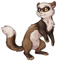
Note: If you had left a comment on the last news post and it isn't found at THIS LINK (google doc), you may need to repost it. Thank you for your time!

Posted by SubetaTeam

skittish
Love the more fluffy tail on the revamp! I also like that you can see the musculature of the arm more, and how the body pose is a little more tilted/off-kilter. But I prefer the facial expression on the original one. I think the more confused/skeptical look is cute and a bit more different from some of the other pets.
The one on the right looks happier but the color & position of the arms is off. I would like to see a little more fluffy.

the current pherret just looks so sad and contemplative and the new one looks so happy and pleased...I can get used to it (the new one is very cute!) but it is a little melancholy for me personally

tl;dr of my comment was: I didn't have any opinion on everyone saying it was "too feminine" because that doesn't bother me, but I am really bothered by the fact that the mask markings look weirdly like eyelashes. Even if the revamp looked wildly masc or something it would still bug me lol. I also wish the head was a little more fluffy/furry looking. I really love the art style and shading of the new one.

the revamp looks more feminine, & more like the popoko. as others have mentioned, the coloring on the front legs seems…random, & off. Prefer the tail on the revamp, but overall the design of the og imho

Having come back to this and looked again, I think I can see where the darker fur on the front legs is coming from... just under the chest fluff, there's a band of darker fur between both legs, right?
I wonder if there's a way of making that band of colour a little more obvious, maybe that's the alteration that would be needed to make the legs look a little less out of place colour-wise?
Personally I don't see the mask markings as looking like eyelashes, so I don't see it as being overly feminine in its appearance.
I'm guessing the lighter goldy shade on the back is a stripe? It looks a little shiny to me rather than a marking... maybe having two stripes, or at least part of a second stripe visible might help it look less like a shine on metal / plastic?
I wonder if there's a way of making that band of colour a little more obvious, maybe that's the alteration that would be needed to make the legs look a little less out of place colour-wise?
Personally I don't see the mask markings as looking like eyelashes, so I don't see it as being overly feminine in its appearance.
I'm guessing the lighter goldy shade on the back is a stripe? It looks a little shiny to me rather than a marking... maybe having two stripes, or at least part of a second stripe visible might help it look less like a shine on metal / plastic?

I don't have a Pherret yet but I would get one if it came in Nuclear...hopefully that color will be added with the release of the revamp. That said, I think the proposed revamp looks great as it is and I'd be quite happy with it. I only have a few comments:
I agree with the comments saying the mask is too "pointlessly-gendered cartoon female" but that isn't really a huge problem since the art would be the same for all genders. I do prefer the larger mask and more upturned fur pattern on the old one and the way it integrates the eyebrows into it though.
The smile could be toned down just slightly to give it a more neutral but still friendly expression.
I haven't noticed anyone comment on this yet so maybe I'm the only one seeing it, but the way the eyes themselves are drawn with the pupils right in the center makes them look really fish or frog-like to me, especially with the gold irises. I looked up pictures of ferrets and didn't see any with that much contrast between the pupil and iris and I guess that's what's doing it, but it gives it this weird surprised appearance. Maybe if it was looking in a slightly different direction it would help with that, or maybe the pupils could be a little bigger, I'm not sure but I feel like that could use a tweak.
I really like the new markings! The tan stripes/toes and darker arms and feet add a lot more interest to the design and make it less flat. It's good to have more patterns like that in the other colorfills too; e.g. the (hopefully forthcoming) Nuclear one would be able to make good use of the multiple greens, yellow, blue, black and white available in that colorway. Otherwise Nuclear ends up just being black with random green splotches and I don't think those are as nice.
I do kind of miss the little tuft of fur on top of the head but maybe that's just part of an older art style we're moving away from. I guess there isn't really a good reason for it to be there and it is sort of an anthropomorphic characteristic (like styled hair), I'm just used to seeing it on pets like this.
I agree with the comments saying the mask is too "pointlessly-gendered cartoon female" but that isn't really a huge problem since the art would be the same for all genders. I do prefer the larger mask and more upturned fur pattern on the old one and the way it integrates the eyebrows into it though.
The smile could be toned down just slightly to give it a more neutral but still friendly expression.
I haven't noticed anyone comment on this yet so maybe I'm the only one seeing it, but the way the eyes themselves are drawn with the pupils right in the center makes them look really fish or frog-like to me, especially with the gold irises. I looked up pictures of ferrets and didn't see any with that much contrast between the pupil and iris and I guess that's what's doing it, but it gives it this weird surprised appearance. Maybe if it was looking in a slightly different direction it would help with that, or maybe the pupils could be a little bigger, I'm not sure but I feel like that could use a tweak.
I really like the new markings! The tan stripes/toes and darker arms and feet add a lot more interest to the design and make it less flat. It's good to have more patterns like that in the other colorfills too; e.g. the (hopefully forthcoming) Nuclear one would be able to make good use of the multiple greens, yellow, blue, black and white available in that colorway. Otherwise Nuclear ends up just being black with random green splotches and I don't think those are as nice.
I do kind of miss the little tuft of fur on top of the head but maybe that's just part of an older art style we're moving away from. I guess there isn't really a good reason for it to be there and it is sort of an anthropomorphic characteristic (like styled hair), I'm just used to seeing it on pets like this.

The new one looks so soft! I'm gonna echo the sentiment that the mask could have more of a "masquerade mask" upward swish to it, though; it looks a lot like cartoon animal eyelashes right now. I'd also like to see the head tuft brought back (it seems to be present in the revamp, but very tiny) because it added a cute bit of personality. I prefer the more neutral/curious facial expression of the old one as well, but that's not a make-or-break thing to me.
Thank you for collecting feedback! I'm excited to see the final version-- a few tweaks could take it from great to perfect! c:
Thank you for collecting feedback! I'm excited to see the final version-- a few tweaks could take it from great to perfect! c:

I really love the revamp. My only issue might be cuz the two are side by side, but the lines being thinner kinda throws me. I just generally like thicker lines

I think @Syfyri's edit covered most of my thoughts, but there is something I wanted to point out to others — the "gloss" people are mentioning, that's meant to be a back stripe marking, not a highlight. So perhaps tweaking said stripe to be more clearly a marking would be a good idea.
Other than that, LOVE this. 🥺 I love the added markings to make it more unique. Though I would also like its forehead tuft back!
And, as a side note (this isn't critique or a jab at anyone), I think it's always funny when eyelashes get equated to feminine traits... when AMAB individuals are naturally more likely to have longer lashes than AFAB. xD;
Other than that, LOVE this. 🥺 I love the added markings to make it more unique. Though I would also like its forehead tuft back!
And, as a side note (this isn't critique or a jab at anyone), I think it's always funny when eyelashes get equated to feminine traits... when AMAB individuals are naturally more likely to have longer lashes than AFAB. xD;
The bottom half of the new one looks alright. I think the neck pose just looks weird to me and the paws, particularly the left, look too fragile and less bulky and "strong" than the current design. I don't mind the markings. I really like the current Pherret though so I am aware I might be a bit nitpicky, but the new one looks very fragile and a bit out of proportion. Granted, I don't know much about how ferrets are supposed to look irl, so shrug.
Super excited for some Pherret affection/attention! Any notes I have are Pretty much what Syfyri has said/edited

It’s a good change, I love it. Only the front paws look a little weird, especially the left one - it doesn’t feel fluffy and bendy (like, relaxed at the joints as they’re softly lifted) enough for me. But overall, I’d take this.

I feel like the face and neck could stand do be a bit more 'filled out'. I prefer the brown nose to this pink one, but that's not really a make or break thing. I like the darker paws, more like a real life ferret, but I don't get the lighter brown stripe on the back.
Oh god these are so CUTE!!!
A bit nitpicky, but it might be nice if the lines were darkened a tad, at the moment they're blurring into the fur colours for me a little bit.
I see where people are coming from re: it looking feminine; the edges of the mask do look a bit like "eyelashes". It's the same basic shape as the old mask but not as curved upwards now, that's what's causing it to read as feminine I think. Personally I think it looks alright BUT I do really like @Syfyri 's edit of the mask, that's perfect.
I LOVE the new markings!! I'm really looking forward to seeing those show up in the other colours. My only problem with them is it does look a bit weird having them go all the way up the arms, I think it'd look better if either the dark fur went down the back a bit more, or the dark fur only covered its forearms.
Otherwise this is looking great! :D
A bit nitpicky, but it might be nice if the lines were darkened a tad, at the moment they're blurring into the fur colours for me a little bit.
I see where people are coming from re: it looking feminine; the edges of the mask do look a bit like "eyelashes". It's the same basic shape as the old mask but not as curved upwards now, that's what's causing it to read as feminine I think. Personally I think it looks alright BUT I do really like @Syfyri 's edit of the mask, that's perfect.
I LOVE the new markings!! I'm really looking forward to seeing those show up in the other colours. My only problem with them is it does look a bit weird having them go all the way up the arms, I think it'd look better if either the dark fur went down the back a bit more, or the dark fur only covered its forearms.
Otherwise this is looking great! :D
I love the addition of more colours. They add opportunities for the "basic" colours to have some pop!
I like the new pose. But I don't like the different color on the legs. I think they should be the body color. :)

I love the new design as it conveys a sense of playful personality. However, there is one aspect that I am not keen on with the revamp, and that is the front legs. The fur coloring in the front legs, compared to the rest of the body, feels off as it clashes with the rest of the aesthetic.
SO CUTE. I think the arms would look better if they were the same color as the back though? Maybe have the arms have the color only on the forearms like the feet are only on the foot and not the leg. And maybe make the eye mask a little less eyelashy? Make it look a little too feminine. I also agree with making the expression more neutral...although I do like the little smile too. Overall though, I kind of love it lol.

it looks cute, though the lines seem a little thin! also i have to admit, i'm a bit.. baffled at how people are saying it's too "feminine". i disagree on that front lol

Its beautiful but looks too feminine.... Perhaps just a simple change of curvature at the outer eyes--instead of the darker brown flaring upwards, a simple rounded outer edge?

Adding a vote for a little too feminine in the facial features. Overall I love it though! Very adorable, and I like the goldish accents.
I love it! It does look more feminine, however.
I personally like the smiley look, but I also like the more neutral look on the original artwork- The neutral look could definitely be more versatile for everyone.
Overall great job though ♥♥♥ It looks sooooo cute & I can't wait to see if there's an official update with all the colors because I will def be needing a Pherret ♥
I personally like the smiley look, but I also like the more neutral look on the original artwork- The neutral look could definitely be more versatile for everyone.
Overall great job though ♥♥♥ It looks sooooo cute & I can't wait to see if there's an official update with all the colors because I will def be needing a Pherret ♥
Reposting since my comment's not in google doc:
I like the update and it's cute, but I think a more neutral expression like the original works better, especially for people that have characters that aren't all smiley. It also looks very distinctly feminine, like when cartoon artists draw girl animals
I like the update and it's cute, but I think a more neutral expression like the original works better, especially for people that have characters that aren't all smiley. It also looks very distinctly feminine, like when cartoon artists draw girl animals
it's a nice revamp. a lot more life to it. that said, i think i would prefer if it had a less personified expression. i know this is QUITE common with pets on subeta, but personally i really like how ferret-like the old expression is.
Overall I really like it! I think it needs to look a little less glossy/shiny, which Syfyri did in their edit and that's my only real complaint. The artist did an excellent job! <3
Love the new art! I think it's absolutely adorable and a huge improvement, and I would honestly be fine with it going out as is. My favorite parts are the very well done fur shading and the addition of a few more markings while still keeping the overall pet simple. All that being said, I wonder if it might be possible for this revamp to push into ferret anatomy territory even more?
Pardon the clumsy edit, as I'm not exactly an expert, but here's my attempt to make this even more ferret like - round the head more; lengthen & thicken the neck; move the curve of the back down (I think the original is fine as well, but ferrets are just so bottom heavy); and shorten the legs, plus thickening the front back leg. I also tried to address the most common complaints I saw from the original news post: the size of the mask fluff (I just tried to make it more like the original mask overall), the expression, and the color of the dark markings.

Also, just out of curiosity, I did an edited version without the new golden markings to see how similar it could be to the original.

Again, though, really liking the revamp a lot! Many, many props to the artist. I had a darkmatter pherret for a very long time, so I'm excited to see what the new one of those will look like after this revamp goes through! :)
Pardon the clumsy edit, as I'm not exactly an expert, but here's my attempt to make this even more ferret like - round the head more; lengthen & thicken the neck; move the curve of the back down (I think the original is fine as well, but ferrets are just so bottom heavy); and shorten the legs, plus thickening the front back leg. I also tried to address the most common complaints I saw from the original news post: the size of the mask fluff (I just tried to make it more like the original mask overall), the expression, and the color of the dark markings.
Also, just out of curiosity, I did an edited version without the new golden markings to see how similar it could be to the original.
Again, though, really liking the revamp a lot! Many, many props to the artist. I had a darkmatter pherret for a very long time, so I'm excited to see what the new one of those will look like after this revamp goes through! :)

Overall, I really love the revamp. It looks so much fluffier!
I do agree with others that the redraw of the mask makes it look a bit too "cartoon female", as they look much more eyelash-like. I prefer the mask shape of the old version, but other than that the redraw is gorgeous!
Thank you for getting input from the userbase on the revamp! I know you won't be able to please everyone, but I love that you're asking opinions.
I do agree with others that the redraw of the mask makes it look a bit too "cartoon female", as they look much more eyelash-like. I prefer the mask shape of the old version, but other than that the redraw is gorgeous!
Thank you for getting input from the userbase on the revamp! I know you won't be able to please everyone, but I love that you're asking opinions.
I love it and its really cute ^-^ but I do also think that the marking above the nose looks too yellow somehow ;o and I have to say that I like the darker brown on the front legs mine had that too <3 (maybe make the brown go a little bit higher on its neck to make it look less weird ) I do also like @Asseas Idea <3
I really love it, except I think the mask should have a bit of a tweak because it looks definitely a little more feminine than it did before, enough that it would annoy me if I had a male pherret. The original had a slightly wider mask with a distinct up-swish at the sides that made it look more like a masquerade mask and less like eyelashes. Personally I think it's fine for the swish to go in a slightly different direction than I would expect the fur to go on a ferret, it is a pherret and maybe their fur turns that way there. My dog has a whorl in his fur on one of his shoulders, so I have learned that fur doesn't always need to go the way you expect and that's okay.
Okay yeah, I like the revamp
The fur looks soft and there's good colour cohesion—although the chest area looks a little awkward? I'm having trouble visualising what it'd look like from different angles, would there just be a dark horizontal band when seen from the front?
The fur looks soft and there's good colour cohesion—although the chest area looks a little awkward? I'm having trouble visualising what it'd look like from different angles, would there just be a dark horizontal band when seen from the front?
I really like the revamp. The new design conveys more personality than the old one and the colors/markings are better.
I love the new one. I do think it would look better with keeping the chest light, and then I think the darker color on the front paws should stop around the elbow area to match the back a bit better; though that may affect the stripes on the back ?
Overall I think the revamp is refreshing and the design has more life !
Overall I think the revamp is refreshing and the design has more life !
The new little pherret is lovely but the arms look a bit strange, I think. Maybe they are too dark
I like the lighter paws, both front legs being visible looks better than the old pose. it's very cute. the stripes are a nice addition. I think it would look better with a darker nose. I saw many people commenting that the face looks a bit human, but I think the old one did, too. it doesn't look particularly more human to me than the first one.
Your artist team is awesome! I bow before this cute little guy (especially since it doesn't look as shy as the other) Thumbs up from me
Trying to remember previous comments lol.
- The change would affect all "color-fills" (arid/sun/etc).
- I think the darker front paws / torso, as it is now, is awkward. If it were more prominent (like a ferret's markings) I think it could be very cute!

Overall this is a great refresh. I was never really drawn to Pherrets before, but this version has so much more personality! The addition of a contrasting color on the paws, back, and bridge of the nose I can see being really helpful in adding dimension/accent color placement across all of the various colors Pherret comes in. To echo a popular sentiment, I think some of the feminine-reading elements ('eyelashes', narrower head) could be shifted to be more neutral. Some of the art of the Pherret that skews newer (Glade, Nostalgic, Sweetheart, Bloodred) have a broader head and the flicks of fur along the outer mask on the face are larger, which helps it from reading inherently feminine.

Will be getting one of these post revamp. Only thing I don't like is the darker color on the front legs. It may be based on real ferret colors but it looks more like shadow without correct light source to my eyes. Would still get one without that being tweaked.