
Proposed Pherret Revamp!
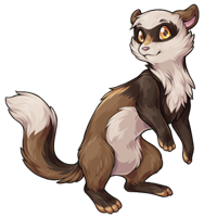
Note: If you had left a comment on the last news post and it isn't found at THIS LINK (google doc), you may need to repost it. Thank you for your time!

Posted by SubetaTeam

@Blake Wow dude, just wow. I saw nothing douchey about the words that Lady wrote. Expressing one's opinion never deserves a knee-jerk rant in return. Dial it back and breathe first, think twice, breathe again, and sleep on it then if you feel the need to bash someone. Finally, be prepared for the feedback yourself.
The revamp is cute, but I prefer the old face. Combined I think it would be great! I do agree with the comments about the forearm colour being slightly out of place with the rest of the colourings though! The pose itself is really fun and has great character ^^

@Blake They weren't even being rude though LOL They were being quite nice about it?? Why don't you just keep your characters as they are if the change goes through? They don't look like eyelashes, who cares, not that big of a deal.
Anyway, I agree with the fact that the markings are lacking on the bottom compared to the top. The dark arms look a little odd compared to the light bottom. I think if the eye mask was changed to a more wing-like shape instead of the short spikes it would probably look better as well. They're really cute though and I'd actually consider owning one now. :)
Anyway, I agree with the fact that the markings are lacking on the bottom compared to the top. The dark arms look a little odd compared to the light bottom. I think if the eye mask was changed to a more wing-like shape instead of the short spikes it would probably look better as well. They're really cute though and I'd actually consider owning one now. :)

@LadyFoxling
If it goes through as is i'll change my pets or pound them, which will be sad bc i actually really quite like (the current) pherrets.
The fact that you're being so rude is 100% of the reason why people who don't own the pet already should have minimal impact on feedback though, wow. What a douchey way to respond!
If it goes through as is i'll change my pets or pound them, which will be sad bc i actually really quite like (the current) pherrets.
The fact that you're being so rude is 100% of the reason why people who don't own the pet already should have minimal impact on feedback though, wow. What a douchey way to respond!

Also I will say, as someone who is gender nonconforming, the opinion that the mask pattern comes off as feminine is surprising to me, lol.
I suppose that "issue" could be fixed if the pattern of the mask looked more winged like in the original--like it curves up past the eyes, or if it was more subtly blended... but weird critique, honestly.
I suppose that "issue" could be fixed if the pattern of the mask looked more winged like in the original--like it curves up past the eyes, or if it was more subtly blended... but weird critique, honestly.

The revamp is very cute however I still prefer the original design. The new one seems too thin and I am not the biggest fan of it looking directly at me like that. I really do appreciate how lovely the color choices and shading are, I just find the original easier to put your own 'personality' on compared to the new one
While the revamp is cute and I wouldn't be mad if it ended up being chosen, I personally like the original. It looks more emotionless (in a good way) and the revamp seems perky (in a weird way).

I think I'd also prefer if the dark coloring on the front legs stopped at the elbows. The way it is now kind of cuts off the upper body and makes it feel disconnected from the rest of the design for me.
Amazing revamp, honestly.
The weakest trait of the previous design was how monotonous it was. Giving the fur coat different colors breaks up that monotony and adds a TON of character. In fact, I felt like we were a little too shy on breaking it up a little more, but as is, it's fine.
I think the only thing that bothers me is the lineart? It seems to come off as a little lighter than our other pets, but not sure if that's just me.
Anyway, love this and makes me excited to see how the other colors for the Pherret will come out. (:
The weakest trait of the previous design was how monotonous it was. Giving the fur coat different colors breaks up that monotony and adds a TON of character. In fact, I felt like we were a little too shy on breaking it up a little more, but as is, it's fine.
I think the only thing that bothers me is the lineart? It seems to come off as a little lighter than our other pets, but not sure if that's just me.
Anyway, love this and makes me excited to see how the other colors for the Pherret will come out. (:
I find myself distracted by the fleshy color on the toes. If it's not meant to be bare skin, I'd pick a different color like the lighter cream already used elsewhere in the design.

I don't like the shape of the eye markings - the darker color makes them look like cartoon eyelashes (possibly on another color, it would be more clear that they're not meant to be eyelashes). I think the darker front legs are fine personally, but maybe if a smaller part of the front legs had the darker coloring or if it were more marbled kind of and not the full front legs being the solid dark shade, it would be more clear that it's due to the coloration of the fur/just having different markings
Overall, it looks very cute though and I want to pet it c:
Overall, it looks very cute though and I want to pet it c:

I like the cute nose marking and backstripe, but I agree with other people on the forearms being too dark. I see the same darkness on the back legs; if the darker brown was shortened for the forearms (more like fingerless gloves style maybe) instead of extending onto the back I think that might be better. The eyemask could also be made a little bigger on the ends so they don't resemble eyelashes quite so much, although I do like them this way personally. But otherwise I think all the changes are great!
My opinion: The fur on the back is too smooth on the new one, I like the old one better for that. I do not like the darker "arms" of the new one. It looks weird to me. And as I've seen others say, the new one looks more "feminine" - my first thought when I saw both pictures was "oh a boy and a girl" lol.
@Blake you'll get over it, the same thing happened to me with tigreans. I am customizing both of my tigreans to look like the old art. So far Raiya is done, I'm working on Kimba. Besides, if you have a specially colored one it'll probably be a while before the art updates for that (ex. galactic or glade) and by the time they do it you probably won't even dislike it. But feel free to make your opinions known. You have yours and I have mine. And I quite like the proposed revamp ^^
also @LadyFoxling
No offense but some of us have had characters based on the old ones for years and it's kinda crappy to imply we can't have any input on the face mask drastically changing to cartoon eyelashes from something less obviously gendered just because you personally like it. Revamps should really be more about improving the art for the people who already own a pet, not totally changing the character of a pet just to please people who don't own one.
No offense but some of us have had characters based on the old ones for years and it's kinda crappy to imply we can't have any input on the face mask drastically changing to cartoon eyelashes from something less obviously gendered just because you personally like it. Revamps should really be more about improving the art for the people who already own a pet, not totally changing the character of a pet just to please people who don't own one.
I love the revamp! I also like the differences in color through the coat.
I really like the thinner linework, also, I think it looks really good!
As for the feminine comments, they're unnecessary in my opinion. It is an animal, and an imaginary one at that. I don't think that its perceived femininity or masculinity should be a matter in this decision.
I really like the thinner linework, also, I think it looks really good!
As for the feminine comments, they're unnecessary in my opinion. It is an animal, and an imaginary one at that. I don't think that its perceived femininity or masculinity should be a matter in this decision.
love the expanded color palette and high detail, especially the softer and more amicable expression. I would agree with others on here that I would like to see some form of transition between the arm's block of color to the rest of the body (kinda like on the feet-- leave the darkened portions to the outer limb segments), but otherwise I'm sold.
@wyrm
My reply to you in the last post also got deleted so it's worth reposting-- this will affect all pherrets, as the non-colourfills will be redrawn/edited to match the marking changes (i.e., the spectrum will get black/dark grey front legs to match the colourfills). It won't happen immediately but the original ones will be removed entirely eventually.
it's why i mentioned the "unbalanced" nature of the markings in my original comment (lots and lots of markings in the top half of the body, almost none on the bottom half)-- with the more pronounced colourfills it's going to stand out a lot more and i think it needs a bit of an edit to make it flow better, although my preference would be for the pherret to remain one of the simpler pets since that's part of what makes them charming to me currently.
My reply to you in the last post also got deleted so it's worth reposting-- this will affect all pherrets, as the non-colourfills will be redrawn/edited to match the marking changes (i.e., the spectrum will get black/dark grey front legs to match the colourfills). It won't happen immediately but the original ones will be removed entirely eventually.
it's why i mentioned the "unbalanced" nature of the markings in my original comment (lots and lots of markings in the top half of the body, almost none on the bottom half)-- with the more pronounced colourfills it's going to stand out a lot more and i think it needs a bit of an edit to make it flow better, although my preference would be for the pherret to remain one of the simpler pets since that's part of what makes them charming to me currently.
I love the revamp! I particularly like the addition of the fur pattern - the different shades of brown on the feet, arms, and back make this look more interesting than the older design. Kudos to the artist for keeping the spirit of the old artwork while incorporating some new extra features. :blush:
I love the revamp overall! The only things that look strange are the dark full sleeves and the connecting chest marking, and the edges of the mask that look like cartoon eyelashes.
The sleeves are discordant with the rest of the design in that it draws too much attention to itself instead of flowing with everything else, likely because it's a large dark area in the middle of the pherret; meanwhile, the chest mark breaks up the underbelly stripe, while nothing else breaks up another pattern, making the chest mark jarring. The mask edges near the eyes look oddly like eyelashes given to cartoon animal women. If they were fluffier again, that'd probably go away, but it's also not a serious issue.
Other than that, the revamp looks playful, energetic, sleek, and fluffy. My regards to everyone involved in this one- this is a good revamp. It doesn't stray too far from the original, but it brings new things to the table, such as the back stripe, the socks and gloves, the lighter toes, and the happy and playful expression. The old pherret looks doleful, hesitant, and a bit plain, but the new one looks bubbly, confident, and eager to take on the world. Thanks for working so hard on this!
The sleeves are discordant with the rest of the design in that it draws too much attention to itself instead of flowing with everything else, likely because it's a large dark area in the middle of the pherret; meanwhile, the chest mark breaks up the underbelly stripe, while nothing else breaks up another pattern, making the chest mark jarring. The mask edges near the eyes look oddly like eyelashes given to cartoon animal women. If they were fluffier again, that'd probably go away, but it's also not a serious issue.
Other than that, the revamp looks playful, energetic, sleek, and fluffy. My regards to everyone involved in this one- this is a good revamp. It doesn't stray too far from the original, but it brings new things to the table, such as the back stripe, the socks and gloves, the lighter toes, and the happy and playful expression. The old pherret looks doleful, hesitant, and a bit plain, but the new one looks bubbly, confident, and eager to take on the world. Thanks for working so hard on this!
Wow that's HELLA improvement, I absolutely ove the new face, the new pattern on the fur, 10/10

Apparently my second post was lost, so I am re-posting it as best I can recall:
The front arms look like it is wearing arm warmers, like they are not part of the actual coat. This is caused by a lack of transition from the dark fur to the medium fur. The arm fur would look more like it is a part of the animal itself if it were feathered more with the medium fur on the shoulder, maybe even have some of that medium fur come into the arm a bit for form a batter transition.
The front arms look like it is wearing arm warmers, like they are not part of the actual coat. This is caused by a lack of transition from the dark fur to the medium fur. The arm fur would look more like it is a part of the animal itself if it were feathered more with the medium fur on the shoulder, maybe even have some of that medium fur come into the arm a bit for form a batter transition.
I've been on Subeta for a bit over 10 years and my only pet is a common pherret. I'm very excited to see the revamp! I love the texture and energy of the revamp! There is so much more motion and personality in it. I can't wait for it to go live!
I was a bit surprised by the darker front legs at first, but the more I look at it, the more it grows on me. I think that will add some new interest to the design, especially when the recolors become available.
I think the current eye-mask looks a bit feminine, like eyelashes. I would like to see the mask reshaped a little, with the swoops curving upward more like the original design.
I might like to see a few more cowlicks or fluffy looking pieces on the head and back of the design. I love how fluffy the chest and tail look!
None of these are game changers for me. If this design took over tomorrow, I would be thrilled! It is so much more lively and good-looking than the original design. Thank you for redrawing my favorite pet and for giving time for user feedback!
I was a bit surprised by the darker front legs at first, but the more I look at it, the more it grows on me. I think that will add some new interest to the design, especially when the recolors become available.
I think the current eye-mask looks a bit feminine, like eyelashes. I would like to see the mask reshaped a little, with the swoops curving upward more like the original design.
I might like to see a few more cowlicks or fluffy looking pieces on the head and back of the design. I love how fluffy the chest and tail look!
None of these are game changers for me. If this design took over tomorrow, I would be thrilled! It is so much more lively and good-looking than the original design. Thank you for redrawing my favorite pet and for giving time for user feedback!

I had the original news post from yesterday still open with a few newer comments than the official google doc linked in this post. Here's a link to the additional comments I had, in another google doc. It goes up to 7:53 pm, but I know there were still a few more comments after that.
I love the revamp, I think it's adorable, and if we get this revamp, I might actually consider changing one of my pets to a pherret!! I've got a few I'm not sure what to do with lol.
I do agree with the front legs being a different shade of brown looking a little odd, so my only real feedback is that I wish the shades of brown were all uniform and consistent. Maybe bringing that different shade of brown up higher on the back legs would help? I love the big, cute eyes, and the light-colored toes, and I love how soft and fluffy yet sleek it looks!!
I do agree with the front legs being a different shade of brown looking a little odd, so my only real feedback is that I wish the shades of brown were all uniform and consistent. Maybe bringing that different shade of brown up higher on the back legs would help? I love the big, cute eyes, and the light-colored toes, and I love how soft and fluffy yet sleek it looks!!
Everyone is complaining about it being too feminine... I actually really like it for that. Feminine = sweet looking, more rounded features, friendly expression, and such. That's not a bad thing. Stop hating on the feminine!!! There are more masculine pets too, LET US HAVE THIS LOL. I think it's lovely and if it ends up being changed to this I'll probably get one! I adore the new version. I can't wait to see the new art for the more specialized potions like sweetheart, angelic, and spectrum!
Echoing many of the thoughts already shared beforehand. But I absolutely love the small changes that @Syfyri added in their edits. I think that many of the body edits I was looking for they addressed, i.e. longer neck, more neutral expression, eyelash mask a little less sharp, etc. I think the only real thing I'd want on top of Syfyri's edit is a slightly fluffier tail and/or adding whiskers.
Looks cute, but the front legs being a slightly different brown looks like a mistake. I'm sure there's a good reason for it, but it just doesn't work.
If I adopted one I'd have to immediately change the color (which would sort of defeat the purpose of getting the new cute Pherret)
Also, the "feminine" comments?? I've never rolled my eyes harder. It's an illustration of a fictional animal - it's not "feminine" OR "masculine." It's an animal.
If I adopted one I'd have to immediately change the color (which would sort of defeat the purpose of getting the new cute Pherret)
Also, the "feminine" comments?? I've never rolled my eyes harder. It's an illustration of a fictional animal - it's not "feminine" OR "masculine." It's an animal.
I don't Love the darker fur on the chest/arms and the one light stripe on the back? (it looks like shine but obviously isnt? its odd)

I love it! I don't have a pherret but I might have to get one after this revamp. Very cute!

Oh what a cutiepie! The personality and anatomy on the new one looks fantastic, it has that ferret-y energy fitting of the species. :)

Big meh for me. I'm not big on that species, so I'll let the people who actually have/will have one decide. With that in mind, new art for Devontis when? :3
And that's all I can think of.