
Fester Poll


Ferrox
OMG I love the new one so much. If this is going to be the new Fester I'll definitely going to get one myself :heart:
I have not much to add, but I will voice my opinion on the color scheme. I much, much prefer the new colors over the old.
Absolutely adore the new artwork. <3
Absolutely adore the new artwork. <3

Fester could use a makeover, but I find this change a bit too dramatic. And the new one looks really grumpy! xD
I'm for keeping the mohawk too. It's a defining feature of the Fester. Wouldn't be the same without it.
I'm for keeping the mohawk too. It's a defining feature of the Fester. Wouldn't be the same without it.

AAAHHHHHHH
I'VE ALWAYS DREAMED OF THIS DAY. THAT'S AMAZING. I'D GET THEM ALL. Common festers have always been sort of weird, but THESE ARE AMAZING. YES YES YES
I'VE ALWAYS DREAMED OF THIS DAY. THAT'S AMAZING. I'D GET THEM ALL. Common festers have always been sort of weird, but THESE ARE AMAZING. YES YES YES


I like the new Fester's art a lot more than the old art, but it doesn't look like a vulture now. I would suggest re-coloring it to be more similar to the original coloration because the current color scheme looks like "twilight." I would prefer shades of brown, and I would like to see more orange in the feet/beak. Perhaps the wings could be opened more so it looks more vicious. A longer neck would be a plus also.

Gorgeous artwork.
Voted for new, obviously. :D
I like the head feathers especially. The revamped version fits well with the newest fester color releases. :)
Still, I feel like something about the pose doesn't 100% fit. I agree with those who mentioned it that the neck could be a bit longer.
Voted for new, obviously. :D
I like the head feathers especially. The revamped version fits well with the newest fester color releases. :)
Still, I feel like something about the pose doesn't 100% fit. I agree with those who mentioned it that the neck could be a bit longer.
If this gets revamped to the proposed version, I might get one. @User not found: __@ It's awesome.
I like the revamp, though I really do think the colors should be closer to the original. What I think people are turned off about the original colors is that it's so saturated and bright. I believe if they were more subdued, people wouldnt mind so much.
The wings are also looking more 'furry' than feathery, especially in that far one.
I would actually like to see the mohawk face foward and a smirk would really be nice too!
What does it matter if a real beak cant smile? Last time I checked, I havent seen any wild Fester in my area ;3. I can understand glaring anatomical issues, but pointing at small details that would actually help the character/pet be more expressive is just silly. That's like proposing to take away Owl's wing-hands simply because real owls dont have any. Also the Irion and Cybill have smiling/smirking beaks and no one's complaining.
The wings are also looking more 'furry' than feathery, especially in that far one.
I would actually like to see the mohawk face foward and a smirk would really be nice too!
What does it matter if a real beak cant smile? Last time I checked, I havent seen any wild Fester in my area ;3. I can understand glaring anatomical issues, but pointing at small details that would actually help the character/pet be more expressive is just silly. That's like proposing to take away Owl's wing-hands simply because real owls dont have any. Also the Irion and Cybill have smiling/smirking beaks and no one's complaining.

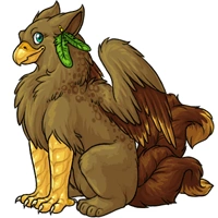

I LOVE it.
The feather texture is lightyears better, and I love that feather crest, rather than what looks like green hair. The extra color dimensions are fantastic too! Great job to the artist!
The feather texture is lightyears better, and I love that feather crest, rather than what looks like green hair. The extra color dimensions are fantastic too! Great job to the artist!

I absolutely love the new art! It's gorgeous. I might consider getting a Fester at some point now. However, there is a point I'd like to make. I don't feel like reading 200+ comments so sorry if this has been said, but I feel like the changed expression is a bit of a letdown. The old one had a very clear and unique personality, and it looked like it could be in the middle of saying "I'm so much better than you, get out of my way." The new one just has a blank sort of mean stare going on. It just looks a bit cold compared to the fiery expression of the old one. That's my only gripe, and it's a minor thing. c:
I actually like the feathers on the head look in the new picture. The mohawk kind of bugs me in the old art.
Everything about the new one is perfect, and I hope it won't get changed.
Everything about the new one is perfect, and I hope it won't get changed.
i agree with the "feather crest would look badass as hell if it looked more like a mohawk" sentiment
that said time to figure out which of my pets gets to turn into a fester
i'm thinking reeves
that said time to figure out which of my pets gets to turn into a fester
i'm thinking reeves
omgesplz. D8
I LOVE the new color scheme. It's amazing how much less awkward the pet looks just by having a gray head and neck with some texture on it.
There's only two things I'm not crazy about. The first is the length of the far wing.. it just looks a tad too short- like it's obvious that the artist couldn't make the feathers much longer or they'd run out of space. I think it would look better if the wing was raised just a tad and the end feathers were lengthened. Not by much though.
The other thing is the beak. The shading is a little strange on it and it seems too large for its head in general.
In all honesty though, I would probably make one as-is. |D I have many bird names and I've really gotten tired of choosing between Lains and Irions because the Graveyard Fester is the only one I can take seriously. The current art is honestly still decent, but the last revamp just couldn't help it enough design-wise. I'm seriously THRILLED to see this pet get a revamp that might finally gain it some attention.
So basically, THANK YOU FOR THIS REVAMP, ART STAFF. ♥️
I LOVE the new color scheme. It's amazing how much less awkward the pet looks just by having a gray head and neck with some texture on it.
There's only two things I'm not crazy about. The first is the length of the far wing.. it just looks a tad too short- like it's obvious that the artist couldn't make the feathers much longer or they'd run out of space. I think it would look better if the wing was raised just a tad and the end feathers were lengthened. Not by much though.
The other thing is the beak. The shading is a little strange on it and it seems too large for its head in general.
In all honesty though, I would probably make one as-is. |D I have many bird names and I've really gotten tired of choosing between Lains and Irions because the Graveyard Fester is the only one I can take seriously. The current art is honestly still decent, but the last revamp just couldn't help it enough design-wise. I'm seriously THRILLED to see this pet get a revamp that might finally gain it some attention.
So basically, THANK YOU FOR THIS REVAMP, ART STAFF. ♥️
I think this revamp is GORGEOUS GORGEOUS GORGEOUS and will look fantastic, once finalized! However, there are always constructive crits to be had, so I'll offer a few things I personally notice with the update.
I'd actually really like to see the new version retain similar coloring to the original. The current revamp colors could just as easily be the Twilight form, whereas the brown+green+gold color scheme was pretty exclusive to the common Fester.
The revamp has excellent detail, but the far wing- the one outstretched- looks incredibly awkward. If you treat the wing more like an arm, then imagine the "peak" of the wing is the wrist, and the long area of the wing will come from the wrist similar to the angle of a hand. For you to hold your hand at the angle of the far wing, your hand is in a really uncomfortable, painful position!
The wing also lacks the shape of raptor feathers (especially the flight feathers) and the overall shape of it looks more like the wing is either crippled or vestigial. I think a lot of this effect is coming from the bottom-most feathers close to the body- they're kind of a big patch of fluff rather than having a definitive feather-shape, and it gives the appearance of incapability or youth- either way, it seems like they shouldn't be able to fly, whereas I'd imagine a Fester would be a pretty acrobatic "free-spirited" flyer- hence, the mohawk!
Related to the mohawk... I think it'd be nice if the feather crest more closely resembled one. The short feathers in the front throw off the look- any bird can have a crest like that, and many raptors have similar ones, but Fester was the original mohawk-vulture! It makes the species unique to Subeta, and I don't feel like it should be taken away. As it is, the revamp could be any petsite's raptor pet, y'know? Nothing at all about it truly says "This is a Fester". I could've said the same thing about the changed expression, but... I think that the serious look is ok, as long as you keep the Fester-smirk when doing other colors (Darkmatter, Reborn, etc.!)
The close, folded wing also has an uncomfortable look to it, but I can't seem to think of words to explain a good wa to fix it... Overall, just rounding out the shape and giving the feathers more accurate definition could help a lot. The simple fur/mop look of scattered feathers can really throw off ones' perception of "This creature can fly- its' wings aren't just for show".
Hopefully that all makes some degree of sense!
Really, they're just a few revisions, but I think they can add a lot to the overall quality and character of the image. It's a FANTASTIC redesign, overall, and I really look forward to seeing its' completion! The tail feathers are gorgeous, very well-done and with a nice degree of accuracy! The long feathers in the crest are also a lovely addition, as is the black tip to the beak and the yellow patch between the eye! Some minimal, yet excellent, changes to a great pet! (:
Keep up the great work, you guys! So envious of those lovely coloring skills~
I'd actually really like to see the new version retain similar coloring to the original. The current revamp colors could just as easily be the Twilight form, whereas the brown+green+gold color scheme was pretty exclusive to the common Fester.
The revamp has excellent detail, but the far wing- the one outstretched- looks incredibly awkward. If you treat the wing more like an arm, then imagine the "peak" of the wing is the wrist, and the long area of the wing will come from the wrist similar to the angle of a hand. For you to hold your hand at the angle of the far wing, your hand is in a really uncomfortable, painful position!
The wing also lacks the shape of raptor feathers (especially the flight feathers) and the overall shape of it looks more like the wing is either crippled or vestigial. I think a lot of this effect is coming from the bottom-most feathers close to the body- they're kind of a big patch of fluff rather than having a definitive feather-shape, and it gives the appearance of incapability or youth- either way, it seems like they shouldn't be able to fly, whereas I'd imagine a Fester would be a pretty acrobatic "free-spirited" flyer- hence, the mohawk!
Related to the mohawk... I think it'd be nice if the feather crest more closely resembled one. The short feathers in the front throw off the look- any bird can have a crest like that, and many raptors have similar ones, but Fester was the original mohawk-vulture! It makes the species unique to Subeta, and I don't feel like it should be taken away. As it is, the revamp could be any petsite's raptor pet, y'know? Nothing at all about it truly says "This is a Fester". I could've said the same thing about the changed expression, but... I think that the serious look is ok, as long as you keep the Fester-smirk when doing other colors (Darkmatter, Reborn, etc.!)
The close, folded wing also has an uncomfortable look to it, but I can't seem to think of words to explain a good wa to fix it... Overall, just rounding out the shape and giving the feathers more accurate definition could help a lot. The simple fur/mop look of scattered feathers can really throw off ones' perception of "This creature can fly- its' wings aren't just for show".
Hopefully that all makes some degree of sense!
Really, they're just a few revisions, but I think they can add a lot to the overall quality and character of the image. It's a FANTASTIC redesign, overall, and I really look forward to seeing its' completion! The tail feathers are gorgeous, very well-done and with a nice degree of accuracy! The long feathers in the crest are also a lovely addition, as is the black tip to the beak and the yellow patch between the eye! Some minimal, yet excellent, changes to a great pet! (:
Keep up the great work, you guys! So envious of those lovely coloring skills~

I love the new one, so much. It's a pet I'd actually consider owning, where I wouldn't be caught dead with the old one ;P There is definitely a different personality, the new one seems much more serious, where the old with it's smile and bright green hair was more of a rebellious, almost punky looking creature for lack of better words. So I don't know how people will take that, but I personally love it (:
WOW. That's just... that's just BEAUTIFUL. drools
But, can the neck be longer? Just so that it doesn't lose the vulture feel. If there's a falcon pet, then it should be separate from the fester. ^^
But, can the neck be longer? Just so that it doesn't lose the vulture feel. If there's a falcon pet, then it should be separate from the fester. ^^

I like the new one a LOT better, but I feel as though the way the wing is positioned (the front wing) makes it anatomically look a bit odd. I want this change to go through, though. This is a pet I would get - I'd get a at least one with the new slot I'll be buying. The change mas the pet a LOT more likable rather than one just to be ignored. The neck is a bit short too - the edit User not found: banish posted is amazingly better. Looks a lot more realistic and I really will be getting at lest one if this goes through.
Muuuuchh better. Keep the black/grey colours imo, it adds to his evilness. We already have a colourful happy birdie. Fester doesn't need to be another ;D
Wow...
Well, I think it'd be better with more colour as it's quite plain, but I like the pose. As a few others have said, I think it looks more like a falcon than a vulture. Nice, but I think it needs some changes.
Well, I think it'd be better with more colour as it's quite plain, but I like the pose. As a few others have said, I think it looks more like a falcon than a vulture. Nice, but I think it needs some changes.
OH GOD. I am so getting one (or two...or MANY) if this revamp goes through. They will like seriously become one of my new favorite pets.
I love the new design too much for my own good, jesus christ u
I CANNOT WAIT FOR THE HYDRUS AND REBORN VERSIONS TO BE UPDATED TOO OH MY GOSH u
I CANNOT WAIT FOR THE HYDRUS AND REBORN VERSIONS TO BE UPDATED TOO OH MY GOSH u
That new art is a HUGE improvement! The only crit I have is the neck. I think a big part of what made the Fester a Fester was the long neck and this one is missing that.
I agree about the neck not beeing as long as it should be.
And the mohawk =(
But beside that, OMG LOVE IT.
And the mohawk =(
But beside that, OMG LOVE IT.
I agree about the neck not beeing as long as it should be.
And the mohawk =(
But beside that, OMG LOVE IT.
And the mohawk =(
But beside that, OMG LOVE IT.

I love the new Fester, but in my opinion you should've kept the old color scheme. This one looks like it could be an Arid Fester.
I love the new design, it's very eerie, one critism (which isn't very constructive, I do apologise), is that it seems a bit stiff, other than that I like it.
I'm actually so split between nostalgia and coolness that I'll abstain from this vote, but I have to say... THANK YOU FOR PUTTING IT UP FOR A VOTE! I like when everyone gets a chance to discuss/vote before the change.
I also agree that the color should be changed back to something brown.
I also agree that the color should be changed back to something brown.
Whoa, this would actually make me want to own a fester! I absolutely love the new design, and while the colors are dark I wouldn't want them to be changed back to brown. There are already a ton a pets that are brown in the common pose, and this new scheme makes the fester much more unique. I also love the harshness of the beak and agree with the users that say it should not be changed back into a smirk.
I can't really complain about any aspect of the new design, which is odd because I usually have at least one little nitpick whenever a revamp is polled. The old fester was clownish and it wasn't really a popular pet, so I think this more serious design will give it a huge boost. :)
I can't really complain about any aspect of the new design, which is odd because I usually have at least one little nitpick whenever a revamp is polled. The old fester was clownish and it wasn't really a popular pet, so I think this more serious design will give it a huge boost. :)
@banish
Oh, I really like what you've done here. The body looks smaller, so the wings look more proportionate, though I just do wish they had more of a sense of breadth, as the old one did. I could believe those wings would unfold into a large, intimidating vulture wingspan. This revamp..not so much. I would probably just put a bit more curve in the neck, since right now it's just stick up-straighty and stiff looking. I like how you melded the feathers of the mohawk back into the neck, instead of just ending them abruptly. I don't know why but it just makes it look neater somehow.
Oh, I really like what you've done here. The body looks smaller, so the wings look more proportionate, though I just do wish they had more of a sense of breadth, as the old one did. I could believe those wings would unfold into a large, intimidating vulture wingspan. This revamp..not so much. I would probably just put a bit more curve in the neck, since right now it's just stick up-straighty and stiff looking. I like how you melded the feathers of the mohawk back into the neck, instead of just ending them abruptly. I don't know why but it just makes it look neater somehow.
Love the new design, love the new colours too.
I think the wings need some work, they don't feel quite right. As others have said, the neck isn't long enough.
I think the wings need some work, they don't feel quite right. As others have said, the neck isn't long enough.
I don't even like Festers but the new design is gorgeous, fits the the site much better and the shading hng. I can imagine the coloured revamps to be incredible as well.